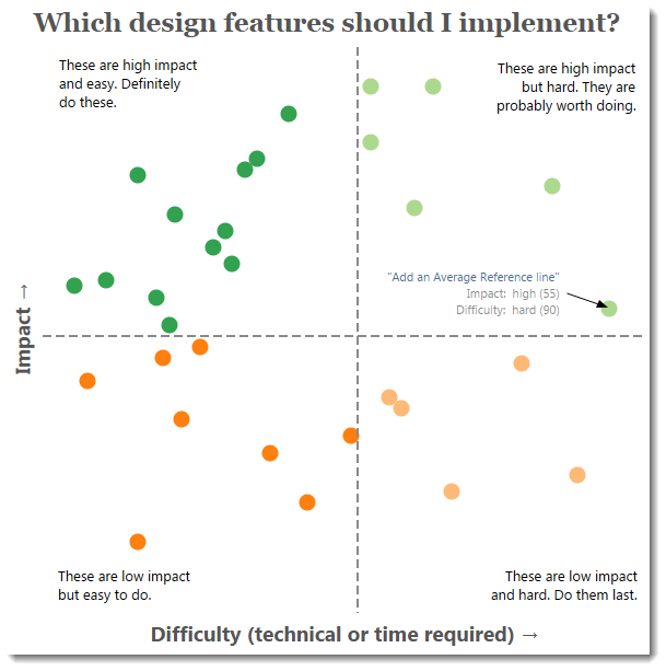
Over the past month, I’ve deconstructed a dashboard I made for Tableau’s internal VizWhiz competition. Below is an attempt to quantify the Impact and Difficulty of each of the design choices I made. You can click on each one to go read the post describing the design choice:
If you’ve enjoyed these posts and want to continue reading my blog, please subscribe to my RSS feed or connect with me on Twitter (@acotgreave)
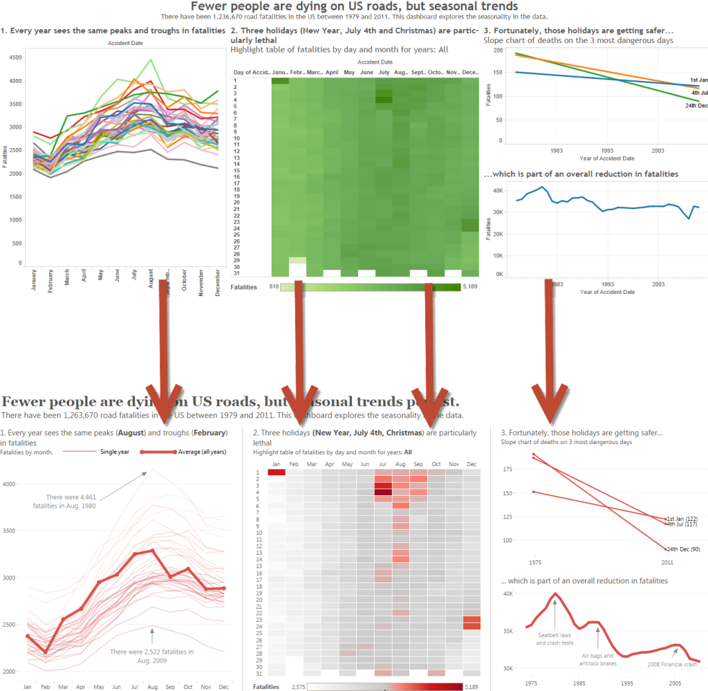
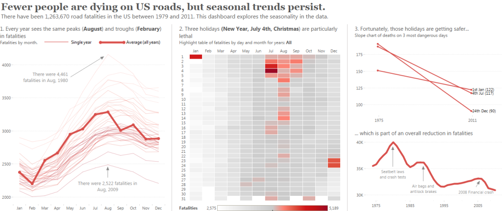
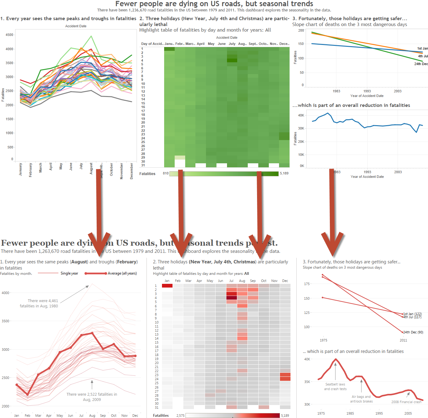
Why did I bother changing a dashboard that looked pretty fine in the first place? Why did I write 14 posts about this single dashboard?
Simple: I wanted to really think about the design choices and share the process of taking a perfectly functional dashboard and trying to make it into a thing of beauty.
Stepping back made me realise how many and what type of choices I make. Each choice has a highor low impact and is easy or hard. I quantified that in the viz above. As Michael Mixon pointed out in a comment, as we become experts we take this stuff for granted.
Take note: my posts are not a manifesto for all visualisations. As I’ve written elsewhere, there’s no right answer when designing visualisations.
I recommend you download the final workbook. There’s lots of extra views that didn’t make the final version. You’ll be able to see for yourself how I did everything.
For reference, here’s the full list of posts:
- Data Visualisation and Process
- Choosing the right colours for your visualisation
- Emphasise the data
- Use only one colour
- The role of text and visualisation design
- Tooltips
- Appropriate titles
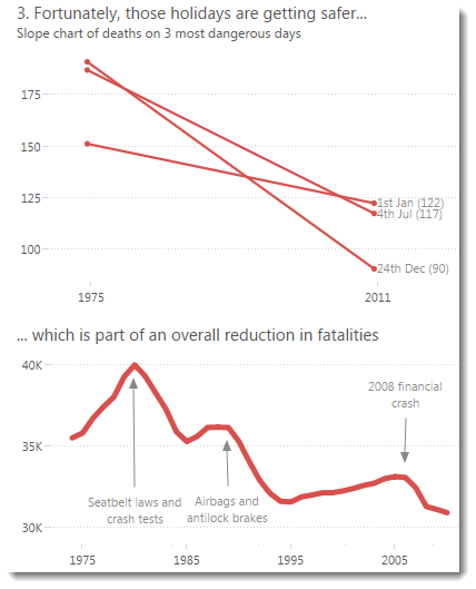
- Labels and annotations
- Should you add a border?
- A short post on drawing marks on your Tableau views
- Less is more: improve clarity by removing borders and lines
- Designing a time series chart for seasonality
- Control your dates in Tableau dashboards
- Layout: the hardest and most important thing to get right
- Chart type choice
- Horizontal or vertical
- Get feedback
- How to design an axis for maximum impact
- Set the range and tick marks
- Remove labels
- Don’t always include zero
- Adding average reference lines
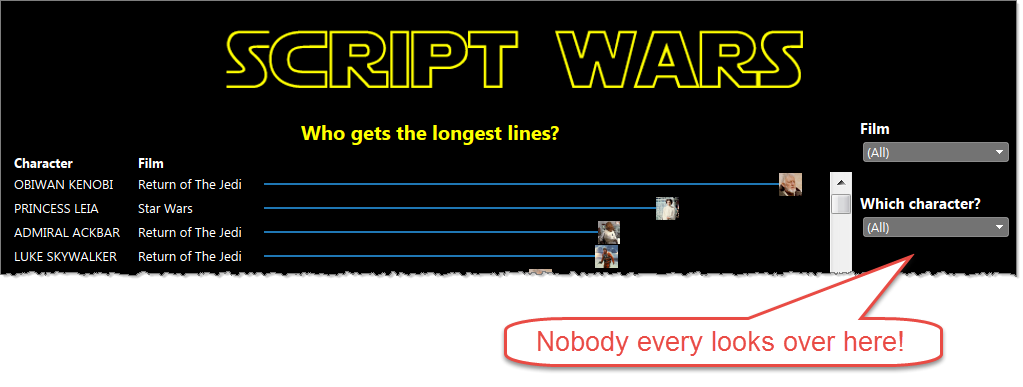
- Choosing the appropriate call to action to get people to interact
- Which action is best for interactivity?


5 Comments
Add Yours →[…] came across this post by Andy Cotgreave about features to use in an interactive dashboard as those created in […]
[…] Tableau Design Month, Post 12 of 12: The Big Recap | Gravy Anecdote […]
[…] came across this post by Andy Cotgreave about features to use in an interactive dashboard as those created in […]
[…] Andy’s Design Month […]
the links aren’t working when i try to look at your posts? it says server error.