
When visualizing data, should you leave the axes at their default settings? Almost always the answer is no. The defaults won’t be bad, but I’d bet you could always improve the viz by changing them.
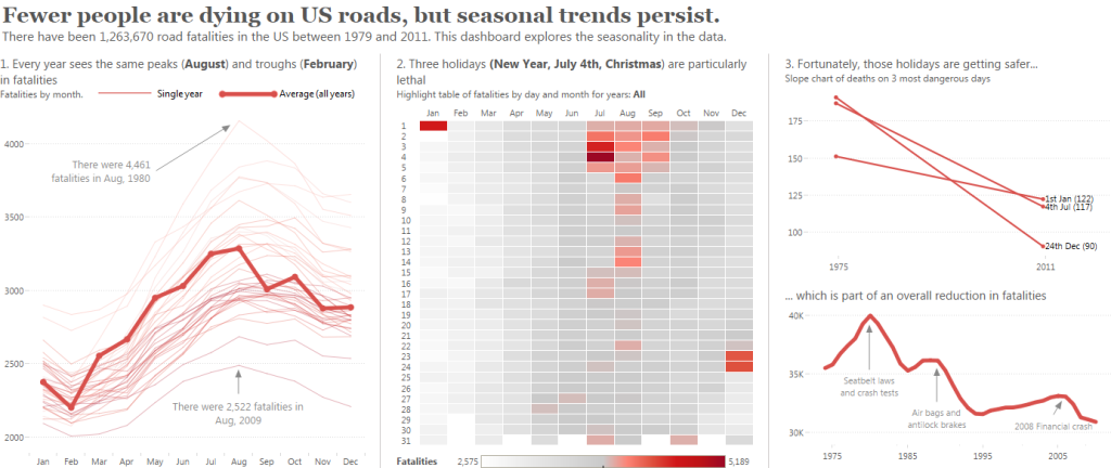
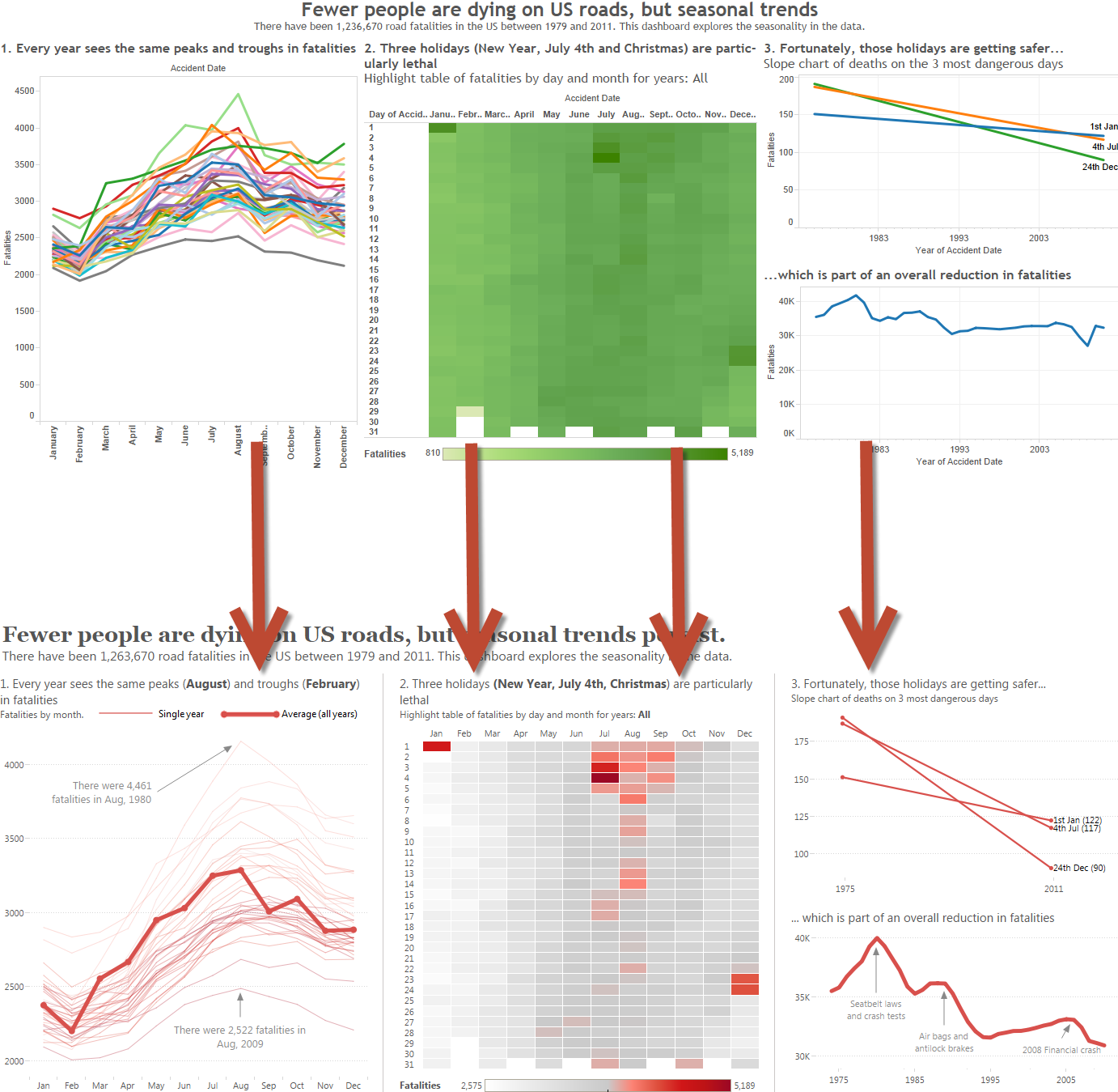
This is part of a series of posts about dashboard design, focussing on choices I made in this dashboard. All of the axes have been altered very deliberately.
In this post, I will first explain the different choices I made. If you want to do these in Tableau, they can all be done via the Edit Axis dialog box (see the help page here)
Here are the design principles I followed:
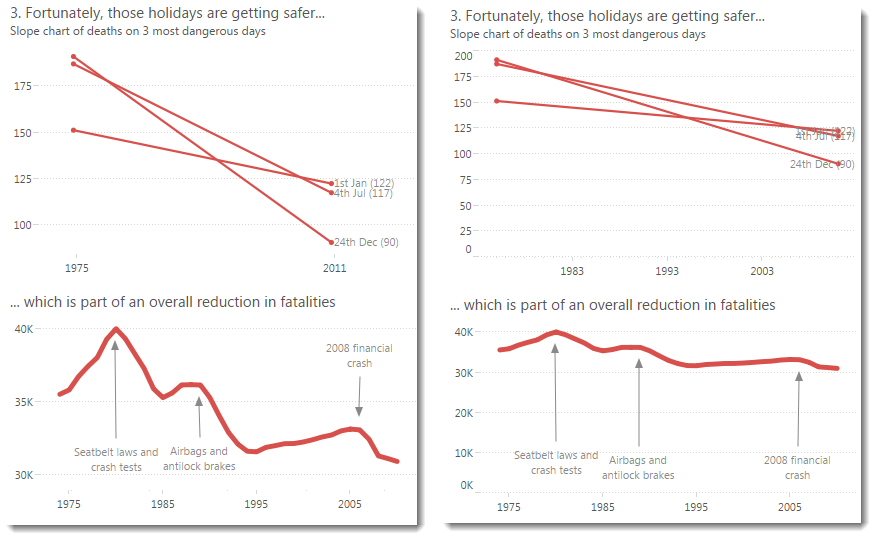
Don’t show zeroes.
My story focusses on relative change over time, so I did not show zero in any of the y-axes. You can find out more about the guidelines on including zero here.
Remove axis labels where the measure is obvious.
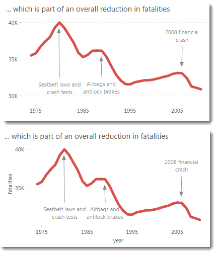
Do you need “Year of accident” or “Year” on an axis when it’s obvious what it shows? I’d say no. Do you need to label your y-axis with “Fatalities” when you’ve got it in the title? I’d also say no. You can see how it looks with and without the titles below. Which do you prefer?
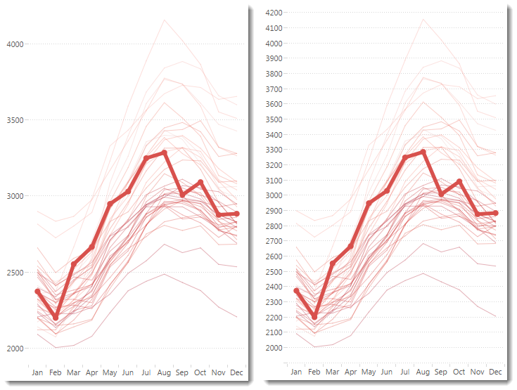
Show the fewest tick marks you can.
In the image below, you can see the difference between lots and few tick marks. Neither of these are bad but I felt fewer tick marks helped focus on the trend in the data
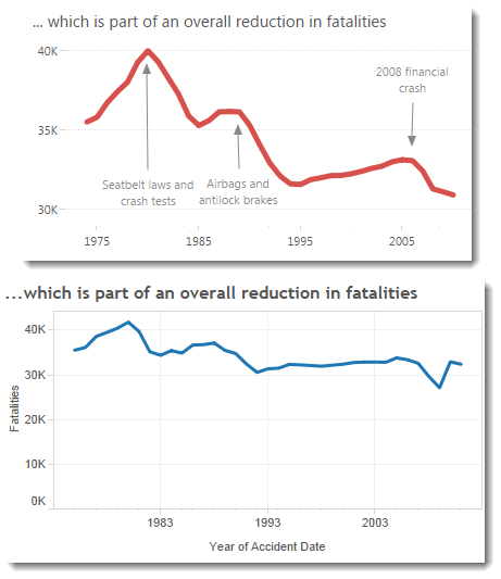
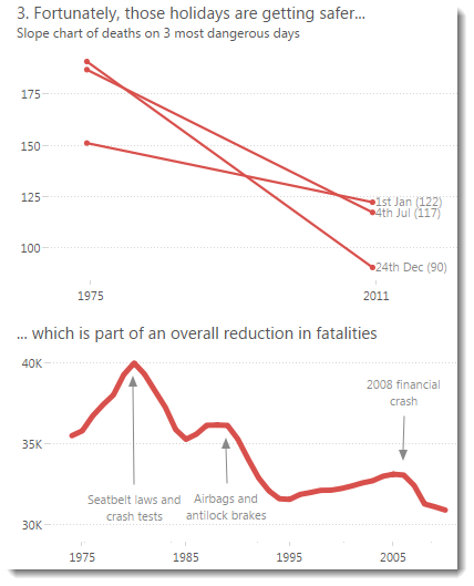
Set the axis range so that relevant, round values are shown.
Check out the difference between the default axis on the time chart (lower chart below) and my edited version (upper chart) It’s easier to start your eye at 1975 than it is at 1983:
In Tableau, getting round values in your default dates is a little trickier than you might expect and for full control you need to master the Edit Axis box. I will blog that separately.
Conclusion
Those were my design choices in this case. Was I successful? Let me know. Remember: none of these are mandatory changes and I don’t even suspect everyone would agree these are improvements to the originals – it’s partly subjective and partly depends on the goal of your viz.


3 Comments
Add Yours →Great post, Andy. The more I work with data, the more I recognize that the thought process that goes into telling a great story with data is very similar to the thought process that goes into composing a great photograph (the other thing I tend to geek out on). Specifically, figuring out what you really want to say and then removing everything from the canvas that doesn’t contribute to that story.
[…] How to design an axis for maximum impact | Gravy Anecdote […]
Good points, all.
It’s worth pointing out that the axis is an element of the field’s Header, so the only way to get show the axis and get access to axis editing is to have the field’s Header visible.
I’m not sure why this is, but it’s plenty confusing to people new to Tableau. In fact, it’s fundamentally confusing, considering that there’s almost no reason for the Header to exist except to be the carrier for the Axis.