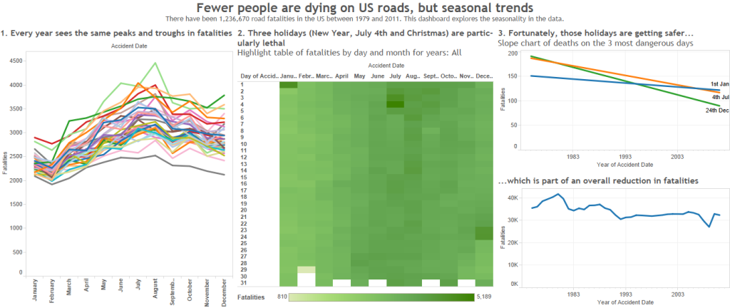
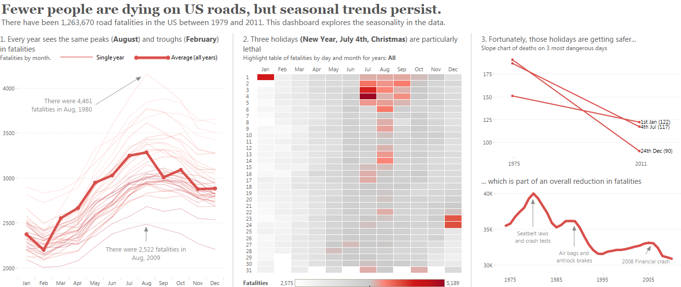
Here are two dashboards. The bottom one uses all Tableau’s default formatting settings. The top one has at least 25 formatting changes or design decisions: these changes take a few hours to implement. Why bother? What’s wrong with Tableau’s default formatting?


The short answer is: nothing. The longer answer is more nuanced.
It’s Tableau Public’s Design Month so I wanted to do a series of related posts. In these posts, I’ll be focusing on the dashboard above (click here for bigger version). This was my entry into Tableau’s annual internal “VizWhiz” competition. In this round, we were given data was about US road traffic accidents.
There are at least 25 things design decisions I’ve made to produce that viz. That’s 25 changes I have made to the default Tableau formatting: some small, some large.
But first: why change the default formatting? What’s wrong with Tableau’s defaults?
Let’s look again at the default dashboard:

Let me repeat: There is nothing inherently wrong with Tableau’s defaults.
My story can be understood from the default dashboard above. In fact, I am sure some people reading this will think the defaults are better than my design. If so, let me know in the comments below.
So why bother? Why would I spend hours tweaking what is already a perfectly-fine dashboard?

I take my inspiration from ex-British Cycling performance director Dave Brailsford. He led the British Cycling team to huge success through his “marginal gains” (click here to find out more). The principle is that you make all the small and large changes you make. Even the small changes, when aggregated, make a difference.
Each formatting tweak might only improve my viz a tiny bit.
The default formatting gives you a bronze-medal dashboard. There’s no shame in getting a bronze medal for something. If you’re in a business environment, producing dashboards for fast, iterative consumption, it is perfectly fine to leave the defaults as they are.
However, what if you want the Gold medal? In this case, you make all the changes you can. Even if they are small, the aggregate effect is significant. For that reason, I am happy to go the distance and make grab every “marginal gain” that I can.
Over the next month, I’ll be describing most of the formatting and design decisions I made.
Humblebrag alert: I am pleased with my dashboard but am wide open to criticisms about it. I am sure that what I think are good decisions might well seem like bad ones to you)


6 Comments
Add Yours →Your revised version is far and away a better design concept.
What I love about Tableau is how quickly I can build a dashboard and even add interactivity. What I don’t love about Tableau is all of the formatting work I have to do at the end to give it the polished look you’ve demonstrated.
All of these little tweaks just take it to that next level. One of my favorites that you’ve used is adding the borders around all of the cells in the highlight table. I use that in all of my vizzes (especially tree maps).
Hi Harvey – thanks for the comment. I’ve got a post coming up about borders around marks in the highlight table. Like you – I use that trick a great deal. It seems to bring the marks more into focus.
The time spent formatting in Tableau: I agree it’s not ideal but after years of doing it, I go into a trance-like mode, and click quickly, massaging, tweaking, bending the display until it feels right. It’s like painting – each stroke/format moves you forward and you reach a point where you know it’s time to stop.
How do you feel about a dot plot to show the change in time in the upper right panel?
Hi Aaron – a dot plot would work well. Do you mean like this?
Great post. I’ve been looking for a way to set many of these defaults for a new workbook. Simple example: every Average reference line I place I like to be formatted as a Thicker Red Dashed line, with a custom label of ” – “. This resets even between sheets…
Any idea of how to set this as a Tableau general setting? Thank you.
Wish I’d seen this sooner.
As I see it there are two main problems with Tableau’s formatting:
1) There’s no way to set defaults to conform to what -you- think are good and reasonable, e.g. I re-configure Dashboard titles as a matter of course, and although it’s now muscle memory it’s an annoying pain in the tukus that I have to do it;
2) Tableau’s formatting UI is absolutely horrible, almost as malformed, awkward, and just plain bad as it’s possible to be. Things that should be simple and obvious are opaque and difficult. There are too many different property sheets, special cases, edge cases, blind alleys that one needs to know about, and other impediments. And there’s no way at all to do simple, obvious and reasonable things such as putting a border around the full body of a sheet/viz (and no, putting it in a bordered container in a dashboard isn’t an adequate substitute.)
The real tragedy is that it wouldn’t be all that hard to build better formatting into the product. The real question is: “why hasn’t Tableau done it already?”
One of Tableau great vulnerabilities is that some new product will come along, make the basic analytical and visual operations as simple and easy as Tableau does, and expand the threshold of simple and east to include those things that Tableau’s neglected, like formatting.