
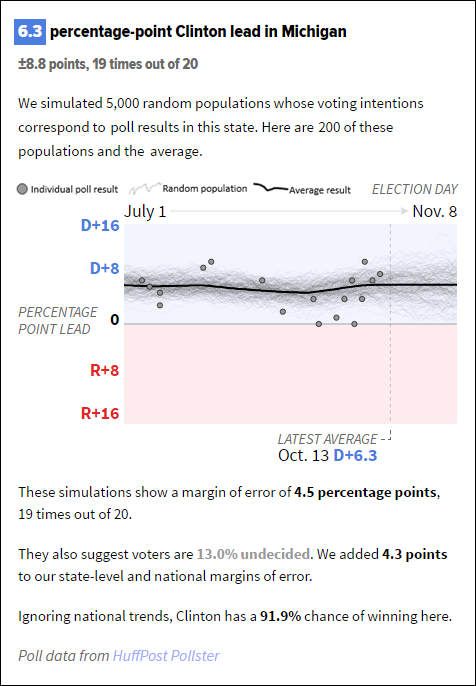
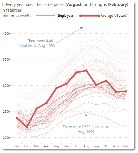
How do you communicate what the dots, marks, and lines on your chart show? Most often, you’ll use a legend. They work well, but check out the this from the Huffington Post. They created a Paragraph Legend (as I’m going to call it).
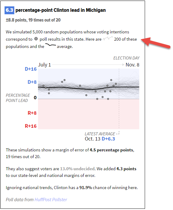
Why’s this great? I mocked up what this might look like if we used a regular legend. Try and decipher the chart using the “traditional” approach:
In order to decipher the chart you need to read the paragraph. Then the chart. Then go to the legend. Then back to the paragraph. Then back to the chart. Finally you might understand what’s on show.
Now look at the Paragraph Legend. Read the paragraph, look at the chart, and then maybe back to the paragraph once more. I found it much much easier to decode the chart with the Paragraph Legend. Like all small things, this is harder for the designer, but an improved experience for the audience.
[This is the second time I’ve reused Andy Kirk’s amazing idea to blog short posts on great things they see in dataviz. All credit goes to Andy for the idea. I’m going to call my series “It’s the small things….”]
1 Comment
Add Yours →[…] also that day, I witnessed a similar example – Andy Cotgreave from Tableau published a small post entitled “It’s the small dataviz things” on his blog. A small comment on a really […]