
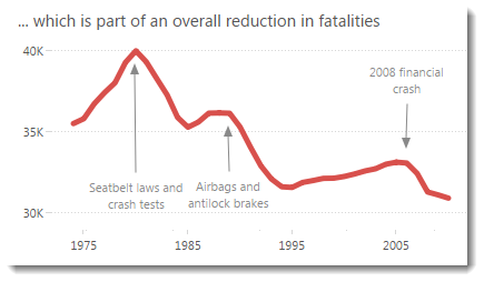
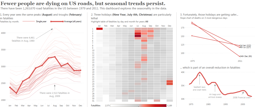
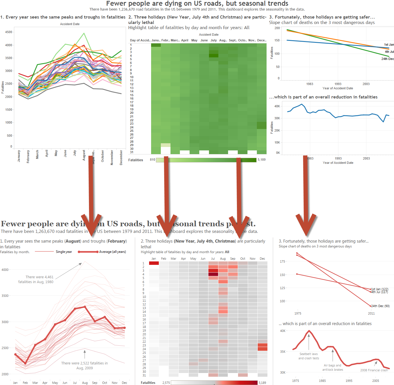
It’s no accident that the tick marks are like they are in the above chart. Check out how they’d have looked if I’d left them at their defaults:
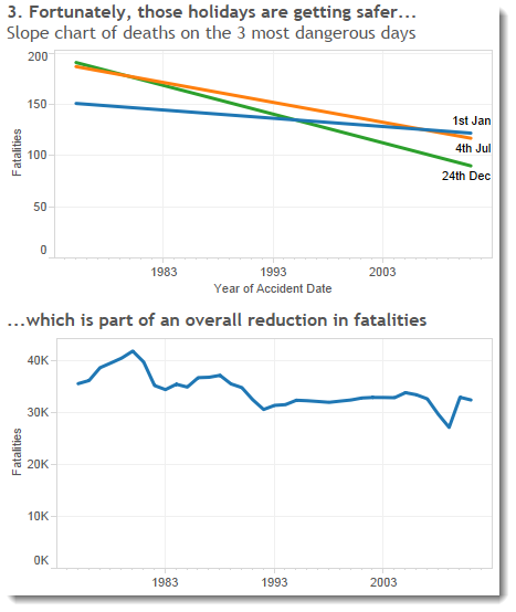
I’d rather my tick marks were at round numbers (1975, 1980, etc) than at odd numbers like 1983. As I’ve said throughout this series of Design Month blogs, it’s not a big problem but it’s a nice one to solve.
Tick Origin
Let’s look first at the time series:
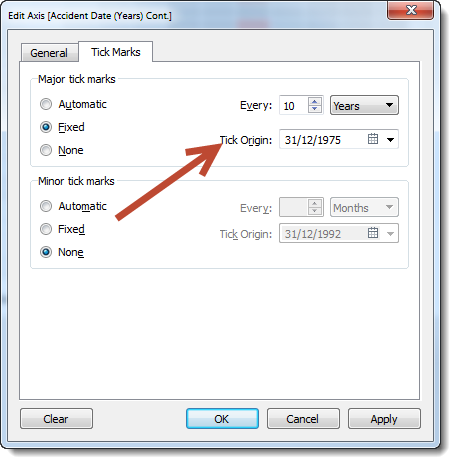
Getting the tick marks to start at 1975 is acheived by using the “Tick Mark Origin” feature that appears when editing time Date dimension axes. Set it to the value of the first major tick mark you want as below:
Fixing axes on a slope chart
My slope chart has a couple more tricks up its sleeve.
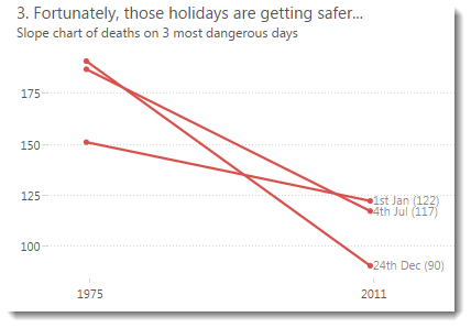
You can find out more about making dynamic slope charts in a previous post. In this slope chart, I used continuous dates (you can use discrete or continuous depending on what your goal is).
I had to jump a couple of hurdles to show the tick marks correctly and leave space for the line labels at the right of each line.
First of all, I set the tick marks to 36 years in order to show only the years that represent the start and of my slope (1975 and 2011).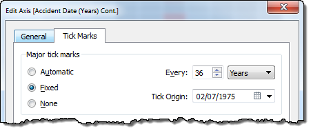
The second thing I did was fix the axis range so that there’s space on the right hand edge of the axis for the labels to fit correctly. I used trial-and-error to find the best fit (2022):
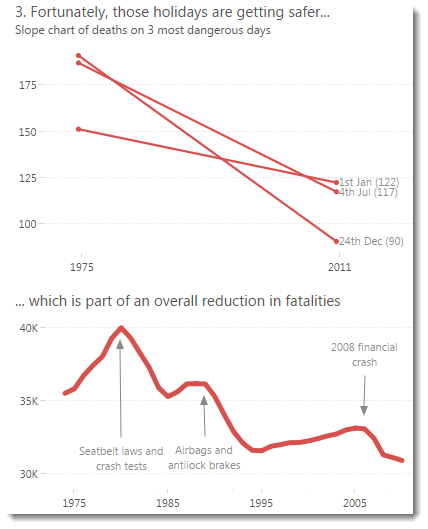
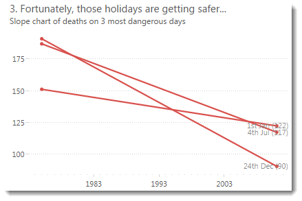
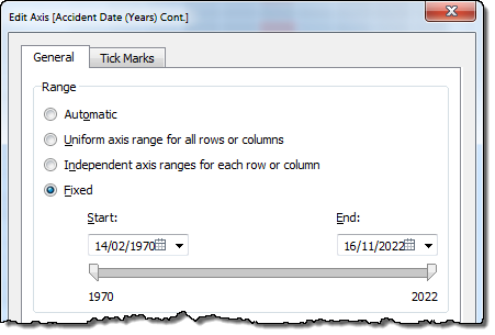 Are these important? For this slope chart: absolutely. Here’s what it looks like if i reset the axis formats:
Note the misleading tick marks on the x-axis and the misaligned line labels.
Conclusion
Slope charts are amazingly powerful and it only takes a few tweaks to the defaults to make them extremely effective in Tableau.

1 Comment
Add Yours →Are you happy with the rescaling of the vertical axis on the slope chart Andy? It enhances the slope…