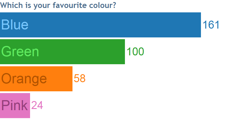

Tableau 9.2 was released this week, along with some amazing new features. One nice feature is “Match Mark Colour.” I believe it has all sorts of creative possibilities for your views. For example, above you can see I’ve got two labels on a bar chart. One shows the numbers, while the other, aligned left, shows the categories themselves, nicely using Tableau’s algorithm for matching useful colours.
How do you make the labelled chart above?
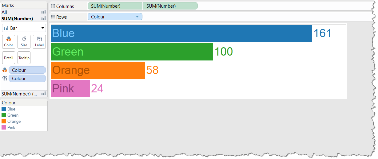
To make this labelled bar example, I created a dual axis bar chart, duplicating the SUM([Number]) measure, and synchronizing the axes.
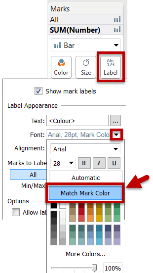
Both measures were labelled. One Measure was labelled with [Colour], aligned to the left. The other was labelled with [Number], aligned to the right. Finally, right click on the [Colour] dimension on the Row shelf and untick “Show Header”
Simple! What other nice design tricks can you do with colour matching?
Caveats:
- Jonathan Drummey points out that Tableau’s colour-matching algorithm isn’t perfect, so check things look right before publishing.
- The shortest bar needs to be long enough to fit the label, otherwise you get wierd overlaps
Recent Comments