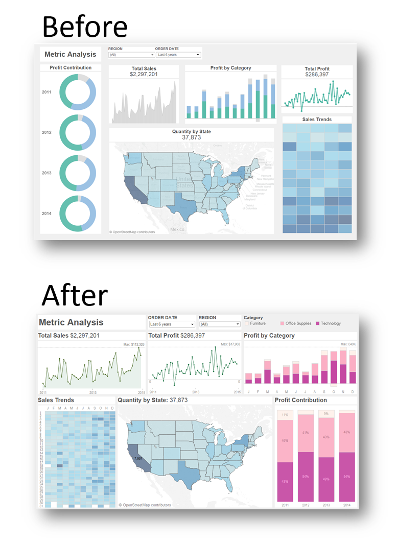

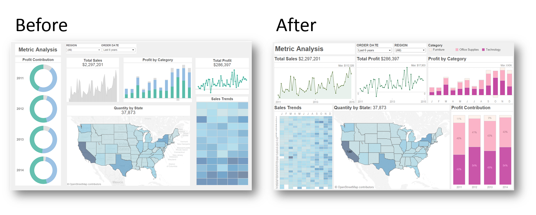
Over on the Tableau blog, we published a post on how easy it is to quickly format a key metrics dashboard. We then redesigned it in response to some valid criticisms of the original (click here). The changes made are subtle but effective. In this post I wanted to describe them to show how to maintain functionality when going minimal with their dashboards.
Example 1: the line charts
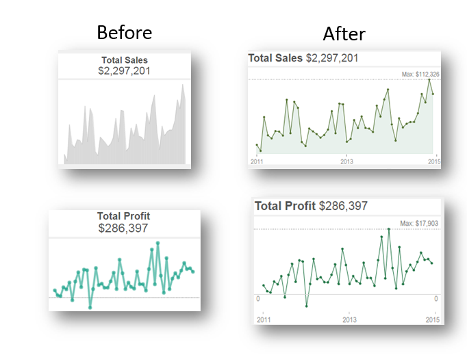
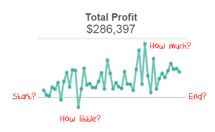
What was wrong with the original? The lack of labels make things clean, but stop you learning anything about the values:
I changed the following:
- Added the x-axis headers. I’m all for hiding headers (see “How to design an axis for maximum impact”), but I think it’s wrong to hide the x-axis.
- Dual axes provide better design control in Tableau:
- The Sales chart is an area/line chart. This gives more definition to the top of the area.
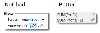
- The profit chart is a line/circle chart. I find this gives more definition to the points than just choosing the “All markers” on the Colour shelf:
- I wanted to avoid showing a y-axis but there still needs to be some way of seeing the magnitude of the measure. For this I added a maximum reference line, with the text aligned to the right. If a user filters the dashboard, the max will always be accurate
- All titles were changed to be left-aligned and single line. This creates better consistency across the dashboard. I aligned the Titles to the left and the Maximums to the right in order to prevent visual clutter and confusion. If they were closer together, it’s harder to tell which is which:
- Note also that the zero line on the profit chart above is a Constant Reference Line, rather than an actual axis. I did this because it’s easier to control the formatting on a minimal chart.
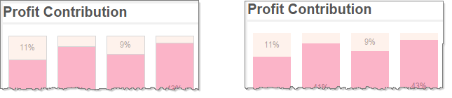
Example 2: the Profit Charts
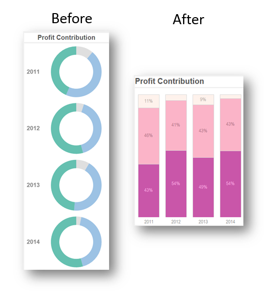
I don’t object to donut charts in all circumstances, but they are simply a bad choice when you make a donut for each Year (see p11 of Stephen Few’s classic, “Save the pies for dessert”). It’s nigh on impossible to see changes over time. I switched to a stacked area chart instead. This took up less space and allowed me to label the marks, too (removing the need for a y-axis).
Notice how the colour for Furniture is a really light salmon pink. That can be a problem against a white background, but I added borders to the marks to make them more obvious:
BTW, I didn’t address a key risk with this kind of chart: what happens if there is negative profit?
Example 3: the highlight table
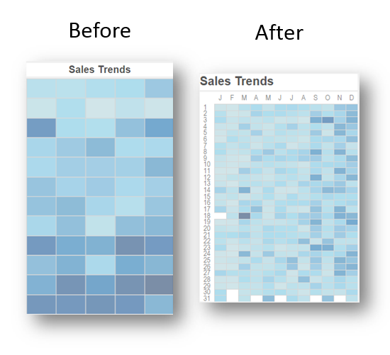
I love highlight tables. However, I didn’t think this one worked for 2 reasons. First, the lack of labels creates a real problem here. Without them, it’s just a mosaic. I also was not convinced that you’d ever really want to see Sales by Week and Weekday. I changed it to Month and Day. The increase in sales towards the end of each year is now clear.
Example 4: General changes
- Colour changes
- I used extensive use of grey in the text in order to soften the labelling and accentuate the data marks.
- I used more distinct colour palettes to differentiate Sales and Categories.
- I switched from a floating layout to a grid layout. This way, Tableau controls the size of the grey borders between the charts.
- I have to say, changing the colour was the single hardest thing on this. All the other decisions were kind of straightforward but every time I changed the colour, I felt like I’d made one thing better but something else worse. Also – the image on the Tableau blog is from before I added the borders around the marks.
- Layout
- I changed the layout so that Sales-related charts are on the left, and Profits ones are on the right.
Conclusion
Would you have done something different? The dashboard is still not perfect. For example, the blue highlight table and the blue map are problematic. However, I hope this exercise has shown that it is possible to have both beauty and functionality in a Tableau dashboard.
The key lesson for me is that it’s not hard in Tableau to acknowledge feedback and then iterate fast to fix the problems.
Feel free to download the workbook and share your ideas.
2 Comments
Add Yours →[…] how does this process really work? Let’s start with an example from this week. Andy Cotgreave went through it earlier this week with a design dashboard exercise. It’s really hard to do these things without an actual […]
[…] своей статье Andy Cotgreave* дает универсальные советы, которые помогут […]