I’ve got this idea for a future theme looking at “3 ages of data viz”. I want your thoughts. Is there something in this idea? Am I right? Are there more? What’s the NEXT age going to bring? What does this teach us about dataviz?
Age 1: The Excel disaster (pre 2000)

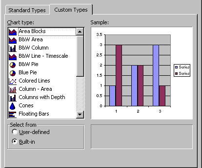
The early spreadsheet designers got excited about graphics and gave us 3-d exploded pie charts. If only they’d read some theory about effective dataviz maybe we’d not have had 35+ years of fighting back against dataviz disasters. To be fair to Excel, as you can see above, the defaults weren’t really that bad, given the limits of graphics cards in the day. Unfortunately, people got too excited about the 3d options.
Age 2: the Stephen Few fightback (2000-2010)

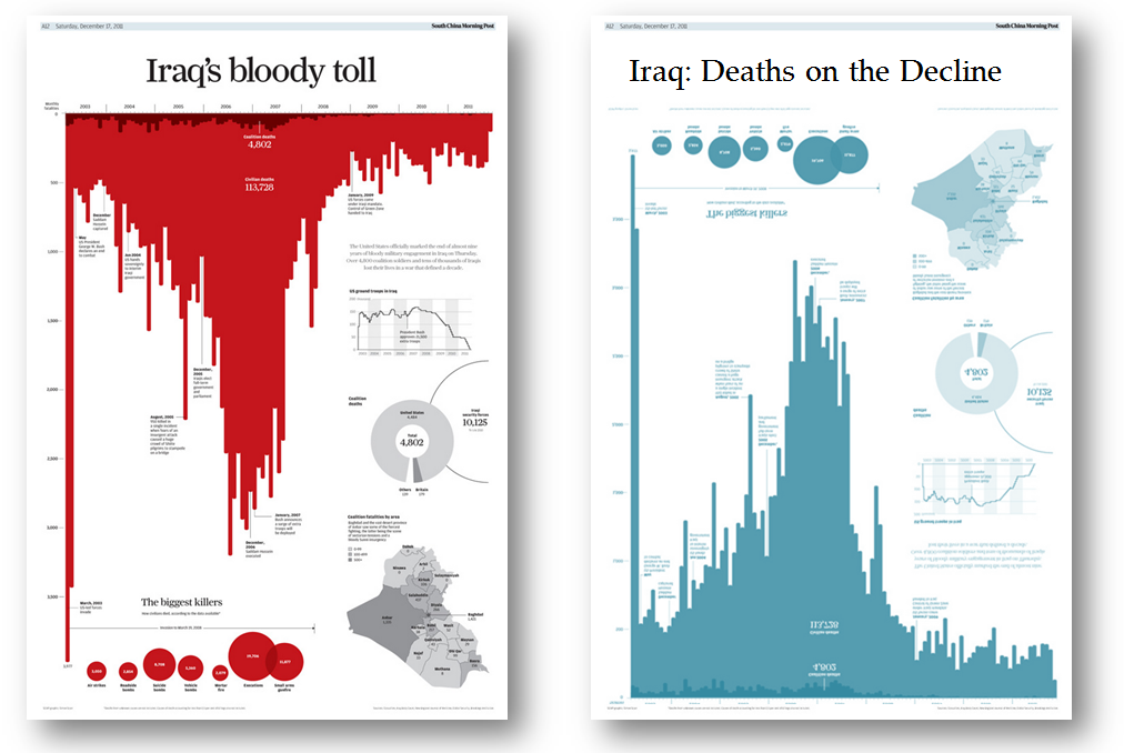
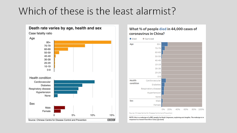
Stephen Few took on the spreadsheet behemoths in the first decade of this century. He made us all see sense and put science-backed best practice on the pedestal. People saw the light and visual tools began to ditch the dross in favour of charts that actually work.
Age 3: the creative years (2010-present)
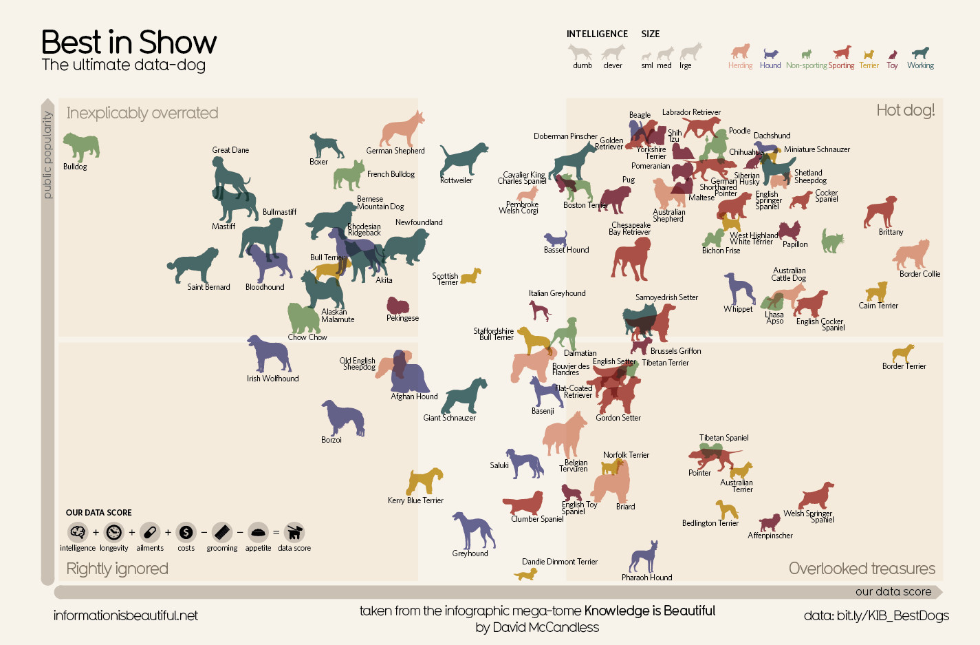
The problem with Stephen Few’s approach is that people found his approach, well, boring. Unarguably his approach was functionally correct and just right for operational business dashboards. But many people were left unmoved. They found that following his approach didn’t engage people. As data journalism flourished and infographics exploded, there was a realization that a balance needed to be struck.
At the extreme end we found that people like David McCandless found success with their design-trumps-function approach but others, such as Alberto Cairo (see his Tapestry Conference slides) and Andy Kirk (8 hats) pushed the need to ENGAGE as well as INFORM.
Tell me your thoughts
My ideas are fluid around this. I’m trying to make the point that we’re in a great place with the combining fields of creative power and effective design. What else do I need to know?

9 Comments
Add Yours →I don’t know if I consider “creative” a third era, so much as a fad? Although creative may look great, they are an accompaniment and not a replacement for more standard BI-oriented visualizations.
Do you mean dataviz on desktop PCs? Otherwise you’d better include Isotype, body counts on wigwams, ancient Egyptian tomb paintings etc. But the interesting topic for me is how people got fooled into thinking that a computer is the best solution to any problem (eg. writing shopping lists on your ipad when you could just use the back of an envelope instead, and the battery won’t run out half way round WFM). When Excel came along it certainly was a pivotal moment and businesses gravitated to it like flies round the proverbial doggy-doo. And there they remain, because the workforce is now so de-skilled in anything else. A lot of work with D3 vel sim is just regaining the old hand-drawn ways, but with interactivity. Some of the very tactile aesthetics like Jim Vallandingham’s exemplify that for me. Perhaps the very nature of SVG plays to that: you put this line here and that polygon there, rather than letting the computer decide and assuming it must be right. But sometimes I think it would be simpler and better just to get the crayons out. To quote one of our politicians here in the UK: “they haven’t gone away, you know”.
In the first age there was a fight between creative viz capabilities and standard desktop software. Creative was tagged with the mantle of ‘eye-candy’ in products like Harvard Graphics (to my surprise, it is still around — http://www.harvardgraphics.com/products/hgadvancedpresentations.asp), Borland Quattro Pro (http://en.wikipedia.org/wiki/Quattro_Pro) and Lotus Symphony (http://en.wikipedia.org/wiki/Lotus_Symphony_%28DOS%29). Each of these advanced the ability to create much more custom graphics than available through the prevalent spreadsheet programs of their time – Excel or Lotus 1-2-3. However, IMO, the added cost for these programs (that is, they would be added to a person’s complement of corporate installed programs which already included either Excel or Lotus) was a huge deterrent to their adoption as well as the impetus for the derogatory inflection of ‘eye-candy’. That is, corporate groups tasked with either creating a corporate standard or with maintaining a low cost footprint evaluated these alternatives and determined that the added cost wasn’t worth their extended capabilities in graphics, etc. Once that name calling got ‘credibility’, features like enabling direct interaction with your data through the graph (a feature of both Borland and Symphony), got swept in with the rest of the capabilities termed excessive to the ‘real’ needs of the users to create very simple line/bar/pie/area charts after having evaluated the data as a spreadsheet with filters and possibly pivot tables.
So, what I’m saying is that we’ve been at ‘Age 3’ before. Last time around, the features of working with your data through a viz was demonized and derided. Those features got lost when Microsoft won the spreadsheet war with Lotus and Borland. Likely not just lost, but also likely the GUI features buried in lots of intellectual property patents, etc. (which would have kept their use by others out of the question for 17 years (?)). With all that past history, it took a while for the business leadership to have a change in watch, for the poor experience of big BI promises to have been felt before the climate was ripe to reconsider the advances in interactivity with one’s data offered by these early products. Fortunately, some people thought they could do this task better than before, so we now have Tableau and others trying to catch up to the data analysis fire that Tableau rekindled.
I like your thinking. It seems like we’re still in Age 1 to some extent. Maybe the accompanying visual explanation is something like this: http://annkemery.com/wp-content/uploads/2015/01/photo-7.jpg Looking forward to your next iteration of thinking.
I agree that you could look at things in this way to a point, though to put the “bad Excel chart fightback” down to one individual is a bit narrow. Fair enough as an exemplar, but only that.
Yes, there has been a change in how data has been visualised, and the tools in the period you discuss, starting with Excel (or even MS Works and others before that) put the ability to chart in the hands of anyone, but following the relatively limiting presets and templates provided more by developers than design experts.
But wait: Did dataviz only start here? What about manual creation before mass market technology? If not that far, what about people who used (and still use) software other than spreadsheets to create data visualisations as illustrations?
I guess I’m just saying that there is a bigger world and heritage of dataviz out there than this view acknowledges. As I said, one one level this is fine and makes you think a bit. But there’s more to it, in my humble opinion.
I came across this via an @albertocairo tweet. Thanks for the post: it made me think.
As for the next age? I think more of the same. That is, the untrained (ill-informed) masses continuing to churn out bad data via, and the few (pun intended) dazzling and informing with brilliant work.
Andy here.
Thanks for the comments; there’s some amazing food for thought here. One thing I didn’t make clear – I was referring to only computer-based dataviz. The long and rich history of dataviz is a whole different world.
Robert – I agree with most of your comment. I’m not sure we’re deskilled with computers in all aspects. It still takes skill to craft a meaningful and effective chart/dashboard. Thanks for mentioning Jim V – I haven’t come across him before but his work looks really interesting.
Brad – your review of history is fascinating and makes me see things in a new way.
Ann – I love your visual! No better way to explain something than a fast doodle. Yes, we’re seeing 3 ages in one, with different levels of skill and experience creating a whole spectrum of good and awful vizzes.
Stephen – glad you came by my blog! What’s next is something interesting to ponder. I hope we see a better merging of form and function and a general education of those still creating 3d-monstrosities.
[…] Source: gravyanecdote.com […]
to the extent that datagraphic design is based on a few fundamental principles, it’s difficult to see that much ‘progress’ has been offered by digitization, but I’m a conservative. it’s certainly easier to make good designs now, but also easier to make bad.
Echoing Robert Grant, going all the way back to the earliest human artifacts, many of the pictures of cave drawings in the public eye are reminiscent of much of the outputs of the recent trendy infographics approach. Animal silhouettes in stylized poses conveying information about what critters are where, and in what numbers.
Considering only computer-assisted data viz the first age must include character-based constructions. Some of us remember EBCDIC-based charts generated on mainframes that were surprisingly effective in representing quantities in context, particularly bar charts.
Data analysis in the first age, before pixel-based graphics and GUIs was limited by the constraints of character-based block-mode terminals and line printers, but it happened and was surprisingly effective.