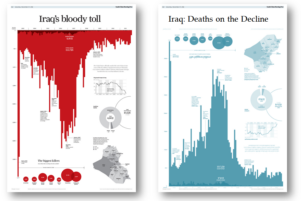
If you’ve seen me present in the last 3 years, you’ll probably have seen me show the Iraq Bloody Toll chart. Then you’ve seen me turn it upside down to create an entirely different message (full post here).
I still love showing this example to new audiences. I love seeing the light bulb go off as they realise that a data and a chart is just a method of communicating a message: facts are not neutral.
But it’s time to find a new example and for that I turn to you for help.
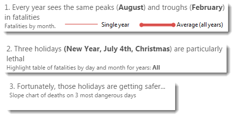
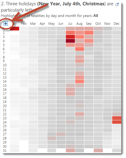
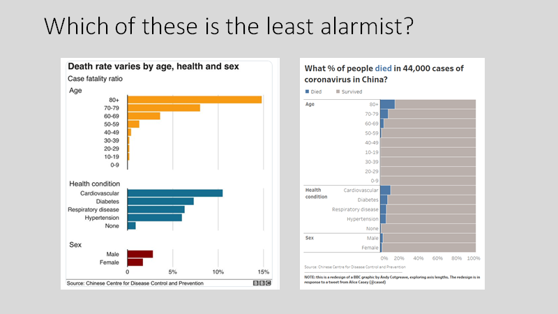
Have you got any other great examples of charts where the message can be transformed in as simple a way as this one?
(Note: I’m only looking for examples that stay true to good practice. Truncating the y-axis doesn’t count!)

There are some older examples. Obama’s bikini chart was a cracker, described very well by Robert Kosara in 2012.
Do you know any others? If I can find enough, we could turn this into an entire blog post or webinar. Let me know in the comments or on Twitter.


3 Comments
Add Yours →Not a viz as such but say you have a process that has a pass/fail metric. Usually people will have a chart over time showing the pass rate and fixate on that. So we currently have a 80% pass rate, oh this month we are up to 81% great!!!
The problem is that’s focusing on entirely the wrong part of the data. A pass is a pass. It cannot pass more, it can only fail. Whereas a failure could be turned into a pass if we understood the reason for failure. Too often people just want to look at the good news in the data to make them feel good. Rather than look at the bad data and figure out what could be done to turn it into good news.
I’ve done that at work all the time by ensuring that I highlight the failure rate and let people see that prominently, that then creates a culture of wanting to reduce the failures to zero, rather than increase the pass rate by 1-2%
Good point Matt. Do you have an example?
Not sure if this counts as a good example:
https://public.tableau.com/profile/daniel.teo#!/vizhome/PercentofDifference/Dashboard1
This is actually coming from an example where we want to change the logic of one of our measures, and this shows how much the numbers would change in our management reports. The upper graph seems to suggest that the differences can vary quite a bit, whereas the lower graph suggests that the differences are negligible. Yet it’s the exact same data.