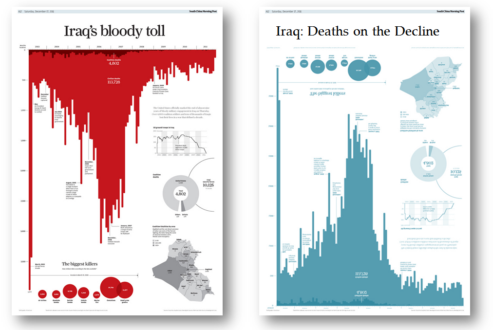
Conside these charts. They have completely different messages and yet the only difference is the title, the colour and the orientation of the bars.

Watch the video below for an explanation, or go check out my slides from an older presentation, “Drive the message home with the right dashboard“. I also make this point in my Brinton talks, as he also covered this point.

2 Comments
Add Yours →[…] Source: https://gravyanecdote.com/uncategorized/should-you-trust-a-data-visualisation […]
[…] A. Cotgreave, Iraq’s Bloody Toll: control your message with title, colour and orientation (2014), […]