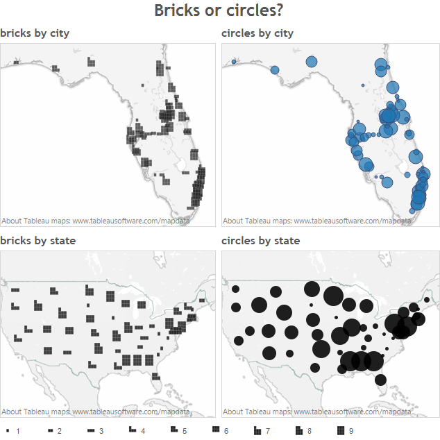
Stephen Few’s latest newsletter outlines an innovative way of displaying quantitative data geospatially: bricks. Go read the article, it’s really interesting. What do I think of bricks? Well, I implemented some bricks in Tableau.
To do this, I created some custom shapes. In Tableau it would be very difficult to implement shapes in the complete way suggested by Stephen – it would be very hard to deal with outliers in the way he suggests. However, this is a starting point and you can download my workbook here.
What do I think of bricks?
Appropriate only for “known” geospatial dimensions
They might only be appropriate where the geospatial dimension is already familiar. Using bricks on US States is effective because we already know which state is where. However, using bricks when the location is less familiar will not be as effective. When we use circles, we instinctively understand that the centre of the circle represents the exact location of the mark. But where’s the centre of the brick? Is it the centre of the 9-mark grid, or the brick itself?
Occlusion is a big problem
Look at Florida above. In the circles chart. there are lots of overlapping circles but I can still get a very good idea of the size of each city. With the bricks, however, the picture is extremely confused.
Is the problem significant enough that it warrants a new type of display?
I’ve said before that every visualisation is a compromise: the purpose in visualising data is to reveal patterns. Details should be available on demand. Also, the circle is a comfortable metaphor for the majority of people. Bricks will require training, or clear instructions, to understand them. This is fine if you are in, say, a closed corporate environment, where you can reach everyone, but not good if you are publishing on the web to a wide audience. This is related to what psychologists call schema and is why it is sometimes preferable to use pie charts rather than, say, stacked bars: familiarity means people will engage more quickly.


6 Comments
Add Yours →Very interesting thoughts Andy. Where circles cluster on maps, I finding using transparency in Tableau to do the trick as depth of colour shows the increased intensity (without the dark border as this confuses I believe). Does this work for bricks? I’m not sure, due to not knowing where the middle of the brick is; as you highlight. It just appears like a game of Tetris gone wrong to me. Congrats on the new blog by the way!
Two things concern me about the bricks. One you have mentioned and that is the occlusion. the second is the number of bricks needed to make a square. Breaking something into 9ths is pretty un-intuitive in a decimal world…..
[…] problem arises when bricks overlap, as demonstrated by Andy Cotgreave, from Tableau, and acknowledged by Stephen […]
[…] latest newsletter he proposed a new method for displaying geospatial data. Not long after, based on feedback from Andy Cotgreave and others, he expressed his disappointment with breadth of applications for which the technique […]
[…] problem arises when bricks overlap, as demonstrated by Andy Cotgreave, from Tableau, and acknowledged by Stephen […]
[…] problem arises when bricks overlap, as demonstrated by Andy Cotgreave, from Tableau, and acknowledged by Stephen […]