Two weeks ago, I checked off one of my long-standing bucket list items.

Ever since discovering the wonderful history of data visualization, I have wanted to see the only known surviving “Carte Chronographique”, created by Jacques Barbeu DuBourg in 1753. This “machine” contains an 18 metre chart depicting the entire 4000 yr (biblical) history of the world. It is the first example of someone putting a continuous, uniform, unbroken time scale on an x-axis.
This is hugely profound. The next time you build a chart like the one below, think about DuBourg. He was the first person to use time on an x-axis in this way.
A copy is in Princeton’s special collections library, and I got to see this wonderful piece with Steve Wexler (a Princeton Alum) and RJ Andrews (Info We Trust). We got to see much more than just DuBourg’s piece, but I’ll come on to that later.
This photo essay shares some of the highlights and discoveries.
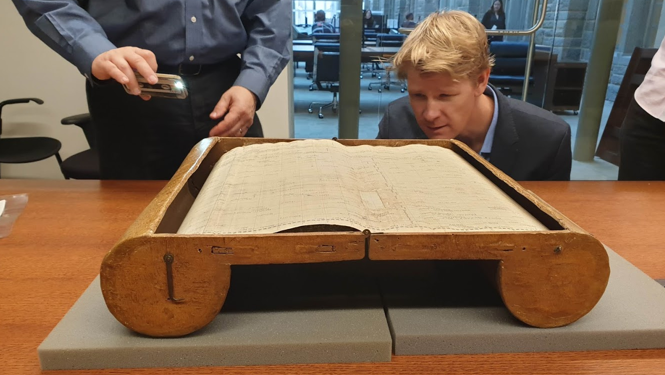
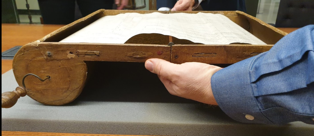
First off: it’s way bigger than I’d ever have imagine. I’d assumed it would be like a large book. But no: the item is large, and bulky.

It’s wood, carefully bent to house the chart, and sealed around the edges. It’s also unwieldy. Below is Eric, the librarian, wrestling with the machine to open it (in case you’re wondering, it’s far too fragile for us to be allowed to open it!)
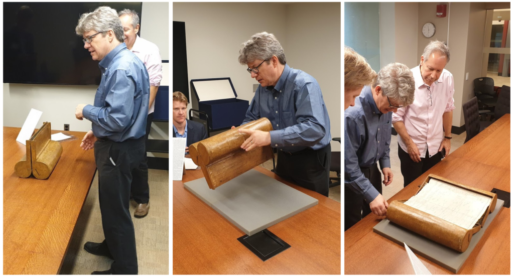
Once opened, a hidden clip flattens out the surface to make a nice viewing platform:
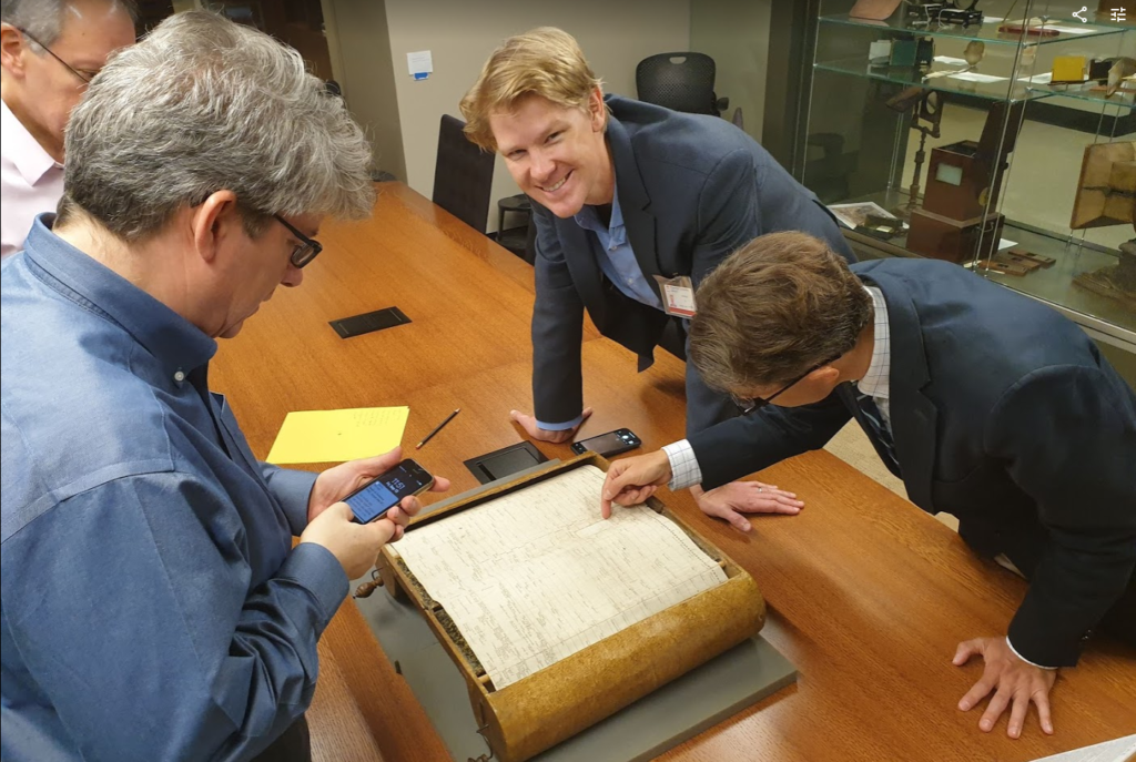
And, boy oh boy, at this moment, I was blown away. In the flesh, this item is exquisite. The resolution of the printing is extraordinary. The detail is wonderful. Steve, RJ and I were like kids in a sweet shop! Here’s RJ grinning uncontrollably:
The Carte has a 4000 year timespan on its x-axis (ie the entirety of Earth’s existence, according to the beliefs of the day). Approximately 100 years are visible at any given time. Unfortunately, the scrolling mechanism is not currently working properly, so we were only able to move left and right through time for about 200 years.
The resolution is so high. As a recap, the chart shows the births and deaths of people of note, along with notable events. Dotted drop lines stretch from everyone’s name up to the x-axis:
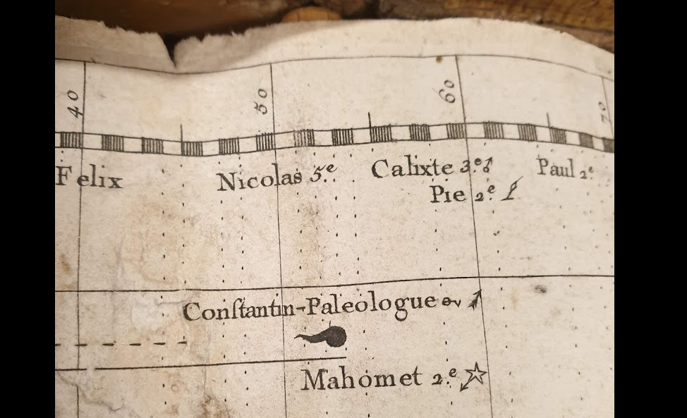
Dubourg had a super solution for categorising each person. He used symbols to denote the type of person/event he was showing. Above, the globe with a flame symbol is “Ruine”, which meant the end of a Royal line. Mahomet is annotated by a star with an arrow: a Conqueror.
These shape encodings are a joy to look at. Today, we don’t bat an eyelid when we grab an icon from the Noun Project, but take a moment to look at these: each was hand-engraved onto a plate.
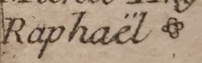
Raphael: a painter, symbolised by a rose:
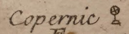
…Copernicus, the astronomer, symbolised by a globe:
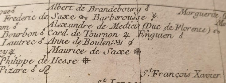
… and finally, Queens Mary and Elizabeth:

Elizabeth’s emoji-star represents someone “grand”. Notice how Mary and Elizabeth both have a 3-dot symbol next to them: Dubourg used this symbol to annotate women in the chart. Three dots were the 18th century annotation for oil, and oil is associated with fertility. Hence Dubourg’s reasoning behind choosing this symbol for women.
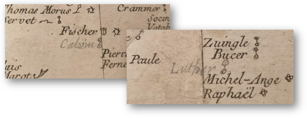
This copy of the Carte was hand-annotated to show missing people. We don’t know why Dubourg didn’t include Luther and Calvin, but somebody added them later:
Seeing this one dataviz was a great moment. It was a privilege to visit Princeton to see it. At this point, though, I said to Eric and Gabriel, our hosts, “Do you, by any chance, happen to have a copy of Priestley’s charts?”
Joseph Priestley created two other hugely influential charts, inspired by Dubourg, in 1765. His charts are also on my bucket list. We hadn’t come to the library to see those, but since we were here, why not ask.
“Sure we do. Which edition would you like to see?” replied Gabriel.
“WHAT? You have multiple editions. Any of them? All of them?”
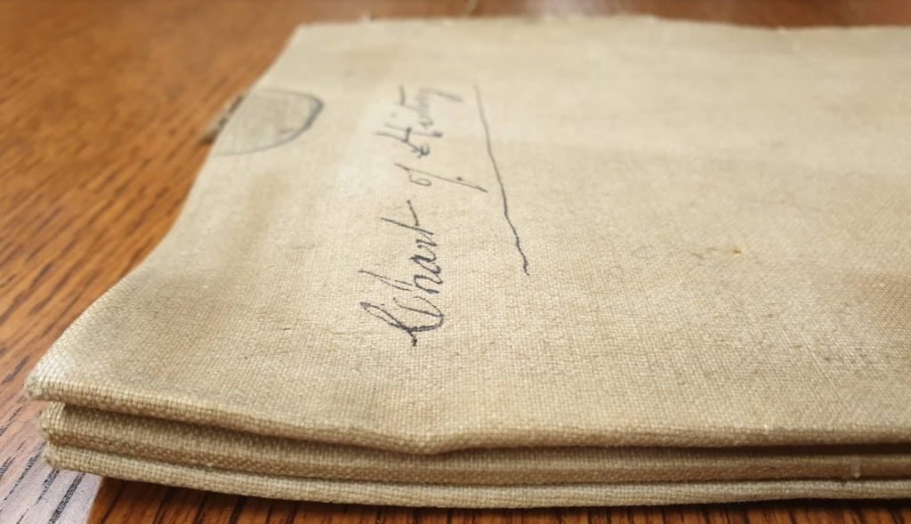
Within minutes a folded copy of the Chart of History was on the table. I’ll write about that in my next post. Suffice to say that the visit to Princeton was now exceeding any expectation I could have possibly had.
If you want to know more about duBourg’s chart, Stephen Ferguson’s incredible essay is worth your attention. For a briefer overview, Chronographics did a great blog post.
And to find out about Priestley, you’ll have to wait for my next post! Check out part 2 and part 3 in this series.


3 Comments
Add Yours →[…] the first instances of expressing time along an x-axis in an unbroken, uniformly scaled manner. His Chronographie timeline is over 50 feet long and housed in a special scroll box. We take timelines as so natural […]
[…] See also how fellow dataviz afficionados RJ Andrews and Andy Cotgreave have documented their real li…. […]
[…] the first instances of expressing time along an x-axis in an unbroken, uniformly scaled manner. His Chronographie timeline is over 50 feet long and housed in a special scroll box. We take timelines as so natural […]