[Updated for Tableau Conference Europe 2018]
I’m delighted to present “New Ways to Visualize Time at TC Europe in London. The content is based on one of the chapters in my book, The Big Book of Dashboards.
This post contains links to all the resources shared in the session.
The trend line is amazing. It shows peaks and troughs and trends. But if you only ever use trendlines to show time, you are missing insights in your data. What’s the best way to show time in visualisation? I cannot answer that: it depends on your data, the story you want to tell, your audience, and many other things.
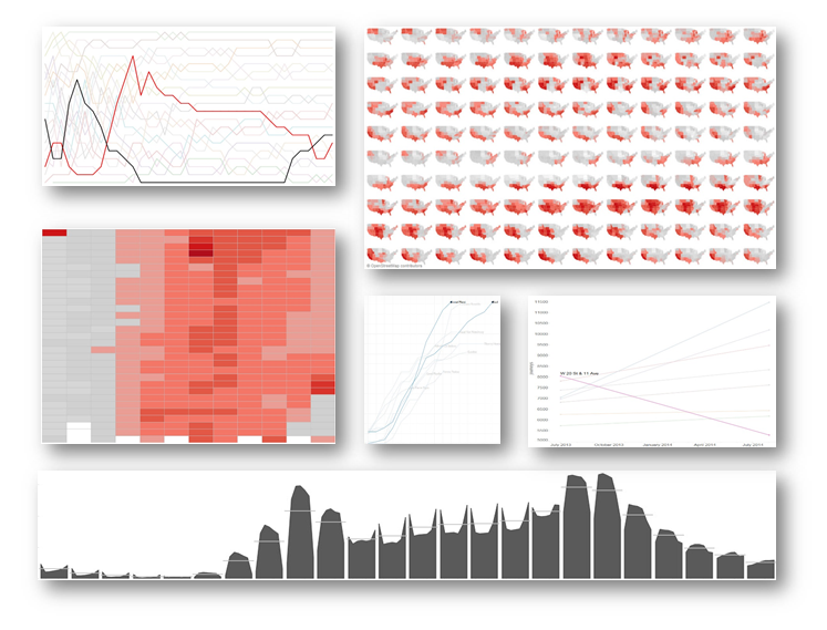 Which way is time?
Time can go up and down as well as left and right. Generally in the West we point forwards or to the right, but that’s not the only way. Check out these:
- For further reading on how time is considered in culture and in data, check out this wonderful article, History on the Line, by Stephen Boyd Davies.
- Some dataviz goes in unusual directions:
- The Nasdaq viewer by WSJ goes forwards
- XKCD Global Temperature goes downwards
- Mike Cisneros’ Oil v Gold is an excellent Tableau example of vertical time
A history of the trend line
We forget (or don’t know) that even the most common chart types were once ideas waiting to be thought of. Even though we build them every day, timelines were invented. Here are the milestones I highlight in my talk
- 1493: People have been making chronological charts for centuries. I love the examples from Hartmann Schendel’s Nuremberg Chronicle, published in this year
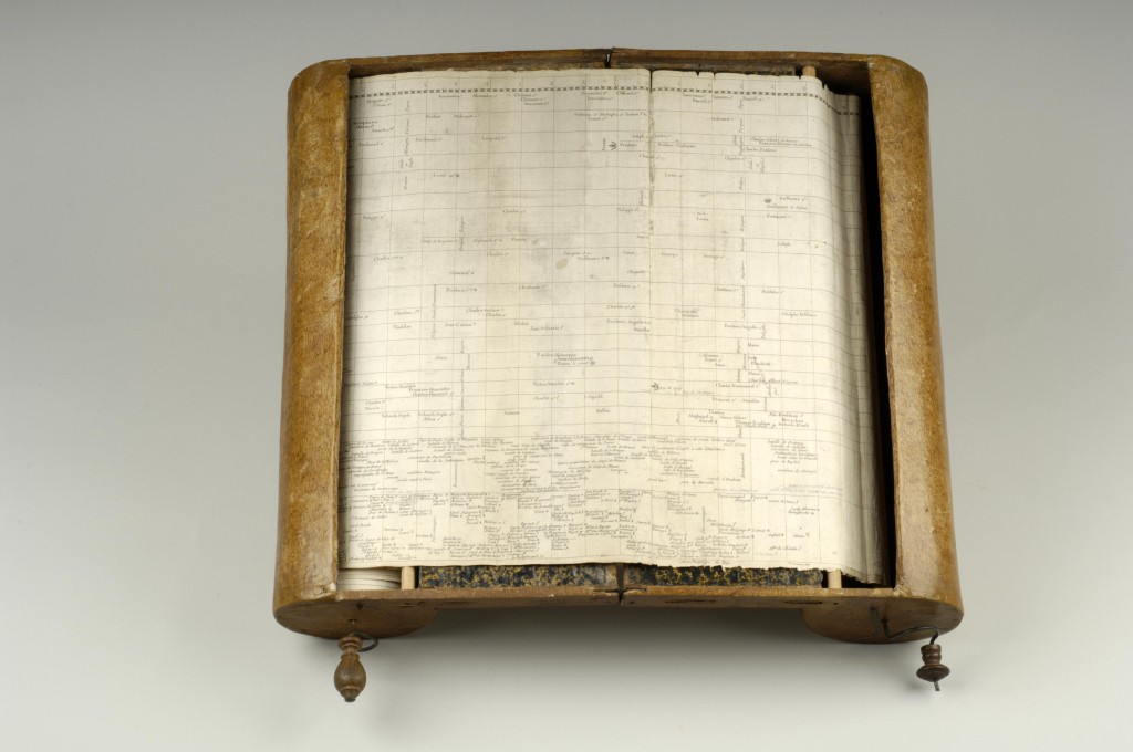
- 1753: Jacques Barbeu Dubourg makes a chart with a fixed x-axis. Unfortunately, his chart is 54ft long! He invents a really cool scroller to deal with this problem
- 1765: Joseph Priestley published the ground-breaking Chart of Biography.
- 1776: William Playfair makes the statistical line chart.
For more reading, I cannot recommend Cartographies of Time highly enough. It is an amazing book about the history of the timeline.
I also love this fascinating article about time as a dimension in which we find the quote “the mapping of time has made only modest intellectual progress since it was invented 250 years ago.”
6 new ways to visualize time
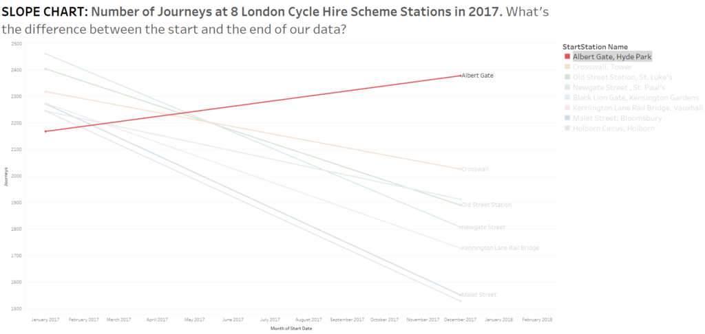
Slope chart
- How to make a slope chart (ad-hoc and dynamic) in Tableau
- Andy Kirk and Cole Nussbaumer have both written in depth about slope charts.
Cycle plots

- Stephen Few has a great paper on them: “An introduction to cycle plots”
- I wrote a blog post about cycle plots in Tableau.
- I also looked at the multi-line version in detail.
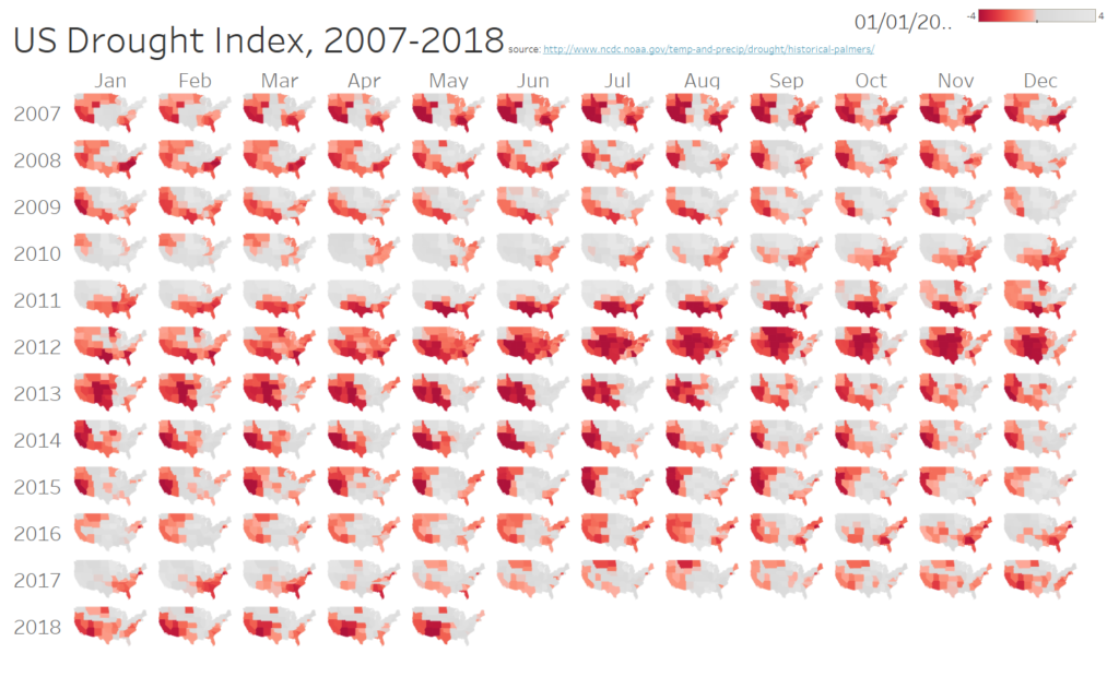
Highlight tables and small multiples
- Here’s a great example from Andy Kriebel
- There are some good tutorials on highlight tables (for example from Interworks and The Information Lab). Just use Time dimensions for the Rows and Column shelves.
- Incorporating maps is not hard. Check out Ben Jones’ examples.
Index chart
- Look at the “Common Baseline” example on this page about table calculations.
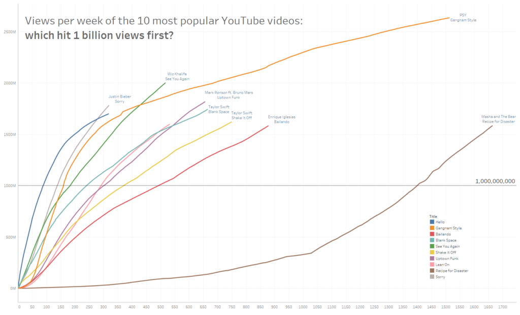
- Jeff Shaffer’s Billionaires on YouTube example is great.
Bump Chart
Other resources
- One of the examples I used is based on US Road Fatalities data. I used that data to create a dashboard that was comeprehensively described and deconstructed in my “Design Month” series of posts in 2014.
- I wrote about a similar topic for the Huffington Post, “New ways to see time.” It has some other examples.




7 Comments
Add Yours →Hi Andy
This was one of my favourite sessions of the whole conference. It gave me a ton of ideas to take back to my user community. I’ve socialised this post internally.
Thanks again,
@paulbanoub
vizninja.com
Hi Andy,
Attended your session on this topic during Tableau Conference & absolutely loved it! At one point you discussed “hockey-stick” graphs – I am trying to find documentation on creating them but have had no luck 🙁 Any tips on this?
In gratitude,
Veronica
HI Veronica and Paul
Thanks for the reply and kind words, I’m glad you enjoyed the session!
The “hockey stick” chart is referred to as common baseline in the post, the link is here: http://www.tableau.com/table-calculations
Look for the “Common baseline” chart using Toy Story revenue data.
Good luck!
Andy
You have the “stand per etappe” bump chart under the wrong heading.
I’m thinking this will be useful for quantified self work
Hey Andy,
I did not attend the conference, but (like I’ve also stated via Twitter, I) enjoyed the replay tremendously — #THANKYOU so much for the many good thought provocations!
Hi Andy,
I am a newbie to the Tableau world (6 weeks in) and I LOVED your session on visualising time. What a brilliant way to show insight! Thank you!
Thanks Erin! I’, glad you enjoyed the session, it’s been one of my favourites to deliver. Good luck with your Tableau journey!