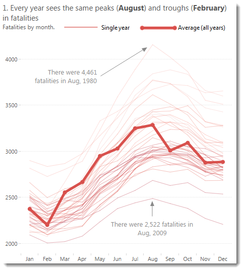
This month I am focussing on design decisions made on my VizWhiz dashboard. In this post, I’m going to talk about the designing time series line charts to focus on seasonality.
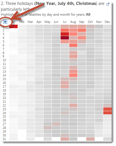
Note: there are other ways to show seasonality, such as the highlight table in the centre of the my dashboard. Andy Kriebel has done the best post about this approach using Tableau; I recommend you read that post.
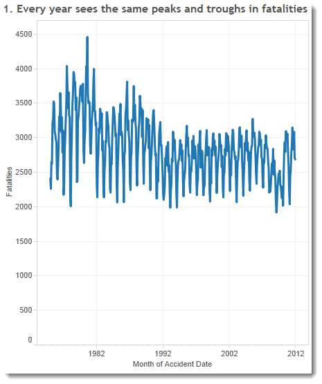
Back to my chart. Here’s the default:
In order to emphasise the seasonality, I made 7 decisions, each of which is explained below.
- Draw one line for each year
- Use moving average
- Add an Average reference line
- Use a gradient colour for a subtle indication of years
- Add annotations for clarity
- Create a custom legend
- Add dots
1. Draw one line for each year
I have written about seasonality before (click here). In this case I wanted Months on the x-axis with a line for each year. That’s very simple to do – just move the dimensions into the correct place:
![[Month] on Columns, [Year] on Mark shelf](https://gravyanecdote.com/wp-content/uploads/2014/11/basic-seasonality.png)
2. Use moving average
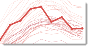
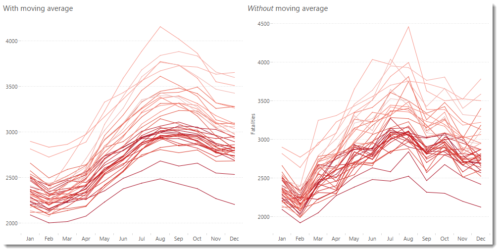
The peaks and troughs are a little bumpy. To smooth out the experience for the end user, I used a moving average. You can see the differences below. The left hand side is easier on the eye and thus the story is easier to digest.
I don’t state anywhere on the view that I am using a moving average: I acknowledge that my view is slightly misleading. The tooltip, however, shows the actual value, not the moving average.
3. Add an Average reference line
The average reference line adds more context to the view. In this single view, you can see each individual year and also get the overall picture of fatalities during each month.
This is documented in a separate post as it’s quite complex.
4. Use a gradient colour for a subtle indication of years
There are too many colours in the chart above. You could put [Year] on the Detail shelf to have just one colour:
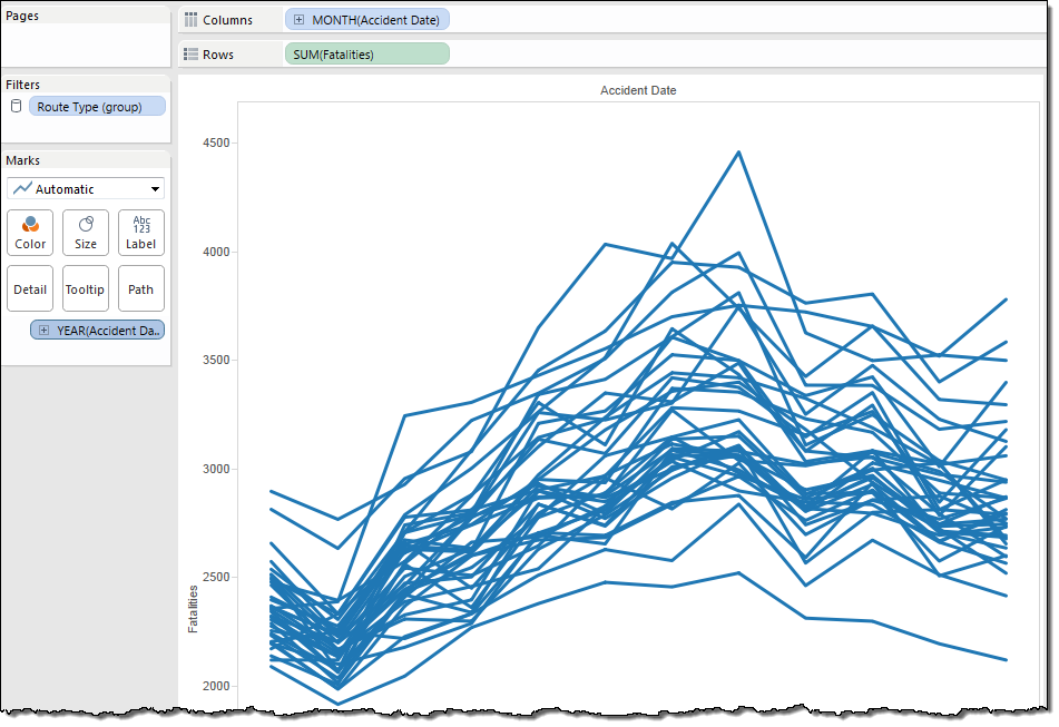
This is ok but it’s hard to see any change between years. I chose to add a subtle colour palette. This indicates there’s a difference between each line but one that’s subtle.
To show the changes I:
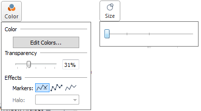
- Put Year on the colour shelf and chose a red palette
- Reduced the size and increased the transparency:
5. Add annotations for clarity
Now that I have a line for every year and for the average fatalities for each month, I needed to clarify things a little. I annotated values in the upper and lower area of the chart. These provide context for the user.
6. Create a custom legend

Tableau won’t create a legend to show that the thin lines are single years and the thick line is an average reference line. I created that in Powerpoint (hat tip to Mark Jackson) and floated the image on the dashboard.
7. Add dots

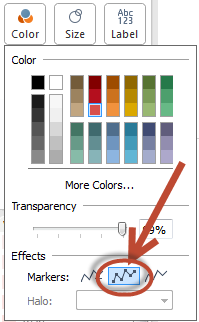
The final piece was to put dots on the average line. This gives an extra indication that the average line isn’t the same as the fine lines.
I’ve always liked this little feature. It emphasises the marks for the average line, allowing the individual years to further blend into the background.
Conclusion
A time series focussing on seasonality
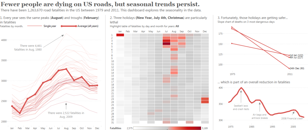
My end result? A chart, I hope, emphasises not only the seasonality of fatalities in the US, but also gives us a better sense of the data by showing individual years, too.
What do you think? Were my design decisions appropriate?
The full dashboard is available by clicking on the image below:



3 Comments
Add Yours →I’m really enjoying this series, Andy. It definitely emphasizes the impact a multitude of small design choices can have on the overall impact of a viz. Over time these choice become second nature, and the default quality of your visualizations improve as a result, but it is a valuable bit of discipline to think through these types of choices and understand why they result in a clearer communication of the underlying data story.
I’ve forwarded this thread to many of my colleagues at work.
Thanks again.
-Mike
Thanks Michael – glad you’re enjoying the posts. There’s 14 in total!
Thank you for the excellent guide. Your choice of displaying the seasonality in this fashion was visually appropriate and very effective!
Plus, the custom legend using PowerPoint never crossed my mind until I saw your post. Note to self!