I went to see David McCandless speak at a #GuardianLive event tonight: he’s promoting his new book, Knowledge is Beautiful. In the past I have been critical of him: I’ve parodied his style, critiqued his work at meetups and madeover his vizzes.
It might come as a surprise then that I thought his talk was entertaining, inspiring, well-structured, well-meant and funny. I agreed with virtually everything he said.
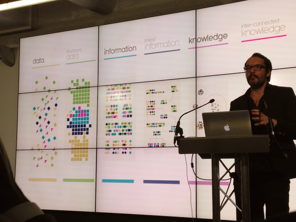
I was very impressed with his new model for the pursuit of data-led knowledge. Raw data are the atoms. They become structured data (molecules) which become linked information (chromosomes). And so on to inter-connected knowledge (organisms). David applied this model to the field of climate science and it fits. It’s a model I could use when talking to companies and journalists.
When talking about his motivation, it’s the same we all feel: all he wants to do is tell engaging stories with data and design.
What powers the sudden legalisation of cannabis in the US? Clue: it’s green. http://t.co/2ACOeV7J81 pic.twitter.com/vOKyqJZdyq — Info=Beautiful (@infobeautiful) November 5, 2014
McCandless focused on how he got into being a graphiste: accidentally. He was a programmer, then a journalist, then in advertising, and finally it all came together as a visual designer. This resonates with me. I never planned to get into dataviz, but my history as budding comic artist (I was young!), geographer, journalist, software engineer and database admin gave me the tools that, when data viz turned up, were all I needed to pursue a passion.
He’s also modest, funny and engaging as a speaker. He doesn’t preach his thoughts, he shares them. He doesn’t say his way is the right way, he just explains the way he does it and what happens when he does. His ultimate advice is to just get out and play with the data.
What then, are the criticisms? These days I measure a visualisation against Alberto Cairo‘s 5 values of visualisation:
Values of visualization: 1. Truthful, 2. Functional, 3. Beauty, 4. Insightful, 5: Enlightening @albertocairo #tapestryconf
— Priya Kumar (@DearPriya) February 26, 2014
Beauty? Yes. Insight? Yes. Enlightenment? Yes.
Truthful? Mostly. If you’ve ever seen Tim Harford dismantle Debtris (“Misinformation can be beautiful too“) you’ll know how hard it is to compare different numbers.
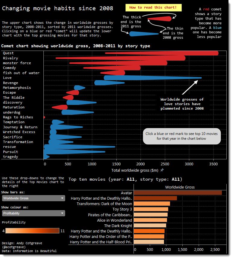
Functional? This has always been the most contentious for those of us who first learnt our craft from people like Stephen Few (who also has harsh words to say on the topic). McCandless’ charts are not designed to best align to visual perception. In so many cases, boring bar charts would be better if the aim is to aid fast comparison of values.
What I realized tonight is that there’s a problem trying to critique McCandless. I suspect his response to any criticism would be “Yes, you’re right. I’m just trying to communicate a story and somehow people seem to like the way I do it. I’m not saying I’m right. I’m not saying I’m the best. I just do it my way.”
As for truthfulness, he’d probably agree and say: “Every single data source is linked to on my site. I may not be wholly accurate but I am open with where I get my data.”
I do believe he needs some more practical advice for people who look to him not just for inspiration but for practical ideas of how to get started. Currently he makes it sound harder than I believe it is.
Where does that leave me? I used to be a disciple of the Stephen Few world, but am no longer so zealous. Data visualization needn’t be polarizing and McCandless’ motivation and humility earns my fullest respect.
Knowledge is Beautiful US ed. out! http://t.co/Bn2cKpOB8N Each click supports a certain nonprofit #dataviz outlet… pic.twitter.com/Wfe7DC6wen
— David McCandless (@mccandelish) October 22, 2014


1 Comment
Add Yours →I’m loathe to add my voice to this topic because I am by no means an expert in data visualization. My background is language interpretation and it’s the topic with which I’m most familiar. I, too, feel the cognitive dissonance this discussion provides and like you, Andy, I end up somewhere in the middle.
Within interpreting, these discussions happened as well. A number of sides pulled on the figurative blanket until it ripped and we were left cold. It made us think and unify towards a greater purpose, one agreed upon by all stakeholders, that was cemented in a neutral governing body. In short, we made a combined authority where all voices could take the floor, regardless of background, belief, or goals. Were there missteps? Absolutely! But, the profession itself grew stronger and I believe that this conversation will be the catalyst.
Thank you as always for your take.