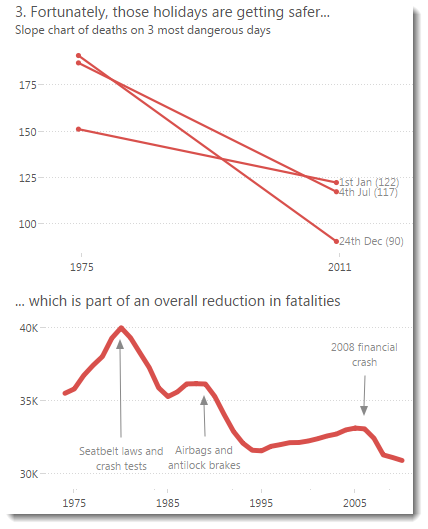
When you design a chart, just how many borders and lines can you remove to maintain clarity? Do you improve clarity by removal?
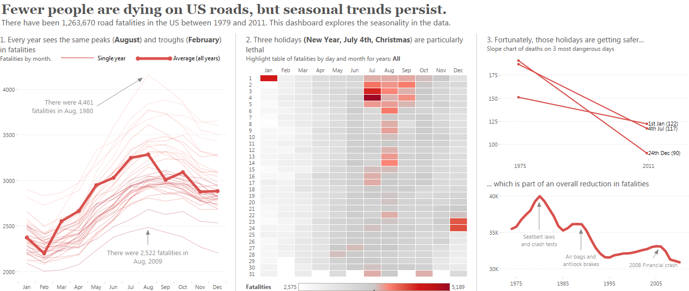
Could I have gone any further? Sometimes I will hide the y-axis completely and just label the max value but I think that’s pushing it a little too far:
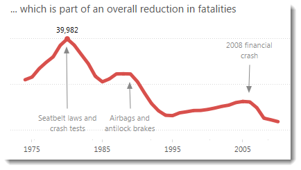
That’s what we’ll look at in this post. I’ll cover axis ranges and tick marks separately. In this post, I’m going to focus on what’s available from the formatting pane.
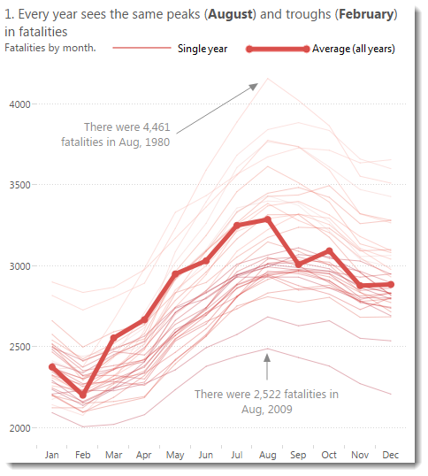
In the image above, you can see that my formatting approach is to reduce the lines as far as possible while retaining the meaning. Did I go too far? I think I got it about right.
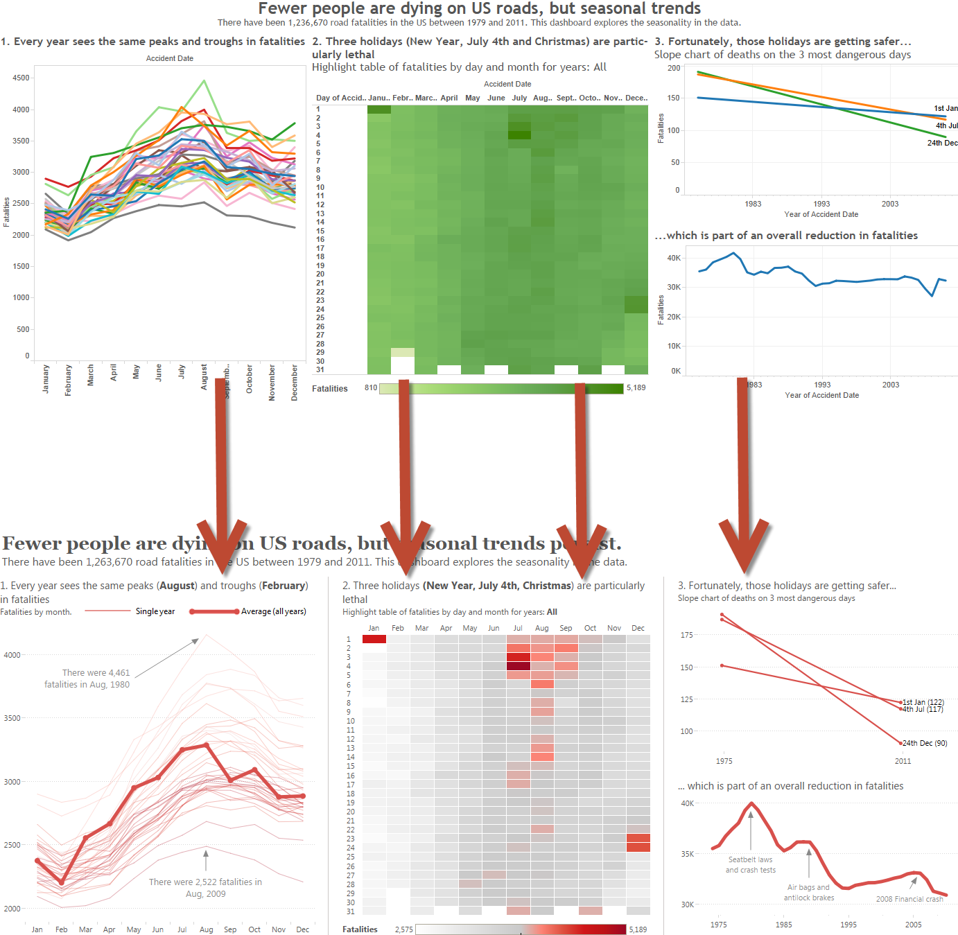
Let’s look at how my end result compares with the defaults: 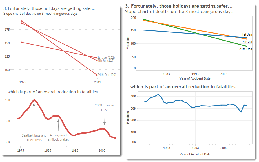
Default formats on the right, extreme reduction on the left. There’s nothing wrong with the defaults – the gridlines and borders are very sensible choices for a default setting. I do think I have emphasised the data more by reducing the lines.
Here’s how you can reduce the borders and grid lines in Tableau:
Borders
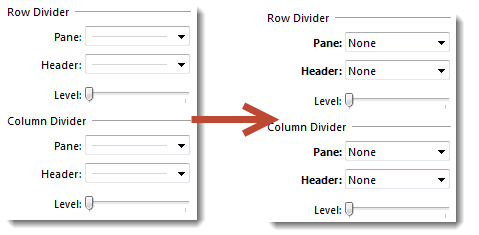
Remove all of the outer borders by selecting Format…Borders from the menu and then turning off all dividers at the sheet level:
Grid lines
I owe a hat-tip to Nelson Davis (@nelsondavis) for suggesting that it’s great to show only the horizontal grid lines in a view.
To achieve the effect, just go to the Format…Lines pane and set the Columns Grid Lines to None:

Conclusion
I like the end result, it’s very crisp. One bonus is that because there’s no border at the bottom, it makes it less likely someone will think the y-axes start at zero.
You can see and download the full Fatalities dashboard here.


2 Comments
Add Yours →[…] cuadrícula de Excel se ve muy fea, según casi cualquier diseñador y persona con buen gusto a la que le preguntes. La cuadrícula es útil cuando estamos diseñando un […]
[…] cuadrícula de Excel se ve muy fea, según casi cualquier diseñador y persona con buen gusto a la que le preguntes. La cuadrícula es útil cuando estamos diseñando un […]