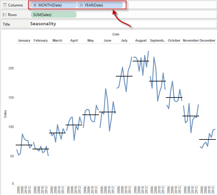
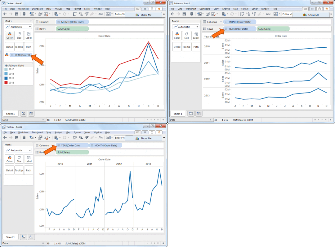
Over on Perceptual Edge, one of the best resources on the web for functional data visualisation, Bryan Pierce posted a nice template to help you create cycle plots in Excel. That inspired me to make a short video of how to create cycle plots in Tableau, and also show a couple of other ways you can quickly look for seasonality in your data.
The end results in Excel look great, but the big downside is that they require you to considerably reshape your data before you can create the chart. In Tableau, there is no need to do that, as it’s automatic date hierarchies make it easy.
Creating the cycle plot is as easy as switching around the Year and Month pills on the column shelf as shown in the image below. I have also added a reference line for each month.


3 Comments
Add Yours →[…] Seasonality and cycle plots | Gravy Anecdote […]
[…] Seasonality and cycle plots | Gravy Anecdote […]
[…] https://gravyanecdote.com/uncategorized/seasonality-and-cycle-plots/ […]