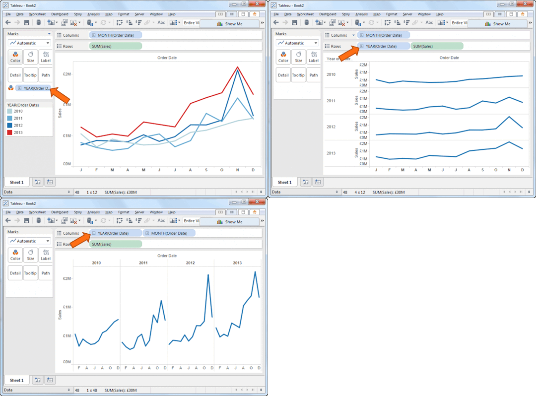
How do you compare different periods or different categories in 2015? Simple – you move your data around and explore it. The GIF below shows various ways of seeing seasonality.

Back in 1914, Brinton recognised this too. But how could you implement it?
Index Cards! They can go side-by-side or one atop the other:
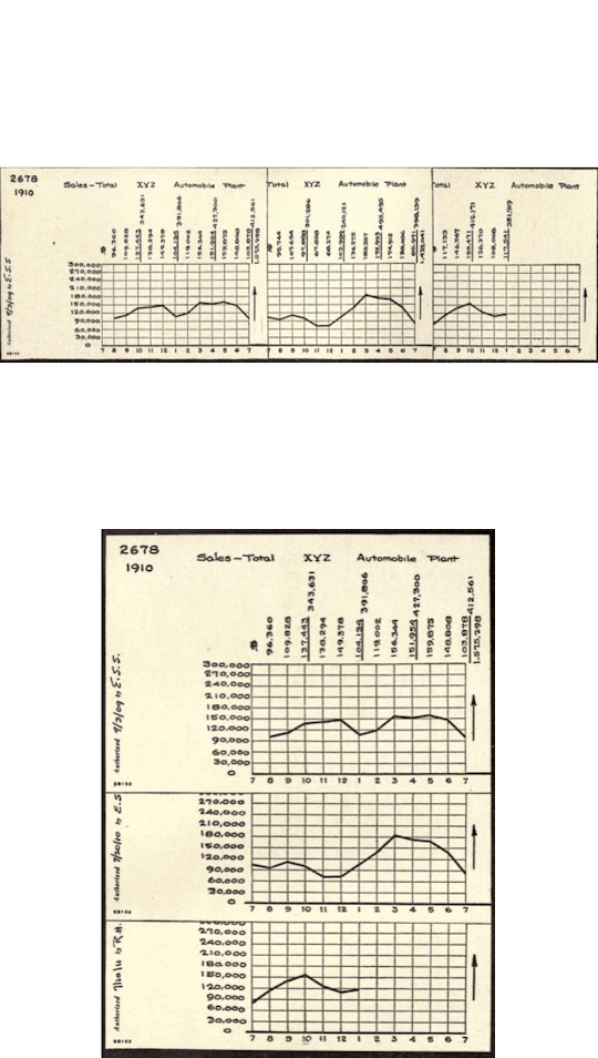
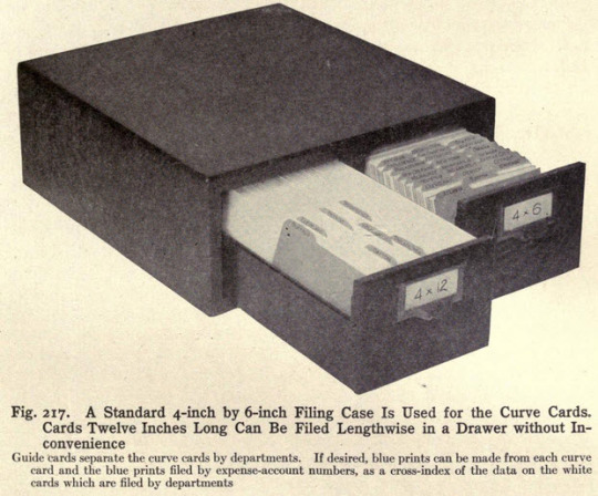
And don’t worry, Brinton has a whole chapter on how to implement, store, maintain and secure this system. Fret not, “it is work any man of even ordinary caliber can do”


Recent Comments