How had analytics developed in the years up to 1914?
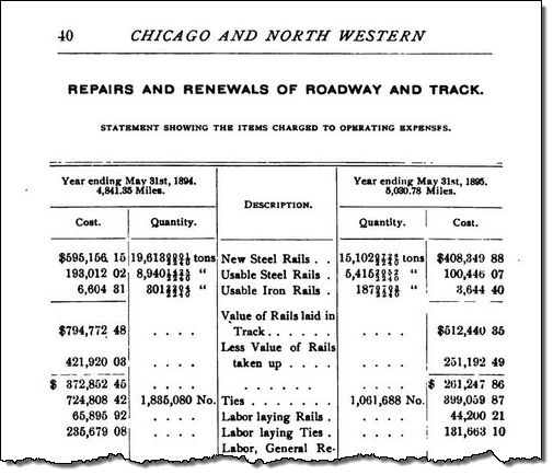
The railroad companies in the US were some of the first to tabulate data in annual reports

Prior to this, the figures tended to appear in the paragraphs themselves. This was deemed impractical as it was hard to interpret the numbers:
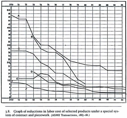
By the end of the 19th century, people were progressing to charting. The chart below is claimed to be the first chart used in managerial reports. It’s from the mid 1880s:
Sources for this post: Control Through Communication, JoAnne Yeates

Recent Comments