Colour in data visualisation: apparently easy but filled with pitfalls. There are volumes of posts about colour on the web. I’ve written about it before when discussing the Iraq’s Bloody Toll chart. And here’s a recent post about exploring and choosing potential palettes.
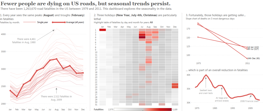
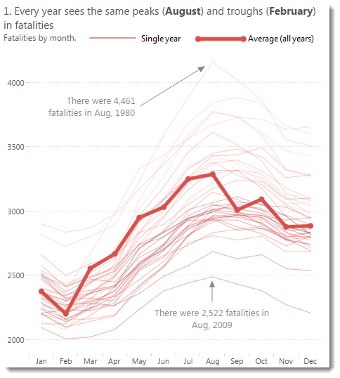
For this post, one of a series supporting Tableau Design Month, I’ll explain the colour choices made in design the dashboard above. There are three points I will highlight in this post:
- Simplify the colour scheme as much as you can
- Choose a colour that relates to your topic
- Soften the darker tones
Simplify the colour scheme
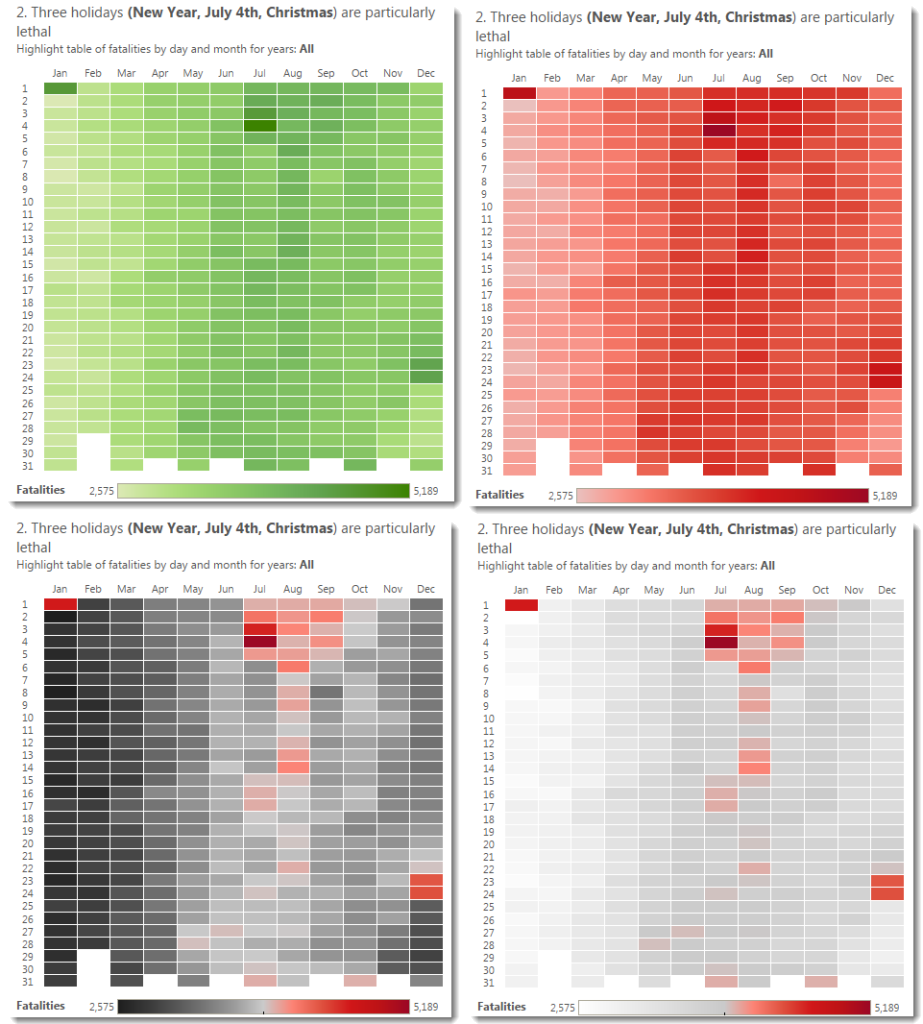
Let’s see what Tableau’s default colour scheme would have been:
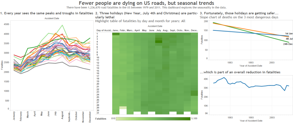
Tableau, or any visualisation tool, cannot know what the purpose of your vizualisation is. Therefore its choices should be appropriate to the chart being built. But in the above, the end result is overwhelming. There are colours everywhere.
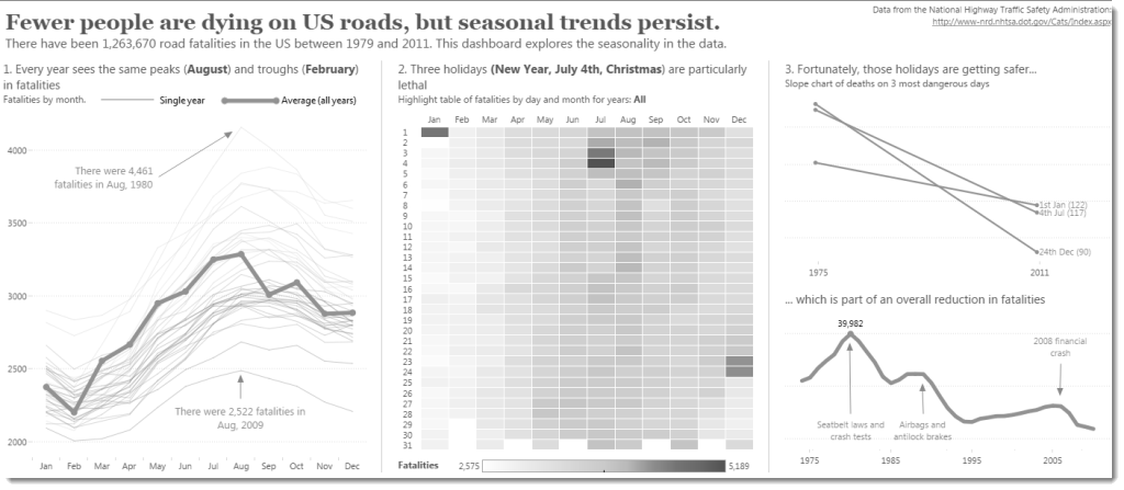
It turns out that using just 2 colours: red and grey, you can tell the exact same story more clearly. You can even test your dashboard by trying it in greyscale: is the story still visible in the version below:
Choose a colour that represents your topic
I chose red to evoke the emotional aspect of this dataset. Red is powerful and emphasises the reality of fatalities. What if I’d have chosen a different colour? Blue, for example:
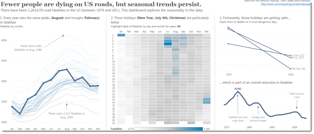
In this case the dashboard is much more neutral. It’s less provocative. It’s less opinionated.
Your colour choice should depend on your audience and your goal.
Soften the darker tones
You can choose palettes to emphasise just the parts of the data you want to. Tableau defaults to a perfectly serviceable green gradient palette.
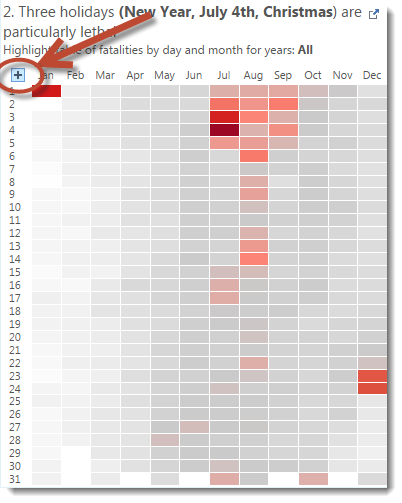
My goal was to make the 3 most lethal seasons (Jan 1, Jul 4, Dec 25) pop out. A simple red palette didn’t do it so I tried red-black, but the black was too prominent. I settled on a red-white diverging as this really popped the days I wanted to focus on. All my choices can be seen below:
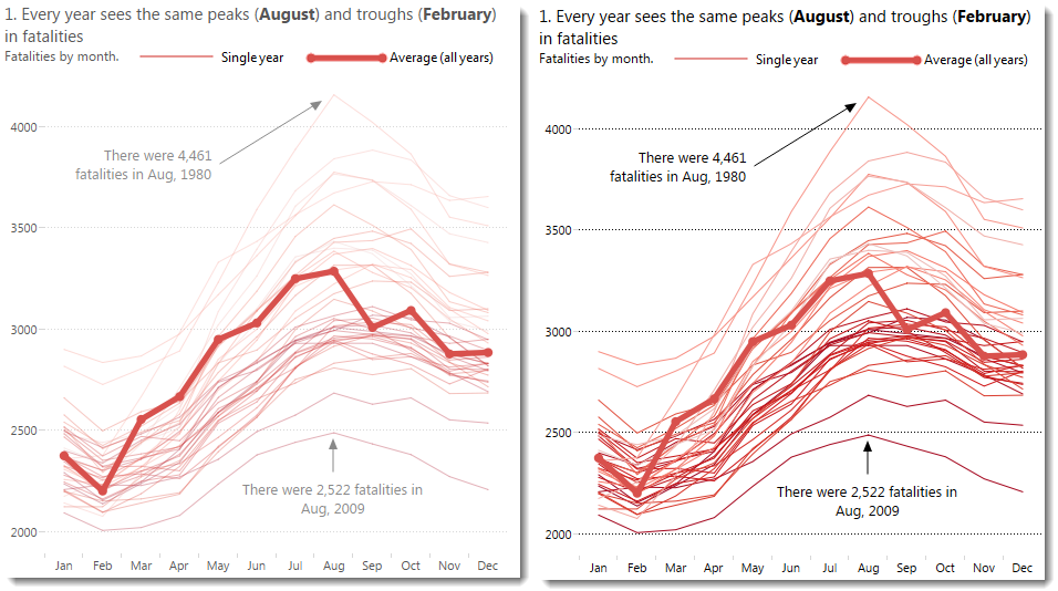
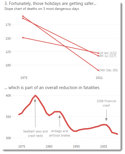
I went a lot further in this dashboard to soften the dark tones. For example, all the fonts are softened from black to a lighter grey. As I write this post, I’m unsure now whether that was a successful choice. Check out the image below. Which do you think is more successful – the dark font or the light font?
Conclusion
Colour isn’t easy. In this post I’ve covered just 3 choices. You also need to consider cultural implications, colour-blidness, publication type, and much much more. As always, I am very interested in your thoughts – let me know in the comments.

4 Comments
Add Yours →There is a potential problem with using soft colour tones in that for a lot of vizzes when you select an item the rest of the viz can greyed out. So, if you use muted tones it can look like the viz is in a selected state. So its a careful balance between muting down the colours and not making it look like some interaction has already happened.
Great series of posts that really highlights how a few very simple decisions can make a massive difference to the overall look and feel, without it being too showy.
Nice piece on handling color with intention. I like the lighter option for the text because it helps the legend stand out. The heading for graph 1 is misleading, though. The heat map makes it clear that February is really not the minimum; it just has fewer days.
Hi Annette – you know, I didn’t account for February being shorter. That’s some oversight. I will go back and normalise for days in month at some stage…
The darker text is more confronting, which matches the content, but on a practical note is also better suited for presenting on a projector.