I don’t consider this an encyclopedic post. Instead, I want to cover the text-based choices in the dashboard I’ve been dissecting as part of Tableau Design Month. This is 14th of 15 posts in the series.
Titles: the unsung hero of your visualization
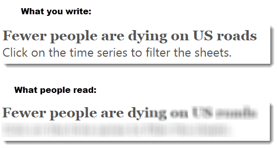
You are fighting for viewers’ attention with any visualization you produce. One of the few things you can guarantee they will look at and process is the main title. Therefore you better be 100% sure this is both:
- Enticing
- Relevant
- Explains the chart or asks a question
Your title is your one chance to grab the reader and convince them it is worth focusing on. This is not a new lesson: Willard Brinton was talking about this 100 years ago:
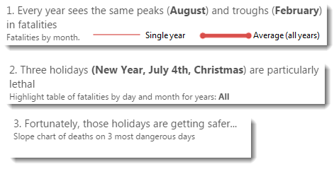
Subtitles are just as important. Consider the titles on each view:

- I’ve numbered them. This helps guide the user through the view. Sure, the left-to-right nature determines the flow but numbering the titles helps.
- I bolded the pertinent data-related facts. I’m using the title to communicate the data itself.
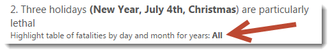
- I’ve also added contextual text. Notice the “All” in the second view title. If you filter down to a single year in the highlight table (you can do this in the interactive version), “All” changes to the relevant year:
 To learn how to make dynamic titles in Tableau, click here to see a post on The Information Lab’s blog.
Annotate marks to add context
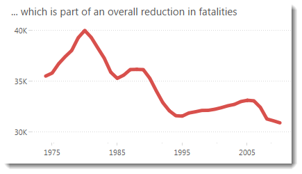
Imagine I’d left the annotations off the charts. You can see the effect above. What are you left with? A chart with a really interesting trend that gives no clues as to what causes it. The viewer is left with their interest piqued but with no answer. This is a serious failure. Adding the annotations answers those initial questions.
My first iterations of this dashboard did not have any annotations. It was only when I got feedback from people that they pointed out the problem. That’s the importance of getting feedback!
Below is the annotated time series: it’s much more useful:
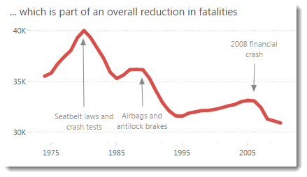
My final word on these annotations – I deliberately aligned the annotation arrows to be vertical to give them consistency
Tooltips – ALWAYS be customizing your tooltips
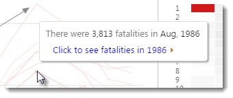
Followers of this blog will not be surprised that all the tooltips are customized. If you want to know more about the importance of tooltips, and techniques to use them in Tableau, check out this series of posts. Summary: ALWAYS customise your tooltips; it is the easiest way to improve your dashboard.
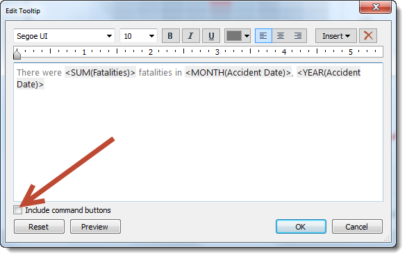
Finally, don’t forget to turn off the command buttons: these are great for exploration in Tableau but a distraction for end users.
Conclusion
I’ve only considered a tiny set of considerations when using text in your visualizations. What else do you consider important for text on your visualizations?
Come back tomorrow for the final post in the Tableau Design Month series – a big wrap up of everything I’ve covered.


Recent Comments