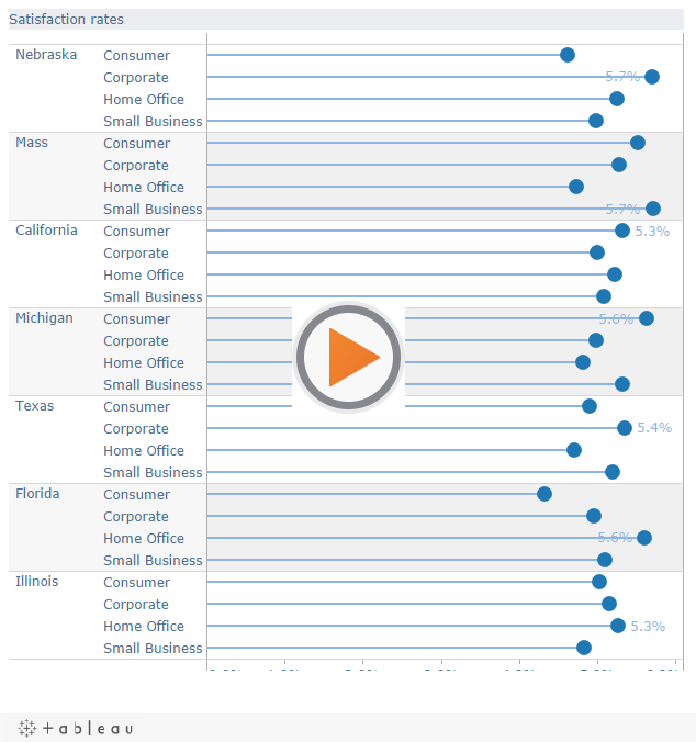
You’ve built a nice chart using synchronised dual axes (maybe it’s a lollipop chart – as described in my previous posts!). It looks great, but you’re just left with a niggling little design flaw: those dual axis sure take up a lot of space, at the top and the bottom of your viz:
What can we do about this? The first thing I thought of was to format all the Tick Marks and Titles away from the top axis:
That’s no good – there’s a huge useless white banner of dead space at the top of the chart now.
Instead, why not just format each axis to show one of the important parts: one to show the title and one to show the tick marks? This is the end result:
Now I have the best of both worlds – the user’s not aware of any dead space, and nothing gets repeated. To format the axis, right-click anywhere on the axis on the worksheet and choose Edit axis…
On the top axis, leave the Title as it is, and show just the Minor tick marks, making sure they are the same interval as the Major tick marks on the bottom axis:
On the bottom axis, leave the tick marks, and delete the Title:
Job done! You’ve maximised your available space and made your users’ lives a bit easier.


6 Comments
Add Yours →Very nicely done Andy, I plan on using your technique the next time I need a synchronized dual axis.
Andy,
Nice hack (you and Joe are scary clever with stuff). But the ability to hide one axis and not the other is something I’d like to see Tableau add to a point release.
Steve
Hi Steve
Yes, I’d agree that it would be nice if you could hide one axis (“Show header”) instead of another without hacks like this one!
Andy
Andy great tip !
One more question – Is it possible to pass a parameter in the Marks section so that the user can select between a bar/line chart on their own ?
Hi Ujval
That’s an interesting question – yes you can allow the user to switch. I just did a blog post for you:
http://www.thedatastudio.co.uk/blog/the-data-studio-blog/andy-cotgreave/dynamic-chart-type
I’m not sure you’d want to do it though as it’s a moderate amount of effort for possibly a small return?
Andy
Outstanding!
I second the request for Tableau to include an option to hide the “useless white space” of a repeated axis.