Ujval Gandhi commented on my post about dual axis formatting. He asked if you could use dual axes/parameters to choose between showing a bar and a line chart. Turns out that, yes, you can:
It’s quite a simple trick:
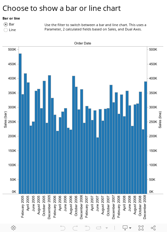
1. Create a Boolean parameter. I called my “Bar or Line”
2. For each measure you are displaying, create 2 calculated fields: one for the bar and one for the line. Here’s the Sales field for the bar:

3. Drop both calculated fields onto the Rows shelf, choose Dual Axes, and Synchronise them.
4. Change the Marks card to show Multiple Mark Types:

5. Set one mark to Bar and one to Line
6. Show the parameter control.
You’re done!
This is quite a nice trick, but I’m not sure why you’d want to do it. I can’t see a way it could be extended to cover other functionality. There are other ways to allow users to show multiple chart types; for example, Alan Smithee has an excellent example of this here. It’s possible that with lots of parameters and calculated fields, you could give the end user more control over what they show.

1 Comment
Add Yours →Wow Andy.
So simple yet effective !
You are right, it has limited functionality but this is an added feature alongwith your earlier blog of allowing the user to select their own measure. This would be extending the Tableau Visualization for a true ‘on demand’ visualization for the user. Let them select their metric and the chart type they are most comfortable with
Regards,
Ujval