What should your dashboard look like?
Should it be a horizontal or vertical? How do you divide up the pieces?
There’s no single right answer. It depends. It depends on your intuition and it definitely depends on getting feedback from people before you publish it.
Let me say that again: GET FEEDBACK FROM PEOPLE BEFORE PUBLISHING ANYTHING.
The best post on this was written by Steve Wexler back in 2011: “Hey, your Tableau Viz is Ugly *and* Confusing”
How did I choose the layout for my Fatalities dashboard, the focus of my Design Month posts?

The answer was I tried everything else and went with what I felt was best.
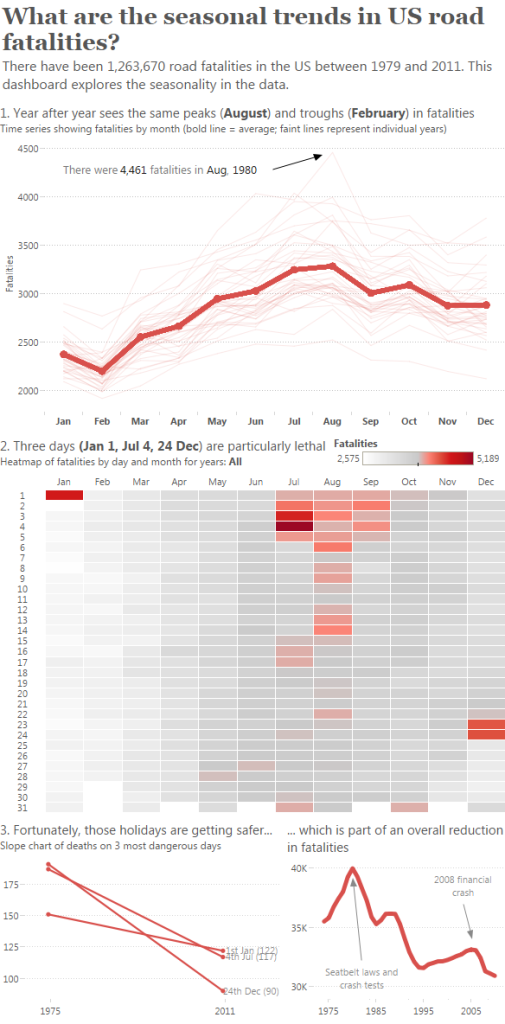
A vertical layout would have worked very well for a blog post:

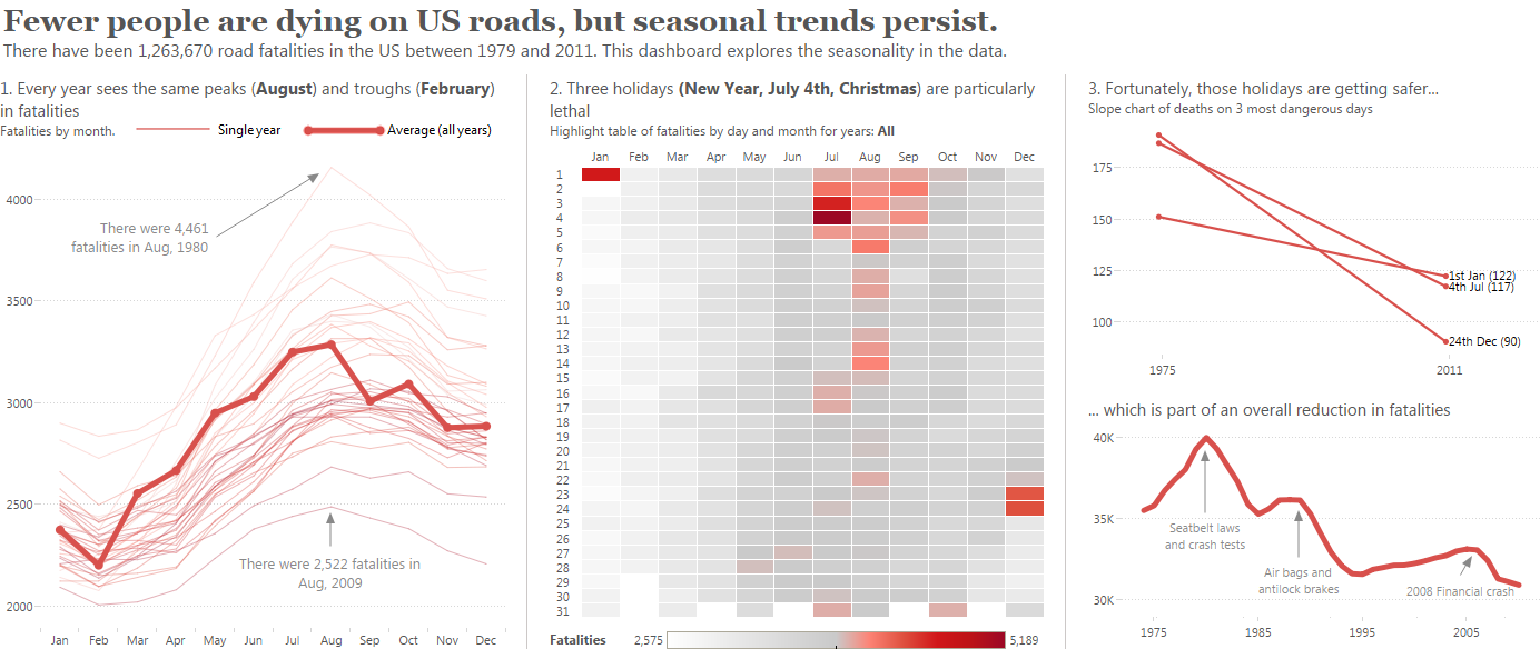
How did I choose? I asked lots of people for their feedback. Some favoured horizontal, some favoured vertical. Their feedback was greatly appreciated. In the end I chose horizontal because left-to-right felt like a more comfortable way to read the story. Horizontal also allows you to compare across charts more easily.
You can make an okay decision about this on your own but it’s not until you share your work and get feedback that you can make an informed decision.
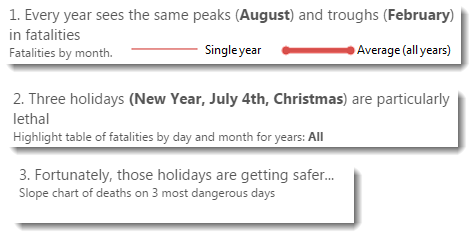
Having made the decision to go horizontal there was one more thing I needed to add – a vertical line between each chart. You can see them below.

The lines allow each view to stand alone. Without the lines, the focus of the dashboard was more blurred. I created these lines separately and imported them as images.
Which do you prefer? Horizontal or vertical?


Recent Comments