I’ve written before about the problem of “rules” and “laws” in data visualization. A classic one is “Thou must start your axes at zero.” If you’re reading my Brinton blog, go see what he had to say about it)
In this post I want to dispel this myth. It’s a myth that’s close to my heart. In August 2009 I went on the record (by commenting on The Guardian’s Datablog) that I disliked one of their charts because their axes didn’t start at zero.
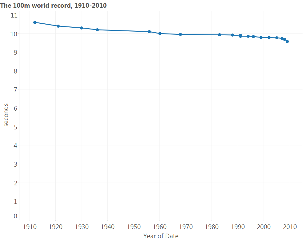
Let’s take the data from that Guardian article in order to investigate this Rule. Here’s how it looks with zero included:
This is bad for at least 4 reasons:
- It doesn’t really expose the change of the record over time.
- It especially doesn’t highlight the impact Usain Bolt had on the record.
- It doesn’t make great use of the space – there’s lots of dead space.
- It’s boring.
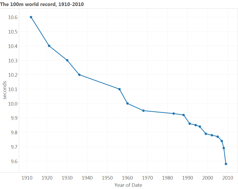
What happens when you break the rule?
All the problems are removed. It’s engaging, Usain Bolt’s impact is clear and it makes great use of space.
There’s one final reason not to include zero in this case. I do not know what the ultimate fastest time a human being will run 100m, but I can guarantee it isn’t zero seconds. My point is that not all measures you are charting have real zeros. In this case, the “zero” might be 9 seconds or so.
Once you learn the guidelines, you’ll be able to fine tune your charts by bending or breaking them according to your use case and objective. Sticking to the rules means you will satisfy the 5 criteria Alberto Cairo defines for a successful chart (he discussed these at his 2014 Tapestry Keynote):
- Truthful
- Functional
- Beautiful
- Insightful
- Enlightening


10 Comments
Add Yours →So do we amend ‘The Rule’ to state ‘…unless 0 is never possible’? On a sales chart you would want to include 0 as it shows that sales haven’t stopped if they are just at their lowest ebb but that’s because 0 sales is possible.
The axis needs to be clearly labelled still but an interesting provocation.
Andy,
Great post on an often overlooked subject. I agree 100% that you need to evaluate starting at zero for all sorts of chart types, like line, scatter, gantt, and dot plot, for example. If the story is the trend, then by all means, evaluate a non zero baseline chart.
But your audience should be warned, if they ever, and I mean ever, start a bar chart at something other than a zero baseline, the info viz police will come and arrest them for breaking one of the most sacred info viz rules there is, “Thou shalt always start a bar chart at zero!”
I know you know why bar charts have to start at zero, but let me share this nugget of wisdom with them. Bar charts are so effective because we can use the length of each bar to make rapid comparisons. If one bar is twice as long as another bar, then we expect the value to be twice as much as the other bar. By starting a bar chart with something other than zero, you are telling a visual lie because we can’t use the length of the bar to compare the magnitude of the differences.
Bonus rule for bar charts, “Never use a log scale in a bar chart.”
Once nice thing about info viz is that there aren’t all that many rules you have to follow, so that makes remembering these two pretty simple.
Want to read more about this rule? See my blog posts at http://bzintelguru.com/?p=1387 and http://bzintelguru.com/?p=1685
Thanks for the thought provoking post Andy.
–John Munoz
The whole “it has to be zero” thing comes about because “then you can compare proportions correctly” — but few question whether zero is actually the most useful value to compare to. Often, zero is as arbitrary a number as any other — e.g. temperature: which is the “true” zero? Fahrenheit, Celsius, or Kelvin? And why would any of those be more useful than, say, making the axis the average temperature of the season?
Hi Andy, good and important post. As designers of data visualizations, we have a responsibility to balance form and function in a way that achieves insight and truth. This may seemingly require choices that violate the largely accepted rules. However, one needs to be very careful following that road to avoid introducing inconsistency and confusing the consumer of the visual. For your example, I would present the chart with y axis starting at 0 but also include the inset zooming in on the last couple of decades. This approach makes good use of space and gives the viewer a proper context.
I would say the collective group of data visualization professionals mostly agree that it’s ok to break the axis on a line chart in certain instances.
There’s an interesting post by Cole on this topic (http://bit.ly/1vNL5cB) with reference to Alberto Cairo and Stephen Few. Here’s my comments on her post.
“I always tell my students that when you break the axis on a line chart it’s like using a magnifying glass so be careful how much you magnify. If you over magnify then you will distort the picture. I also tell them, as you point out, to never break the axis on a bar chart. When I see that I assume the author is lying to me. The other one that I see people do frequently is break the axis on an area chart. This is the same fundamental problem with breaking a bar chart. Maybe people think that because it’s a line that it’s ok, but the purpose of the shading underneath is to compare height. So any chart type the uses length/height as a quantitative measure needs to have a zero base line (bar, area, lollipop, histogram, etc.). Also in the same category with the line chart is the dot plot (depending on how it’s used).”
@John Munoz:
Two counterexamples to ‘barcharts must start at zero’
mean roll on a six-sided die where either 1 or 3.5 is right
hazard ratios for divorce where 1 would be better.
Of course, you can fit both of them into the rule. In the first, you just need to redefine ‘zero’, and you can rule out the second by arguing that a hazard ratio is basically on a log scale and so shouldn’t be a barchart.
Hi Thomas – thanks for the comment and the links to your blog – I’ve subscribed.
I disagree with the die roll chart, though: I don’t think a bar chart is appropriate at all. “Number-rolled” is discrete. Rolling a 4 is not greater than rolling a 1. You could have a die with the letters A, B, C, D, E. I’d avoid bars to show die value completely.
Cheers
Andy
In general that would be true, but in this case the researchers were specifically interested in the numerical values: respondents self-reported the number rolled and received that many raffle tickets for a large prize. In that specific context, rolling a 4 got you four times the reward of rolling a one.
Another way to think about this is to have the starting point of the Y axis be the minimum value the object being measured on the Y can take….
In that case red reference line at “9” value will be very helpful.
If that was a sales chart option without zero would look terrifying and misleading