[sb name=”TourDeFrance”]
I have always been a fan of The Ecomonist and the amazing charts they create. Their Graphic Detail blog is a must-read. They are simple and have a visual style that is consistent week after week. This is good because each time I view an Economist chart, I don’t have to waste energy working out the layout and style. Instead, I can focus on the content.
This got me thinking: can Tableau create Economist-style charts?
Why yes.
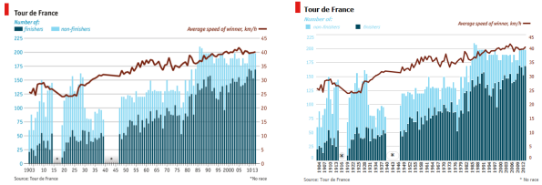
I chose a recent chart from the Graphic Detail blog. It charts the changing speed and size of the Tour de France. It’s a great little chart. I downloaded the data from Bike Race Info and got working. The results are at the top.
Go check out the original post. How close do you think I got? I am pretty pleased with how close it is possible to get. And of course, with Tableau-interactivity, it is easy to enhance the chart. I added some nice tooltips and a URL action to go visit the Wikipedia page for each year of the race. It would be easy to go further with this and add more views to a rich-analytical dashboard.
What other publications have a consistent style that we could try and emulate in Tableau?


Recent Comments