
This is the second part of the story about how I made the Kraken, the winning entry in Tableau’s internal art competition. In part 1, we got the tools to make circle charts, and a fantastic Kraken image. In this part, we’ll look at how I took the data and made the final image. We’re going to learn about the internals of a Tableau file (XML), how to hack those internals, and some of the limitations to the way Tableau works.
First tries
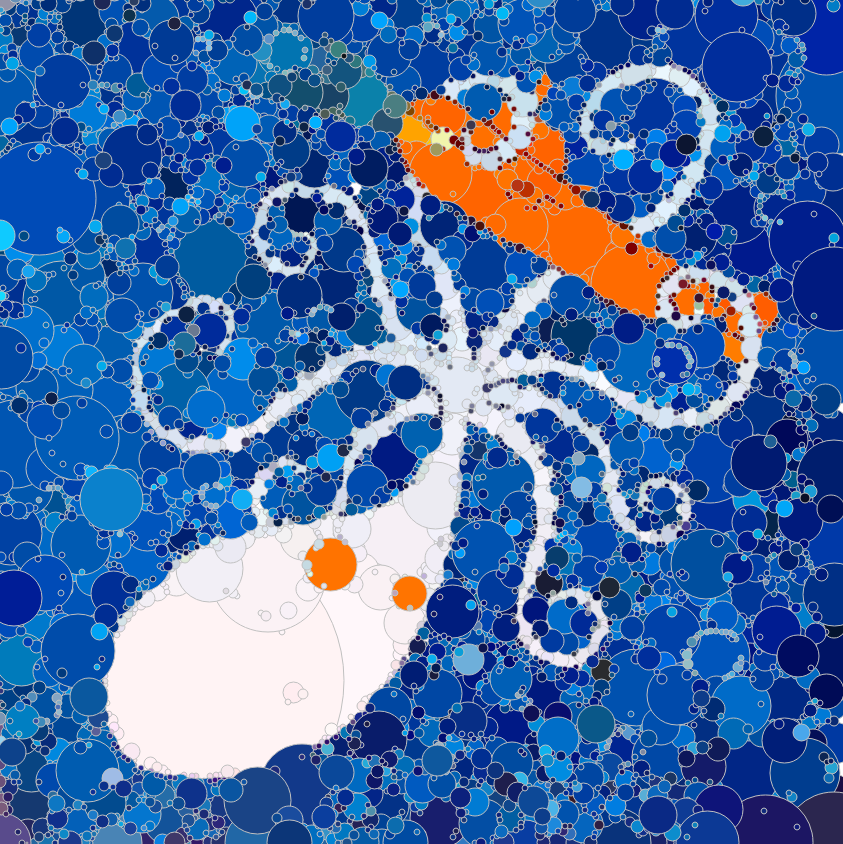
Here’s the data, alongside the final image I used. I must have made 15 or 20 different configurations of the kraken image before I was happy.
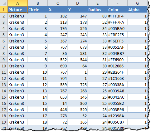
From there, you might imagine it was simply a case of connecting and creating a scatter plot in Tableau, right? Wrong. First off I had to create a calculation to calculate the area of the circle. Below is the first sight of my data:
Not bad, eh? But far from what I wanted. There are many problems to solve.
Colour
I have colour in my data source and I need to encode each circle according to the colour value in the data. This was my first sinking moment – Tableau can’t do that. But I do have something of a reputation as someone who’s not afraid to break open a TWB file and edit the XML directly. It was time to crack open the text editors.
Hacking the TWB files is fun but do it at your own risk! Tableau don’t specify the format of the TWB files, so you are on your own when attempting to hack it directly. That said, the structure’s pretty easy to work for most things. In this case, I created a file that set some custom Colours on a dimension, saved it, and opened it in a text editor. Here’s what I saw:
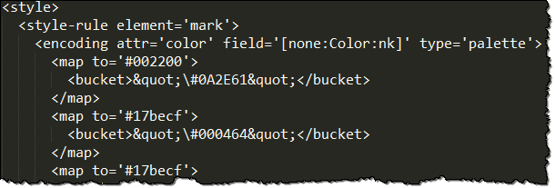
Every colour can be encoded with a simple XML pattern. Excel is my friend, along with some data and the ever trusty CONCATENATE function:
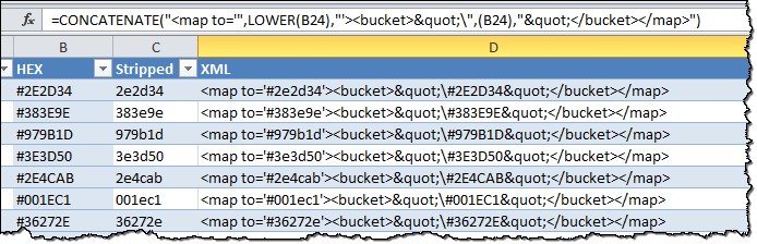
That XML column can be copied directly into the TWB file. Save it, open it up in Tableau and now put Colour onto the Colour shelf. Progress:
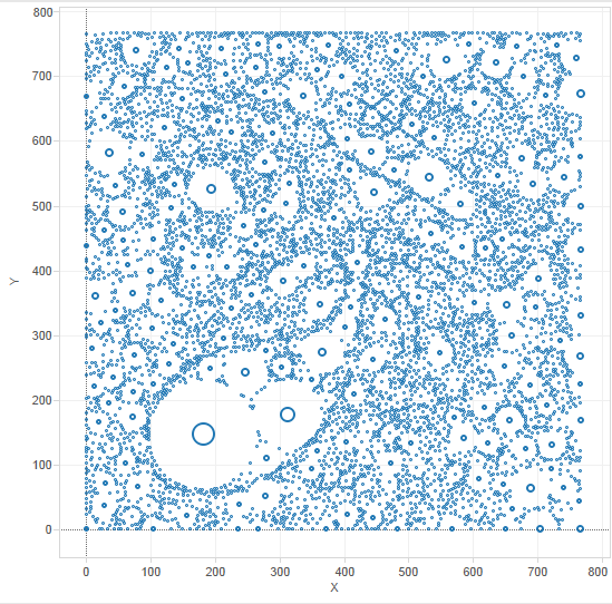
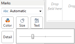
Circles.
Take a look at the circles above. They don’t scale quite as you’d expect. Getting this bit right was the hardest and made me realise there’s something unusual going on when you do circles on a scatterplot. Surely, if I’ve calculated Area based on [Radius], then Tableau should size the circle according to that value?
Well, not quite. It’s also influenced by the slider:
And the size ranges dialog:
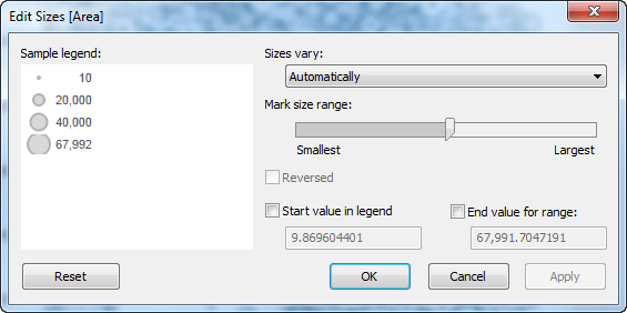
And the available space on the screen.
In fact, getting this bit right was the most manual process. In the end, I had to put the view onto a fixed sized dashboard, and tinker until it felt right. One thing I discovered is that it’s simply not possible to get Tableau to scale the circles “accurately” by the area calculation. My image was never going to have no overlaps in the way the Percolator output does. But you know what? Tableau’s wacky drawing algorithms was creating a different kind of aesthetic that I found equally appealing.
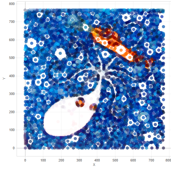
Finally, I am getting really close. My Kraken is looking pretty good:
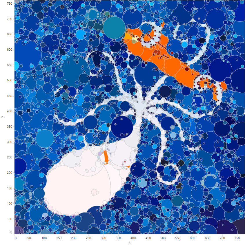
Finishing touches: the z-order of the circles.
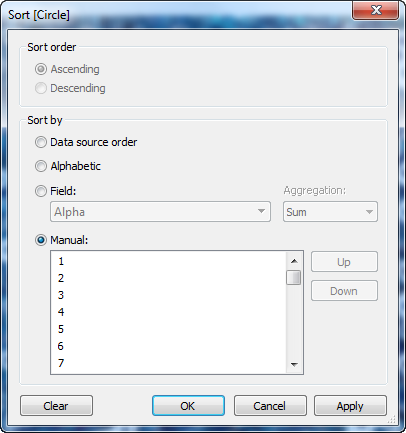
What’s wrong in the picture above? Well, the eye’s aren’t visible, and there’re lots of blue circles overlayed on top of the Kraken’s tentacles and the submarine. Tableau doesn’t will draw circles in a scatterplot in the order that they are sorted. But here I have 5,000 of the damn things. I’m not going to battle Tableau’s manual sort dialog box:
That way lies madness! Instead, it was back to the XML editor. I selected the circles I wanted bought forward, exported the data, and created some XML to encode the sort order inside the TWB file. It was a similar process to the colour encoding, outlined above.
It’s done! Kraken image ready for entry
At some stage, I knew I’d done enough sorting of the circles. Maybe it was when the clock struck 3am. And I was done. I’d gone from a PC Viz Challenge, and grown the seed of an idea into a fully matured final picture. I was really pleased when I sent the entry for our internal art competition. And overjoyed to hear I won!
This process was great fun. What should you take away from it? Doing something like this will teach you more about Tableau. Knowing how it works under the hood, or discovering how packed circles behave will help you make better pictures. Hunting around the web will also inspire you to make new contacts and discover new ways of seeing data.
I hope you’ve been inspired by these posts – if you’re going to make some art out of Tableau, let me know on twitter (@acotgreave)


Recent Comments