
[I’m shamelessly stealing the idea for “the little of” from Andy Kirk. His series has been amazing]
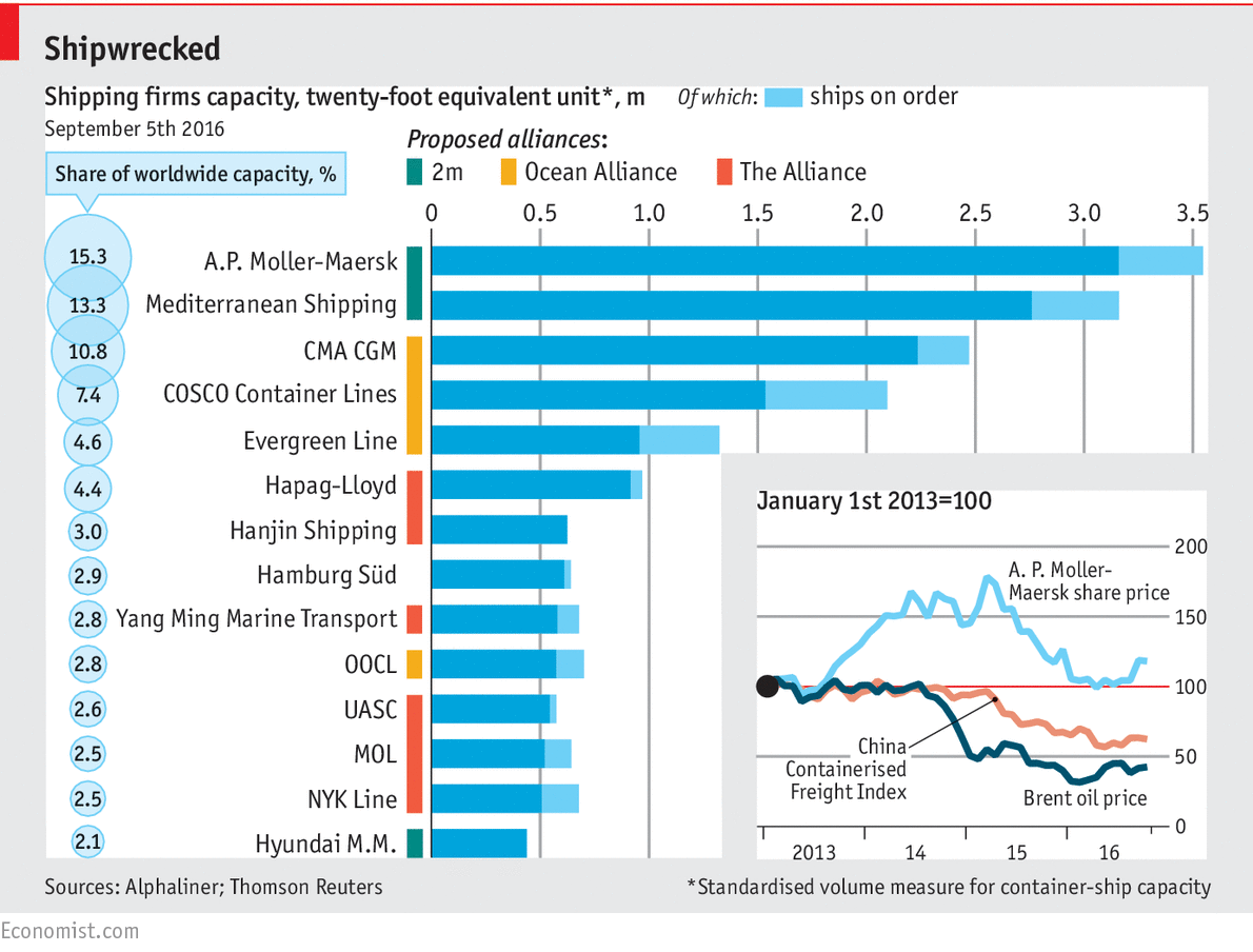
Yesterday in MakeoverMonday we tackled the worldwide shipping industry. Today the Economist shared a chart about the same topic (above). I highly recommend you also read the full article as it’s about an industry trying to save itself through the use of better data.
What’s I like in this chart is the “Proposed alliances” blocks next to the company names. The primary question in the story is the size of the shipping companies. The secondary question, dealt with in the second half of the article, covers alliances. They designed the chart so you can get on with answering the primary question without the initial distraction of the alliance information.
If I’d designed this chart, I’d have probably coloured the whole bar according to the proposed alliance. I’ve mocked that up below.
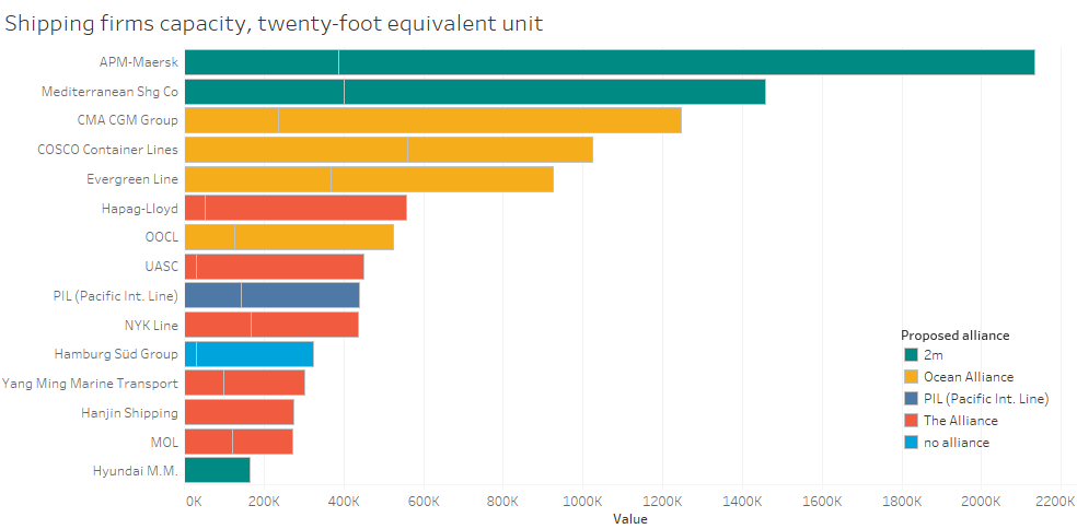
What’s the problem? You can’t escape the colours. You see the colours before you answer the primary question. What the Economist did was keep simple bars that allow the primary question to be answered first. Once that’s dealt with, you can examine the alliance colours and focus on the secondary question.


Recent Comments