
This week we’re tackling one of the interactives from Information Is Beautiful.
I struggled with this week’s makeover. I couldn’t find any great way to retell the story to the level of detail of the original. In the end I decided to exclude detail and focus on just the growth the hacking and what that means for me and you. Personally, I am a huge fan of Lastpass and recommend everyone to use it or an equivalent.
I spent a long time trying to do a remake but in a “better” way than using circles.
I tried a stacked bar:
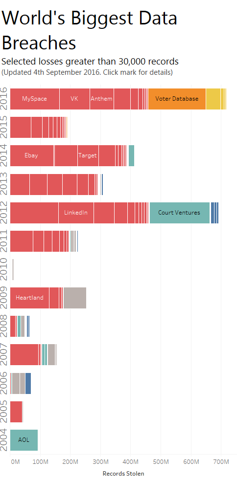
The problem? There’s less detail than in the original and it’s not engaging.
I tried a treemap bar (which you can interact with here):
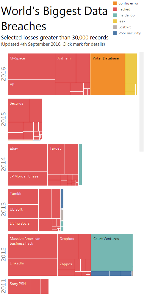
The problem? A treemap is a part-to-whole, and this dataset is only selected breaches. I do like this chart, but because the tree implies part-to-whole it’s not acceptable.
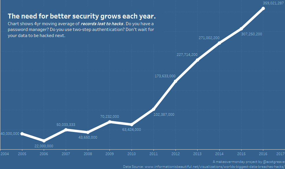
In the end, after more time than I had available to spend on the makeover this week, I figured I’d have to find a simpler, different story and focus on hacks alone:
My conclusion? The original is a very good way to prioritise access to all the data over ease and accuracy of comparing each breach.

What I like
- It’s engaging. That makes me want to explore it.
- There is detail, in the form of a short sentence to add context, when you click on a circle.
- It works well on mobile (the vertical timeline is becoming more prevalent as we move to mobile).
- I like the interactivity: switching bubble size and color for different categories reveals different insights.
What I dislike
- It isn’t easy to accurately compare the difference in size of different circles. If the prime purpose is to show differences accurately, then you’d need to use bars. Since that wasn’t the prime purpose here, this isn’t too big a problem.
- There’s a lot of overlapped marks. A border appears around each circle as you move your mouse over it, making this less of a problem. Making the marks transparent is another possible solution.
- You can choose to colour the bubble by year, but the “Interesting story” color overrides that, confusingly.
Recent Comments