
When Andy and I were discussing future topics, we were considering the Global Peace Index. I mistyped it as the Global Peach Index. “Wait a minute, that sounds fun. What if there is data on the peach industry?”
And here we are with data on global peach growth.
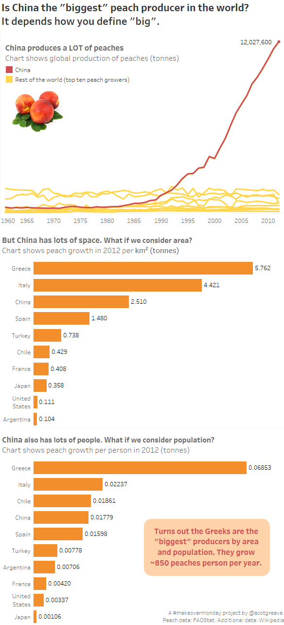
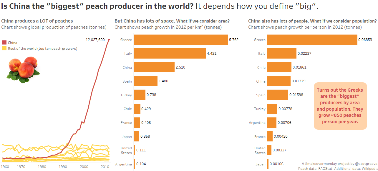
On the first exploration of the data, the massive domination of China pops out. Below is the percentage of peaches grown in China. >30% of all peaches in 2012.

“But China’s huge. And populous,” I though. And that led me to bring in population and area. Do that and you realise that while China’s clearly growing loadsa peaches, and has been increasing its growth in the last two decade, it’s Greece that’s the biggest relative to are and population.
All of which is a good way to say that in data analytics: think about the contextual implications of each measure in your database.
The original
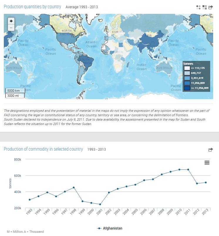
This week’s source from FAOSTAT is kinda standard fare. Things I think could be improved:
- The colour bins have very specific boundaries. I’d rather see them fitting round numbers. This mapping system has to fit all FAOSTAT datasets, so I suspect there’s some automation going on here.
- The map has ocean depth and land cover detail. That’s too much detail. Why should I be interested in ocean depth when looking at peach production?
- The line chart updates when you select a country, which is nice, but I’d rather also see the title update, otherwise it’s not obvious if you did select anything. There is a country line legend right at the bottom, but I didn’t spot that.
Here’s the horizontal version of the makeover:
Recent Comments