
I’m late to the game this week! Normally I get the Makeover done on Sunday or first thing on Monday. This week I had to wait until the end of the day.
The original was great:
- Appealing colour scheme
- Mobile friendly
- Great tooltips
- Lovely use of Gantt bar
- Customisable sorting
This week I decided to see what everyone else did before I did my own, to force me to come up with a new perspective.
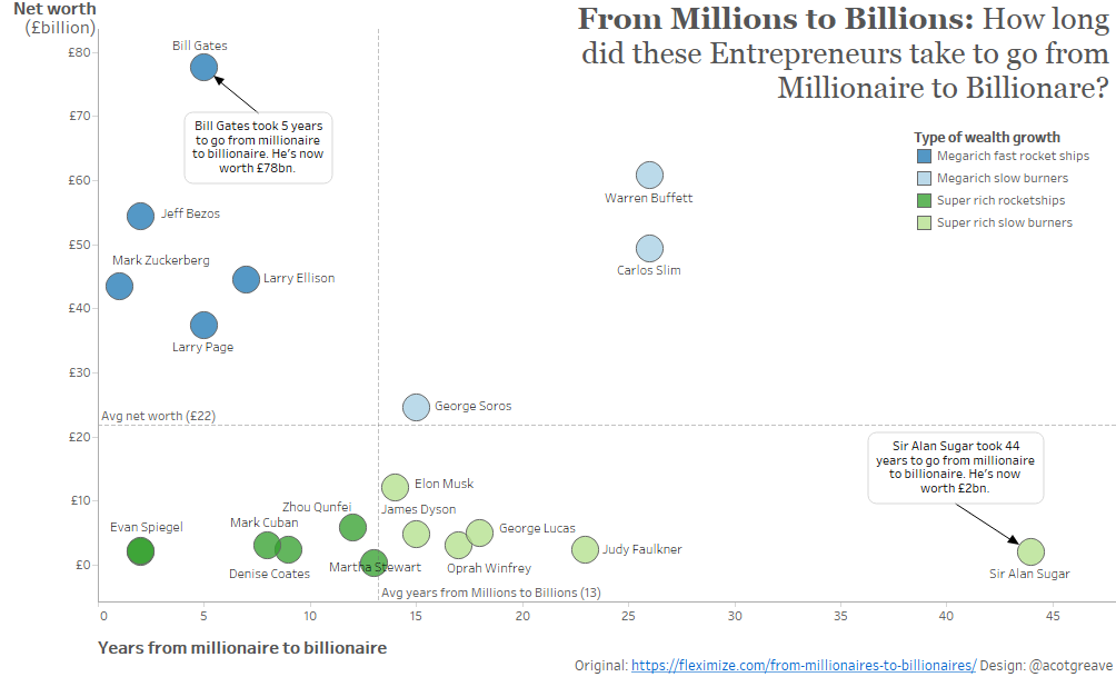
Most people seem to have focussed on visualising the ages that these entrepreneurs made their millions/billions, reusing the same main fields as the original.
Since that’s what most others do, how could I show the same story in a different way?
I decided to focus on the other measures: the gap between millionaire and billionaire and their net worth. It’s not quite the same story, but I needed something original!
Did I succeed? I’m not sure.
As I write and reflect on this one, I don’t think my story is as compelling as the original. Not only that, I don’t think the scatterplot makes it clear! I do think the difference between Alan Sugar and Bill Gates is pretty clear, but as a scatterplot it’s just too hard to decipher for a story that’s better told in the manner of the original.
Recent Comments