This week we’re looking at quality-of-life metrics in the USA. The original article had a series of 5 maps showing how each state is ranked according to various measures.
This is an interesting challenge: how can you compare ranks among multiple metrics for so many states? My normal approach to MakeoverMonday is to make static charts, but this is one dataset where the only way to provide insight is to use interactivity.
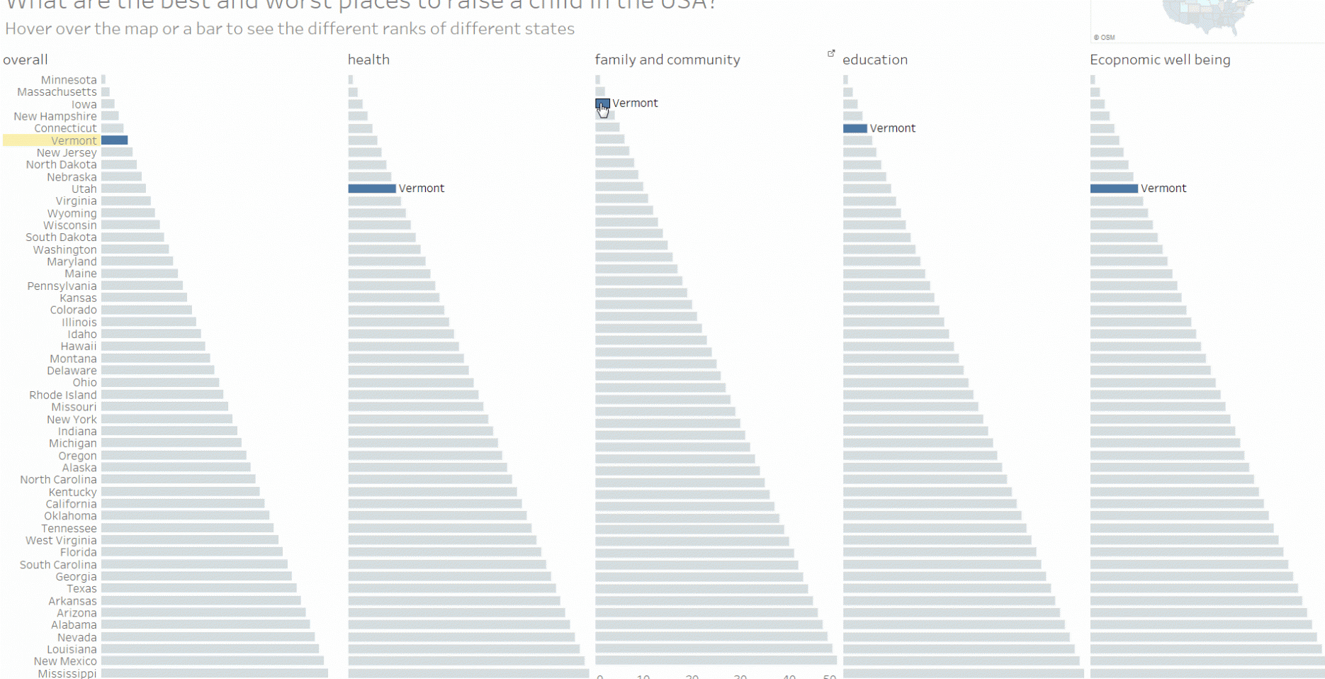
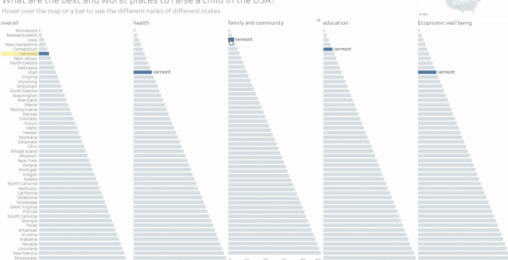
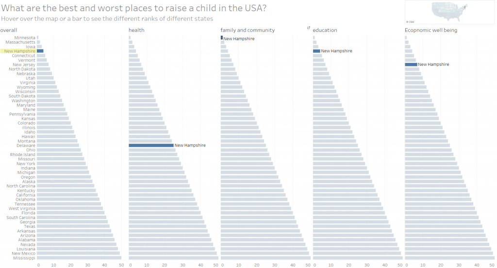
Whenever you hover over a bar, or the map, every area of the dashboard highlights to show the rank of that state in each category. For example, it makes it easy to see that while New Hampshire is ranked number 1 for Family and Community, it’s weak in Health:
You can download the workbook here (it’s built in Tableau v10 beta 4)
1 Comment
Add Yours →Hi,
Im trying to open the workbook with tableau public 9.3 but keep getting error messages.
Is there a way to use the workbook with tableau public?
Thanks so much,
Rob