
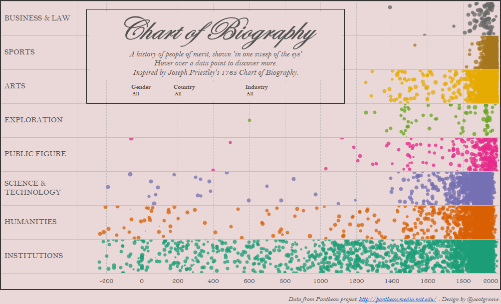
[Today I had a classic MakeoverMonday experience. I wrote my original post, and was ready to hit publish. I then realised I just needed to check my calculations were correct. I went back to Tableau. While checking the data, I came upon a completely new idea. I NEVER would have come up with that idea had I not been able to drag, drop and experiment so readily. I will publish the original post tomorrow.]
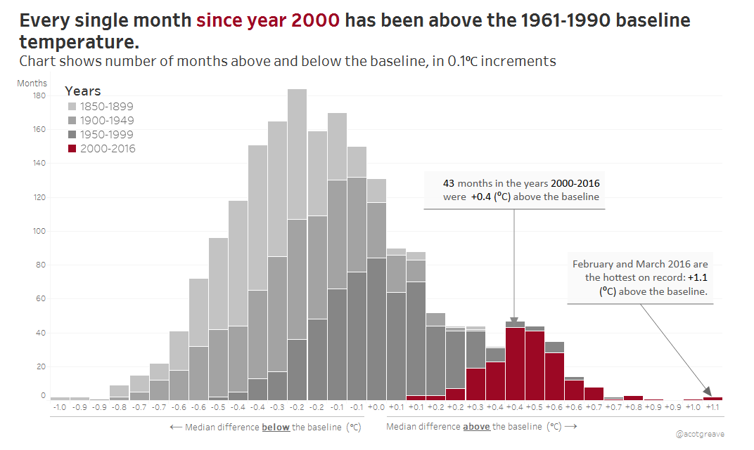
The world is getting hotter. This week’s data comes from the UK MetOffice’s HADCrut4 data: a global, gridded dataset of surface anomaly temperatures. Note: the baseline for HADCrut4 is 1961-1990, not 1850-1900 as stated in the original article. See the MetOffice page for more details.
The science behind the dataset is complex, but the data’s straightforward: the measure is going up over time. How should you best show an upward trend? I had three ideas, which I implemented, and will publish tomorrow.
A final check of the data, though, led me to the idea of a histogram.
Are histograms good charts?
I really like my chart this week. It shows just how much the 21st century has been above average in an unusual way. The challenge with histograms though is that they aren’t as immediately understandable as a line chart. You’ll see in tomorrow’s posts that I was initially riffing on line charts. If you’re sharing your findings with people who don’t usually see many charts, or have much time, you might want to show a simpler chart. Or you could trust that your audience is in fact intelligent and go with this design.
Iterations
I built a histogram initially just to check whether one of my calculations was correct. I immediately realised it was an interesting way of showing the data. But which chart shape and at what level of granularity?
My first version showed every month as a separate mark (because that’s what I was trying to validate). However, it’s just too much detail and nobody really wants to know the specific value for a particular month in the 1990s. It’s the trend that’s important.
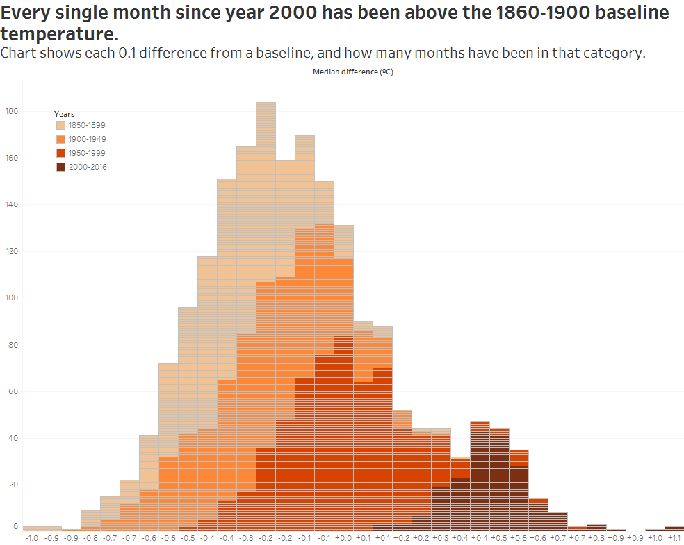
I tried an area chart too. I like this as it shows the waves of the different time periods. However, it’s just one level of complexity too far. A histogram’s challenging enough without colouring it by groups and using area instead of bars.
Bars it was! My final step was to tell the story. I turned to colour here. My story is about the years since 2000, so I changed the palette to emphasise those years. Red for the recent colours, greys for everything else:
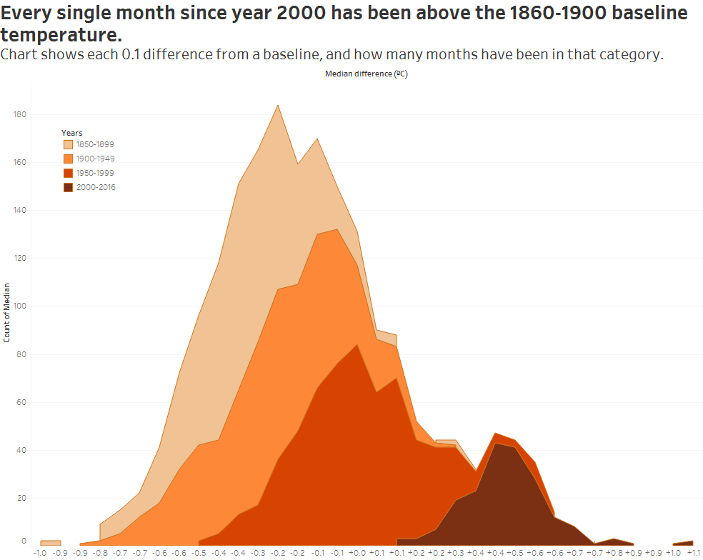
Unstacked area?
Finally, does an unstacked area work best of all? I think it might…

Helping the user understand a histogram
Here’s my biggest challenge with histograms: how do you help a reader understand it in as short a time as possible?
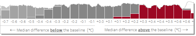
- I created custom axis labeling as shown above
- I annotated one of the marks
- I used colour in the title to further explain what each mark showed
Did that work? How easy was it for you to interpret the chart?
The original chart
Spiralling global temperatures from 1850-2016 (full animation) https://t.co/YETC5HkmTr pic.twitter.com/Ypci717AHq
— Ed Hawkins (@ed_hawkins) May 9, 2016
With 12k retweets at time of writing, people clearly love spirally climate data!
What I like
- If you watch the animation, it clearly expands outwards
- The colours pop out (although they seem arbitrary)
- Spirals fit into a small space, like a tweet
What I would improve
Spirals?
This is a straightforward timeline and the radial nature simply does not show the growth over time. Bloomberg did a much more exciting animated version. A simple trendline shows growth better, too, in my opinion. Growth in a sprial is only visible by a vague awareness of an expanding circumference. Spikes in months or years are lost in the noise and confusion of the sprial.
But…. Twelve Thousand Retweets? For all the problems of spirals, people engage with them. Is it better to get people thinking about the data, or be a chart purist? Bloomberg, when it tweeted about it’s story with a map, got only 192 retweets. From an account with THREE MILLION FOLLOWERS.
Global temperature records just got smashed again http://t.co/1rwVgD5sct pic.twitter.com/2ZuNlV2BGm
— Bloomberg (@business) April 21, 2015
Conclusion? Spirals aren’t the “best” way to show the data, but they make people look at it.
6 Comments
Add Yours →I actually prefer the original (and not just for the “sizzle”). Why?
Is the point to show precise quantitative data, or general qualitative information? I think in this case, the latter: The “story” to tell is—as you point in your post— that “the measure is going up over time.” If it was doing anything else, that required comparison or analysis, then the spiral would have been a poor choice.
“Growth in a spiral is only visible by a vague awareness of an expanding circumference.” –> yep, which only works because the measure is going up/expanding outward over time. For more detailed analysis, the “spiral” would be a poor representation, for many reasons, but most notably for how it flattens out information and the density of data represented!
“This is a straightforward timeline and the radial nature simply does not show the growth over time.” – I’m fine with representing time using horizontal direction, or in a circular fashion (think clocks and watches). Given the simple story to tell here, I think the “swelling” spiral does that well…
As always, I am very grateful for your analysis and alternative viewpoint!
Looking forward to your follow up, tomorrow!
Hi Stephen. Thank you for your comments. I hear what you’re saying about the radial chart. When I first saw it, I immediately thought of the Bloomberg version from last year. That does exactly the same thing, but horizontally. In that example, there is so much more to see: you can compare different months within a year. You can look at a single month and scan through all the years.
Most importantly, you can EASILY see exactly when a month is the highest on record. It takes no effort.
I don’t object to all radial charts. In this case, I think the Bloomberg example is far superior.
Oh, and…
The part I struggled with at first glance (took me a moment to parse) is the “chunking”of years into the 4 sets. Not sure how important that grouping is to telling the story. Why those sets of years, vs any other grouping?
The chunking was pretty arbitrary. I started at the start of the dataset and chose 50 yr increments. Of course, when I got to 2000, I only had 16 years left for the final group. Who knows, the conclusion might not have been so clear cut had I chosen any other grouping. It just happened that my first choice made a strong story.
[…] […]
[…] Yearly histogram distribution from Andy Cotgreave […]