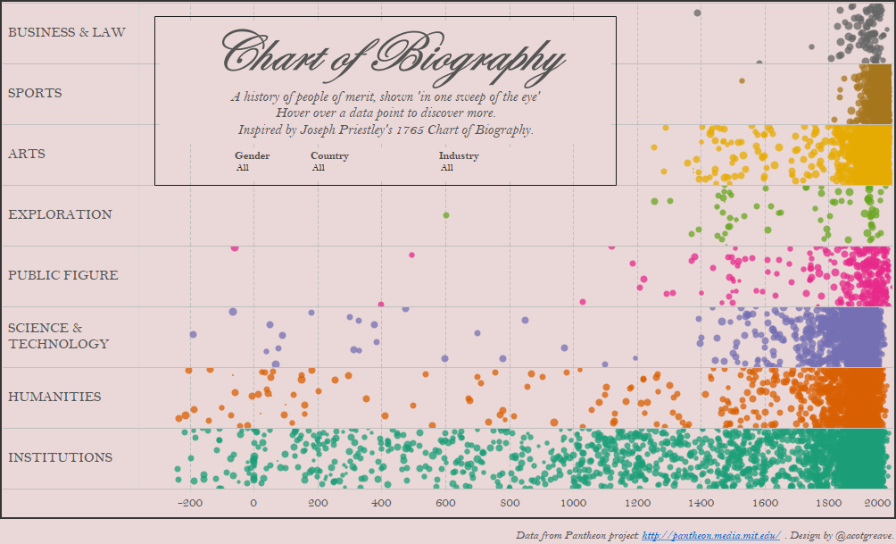

Today’s makeover sees me completing an ambition of 5 years: remake Joseph Priestley’s Chart of Biography in Tableau. Finally, all of my 5 Most Influential Vizzes have been remade in Tableau.
Here’s the source chart for this week’s Makeover:

It’s a horizontal history from the excellent site Why Ask Why. It’s a cool data experiment and exploration. The article inspired Yura Bagdanov to do a horizontal version. Of course, when I read the article, I saw only the Chart of Biography, what I think is the most influential chart of all time:

Priestley’s chart was the first to condense time onto an x-axis which fit on a single page (Dubourg did something similar earlier, but his chart was 54ft long!). It’s also the first Gantt chart. And it directly influenced William Playfair as he created his statistical line charts. Boom! Check the blog tomorrow as my next post is all about Priestley’s own analysis of his chart.
This dataset doesn’t have the same names as Priestley’s, but it’s the same type of data: thousands of famous people with details of their life and death.
Making the chart: the 1765 version
Priestley created a Gantt chart. Could I do the same in Tableau? Well yes, but all my early efforts didn’t really work out:
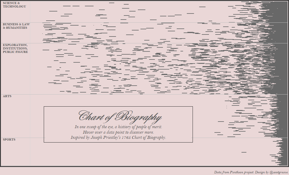
The problem was there’s just too many names! I used jittering to randomly distribute the names in each pane but I wasn’t happy with the output. Time to rethink the view with a 2016 perspective.
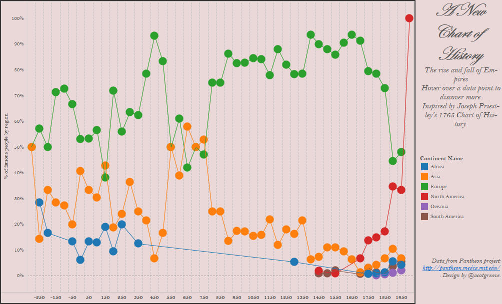
Making the chart: A New Chart of History
I did have a go of recreating A New Chart of History too, but it only highlighted the inaccuracy of the data. 50% of famous people born in 1950-2000 came from North America? Not sure about that.
Making the chart: the 2016 version
Interactivity gives us lots of options!
Tooltips and highlighting
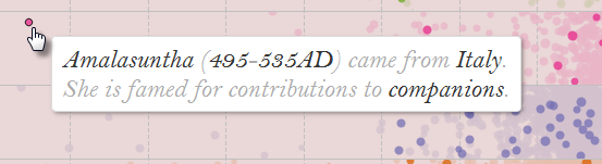
Priestley labelled every single bar. Can you imagine how hard and tedious that must have been? All I did was make a nice tooltip!
You can also see in the above image that the country is highlighted. Another advantage of modern interactive tools!
filters
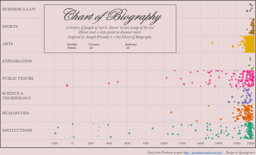
I also get the advantage of filtering. Above is the view with only the females in the dataset shown.
The view above also highlights the problem with the Pantheon project: it’s incomplete. Only 6 famous female explorers? 5 business women?
I am very grateful to the London Viz Club for getting the data from the Pantheon project – that was a cool little Alteryx task. I’ve waited 5 years for a dataset like this: today is a happy day!303
1 Comment
Add Yours →I like this remake a lot. I have one suggestion to make it even better. We don’t normally view BC dates with a negative sign, and there’s no year zero. I’ve dealt with ancient dates before and found custom number formatting works well. You can add the suffixes and substitute “BC|AD” at zero to indicate the split and remove a label for that nonexistent year. See my timeline here for an example: http://viz.bible/explore/periods/