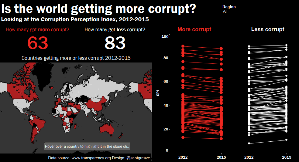
For the second week Andy and I have raided our vaults for old dashboards. This week, Andy’s Corruption Perception Index dashboard from 2010.
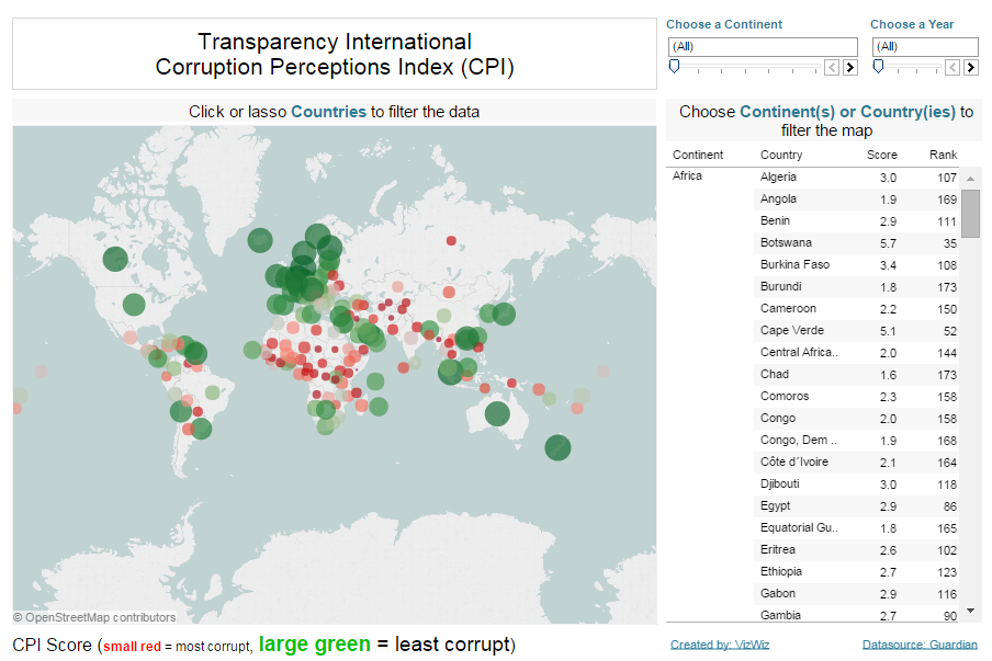
What do I like about Andy’s original?
- A simple grid layout lets me see each dashboard region clearly
- He used size to differentiate most/least corrupt
- He’s got links to the datasource
- There are clear instructions above the map and the table
What did I think could be improved?
- It’s a very straightforward presentation of the data with no real agenda. It doesn’t inspire me to interact because there’s no indication of any conclusions I can make about the world from this data
- Red/green: not a great colour choice. He does use size as a second encoding of the data, so it’s just about excusable.
- Sliders for filters, not drop downs. Is this a problem? I addressed this in a comment on one of my previous makeovers. What do you think? Are slider filters good?
- It looks so dated, don’t you think?
For my makeover I tried to achieve several things:
I tried to pose a different question. Instead of looking just at the CPI, I wanted to focus on whether the world is getting more or less corrupt.
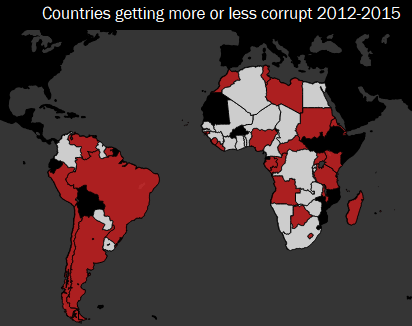
On the face of it, the news looks ok: 83 countries got less corrupt between 2012 and 2015, whereas 63 got more corrupt. The story is of course more complicated than that. Looking at the world map, it looks like things are really bad in South America, but pretty good in Africa (lots of white means lots of countries becoming less corrupt).
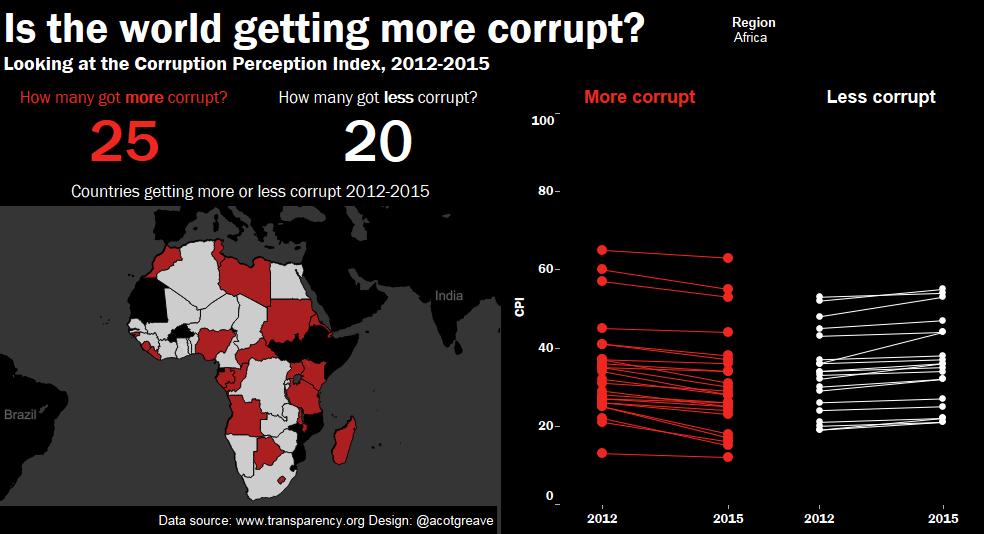
However, let’s look at the dashboard for Africa:
Turns out the story isn’t as positive in Africa as initially thought:What’s going on?
- More countries got more rather than less corrupt (25 versus 20). There’s lots of white in Africa because the countries that got less corrupt happened to be the bigger ones: they are more dominant in the filled map.
- Look at the CPI slope charts. Although 20 countries became less corrupt, they already had very poor CPI scores. Sure, they became less corrupt, but that hasn’t made them safe havens for citizens. The picture’s improving, but not by much.
In terms of design, why did I make my choices?
- Instead of red/green I chose red/white against a black background. I want to make something with had more punch. I think the end result is a little too much.
- To show change, I chose to do slope charts. When you interact with the dashboard, each line is labelled and highlighted. Without the interactivity, I acknowledge it just looks like spaghetti.
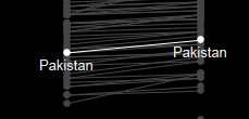
- I chose filled maps, but could have used dots on the map. I’m happy to agree with you if you felt dots would have been better.



2 Comments
Add Yours →no link to the interactive version, it seems.
“What do you think? Are slider filters good?” : As a user, I strongly prefer slider (over dropdown) to view a possible *time-based* trend …because less distraction / fewer keystrokes.
[Else, using cursor keys after dropdown would be ok …but they don’t ‘work’? Or have dropdown + animation …but animation doesn’t work in TableauPublic?]