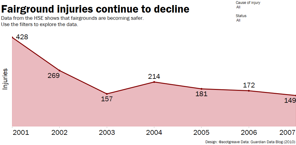
For the next two weeks, we’re making over dashboards from our past. Andy and I have been using Tableau Public for 6 years: we thought we’d go back into the vault and improve on some of our earlier work.
What have we learnt in all this time and how would apply the learning?
Here’s the original, and below that, some notes on my makeover.
- The most important not to do is scoff at your early work, or anyone’s work that looks like this. Why? When I built this chart, and added it to the comments in the original Guardian article, it felt amazing. I felt empowered and excited at the ability to take some data and make my own sense of it.
- I decided this week to go for maximum simplicity. For all the detail, the story across all criteria was the same: injuries are going down.
- Given that that’s the case, a line chart with some filters seemed like an effective approach.
- I pared back as much formatting as possible. In this week’s makeover I was trying to produce something you’d see in a print newspaper; something with a very simple, easy to interpret message.
- The declining line reminded me of a roller coaster. I considered putting a roller coaster icon on one of the downslopes. However, this is one of those cases where you need to remember that this is real data about real people, some of whom lost their lives.


2 Comments
Add Yours →Yes, absolutely love the simple approach!
I had the same thought that I would really like to just see a simple time series for this information when I looked at the original.
The only two other thoughts I have are:
1) I would still like to be able to see fatal vs non-fatal accidents as part of the filtering (or a severity scale perhaps)
2) Sliders as the mechanism for filtering from a category list seems really awkward.
Sliders for filters: this is a really interesting point. I agree they are awkward, almost!
When do I find they work? If I’ve built the dashboard, I’ll end up using sliders as a quick way to cycle through the different categories to check that the view is coherent for all options. In this situation, sliders are great for rapid exploration when you’re not looking for a specific category, but doing a quick scan for a sense of the data. Where the sliders don’t work is when you then publish the dashboard and let other people loose on it, like I’ve done here. It also doesn’t help that there’s a lag in Tableau Public preventing an instant response in using the slider.