What’s the goal of analysing data? It’s about finding insight, and communicating that insight in an optimal, engaging way.
How do you reach that goal?
You don’t get there by first deciding which chart types you want and then adding data to them. Saying “I will start with a bar chart” and adding data to it is the equivalent of trying to create a masterpiece with a paint-by-numbers set.
You do it by starting off with freeform exploration, improvisation, and shifting perspectives. We might try out 100 different views and keep only one. That single output will be powerful, but you’ll know it’s right because all the other views provide small contextual validations that you gained on the journey to the final output.
What does this look like? How about this squiggle?
The start is fast, messy and unpredictable. You’re failing fast and moving on. Over time you focus on the insights you’ve found and gradually hone in on the best articulation of the data.
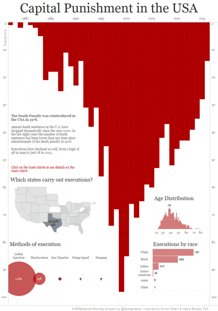
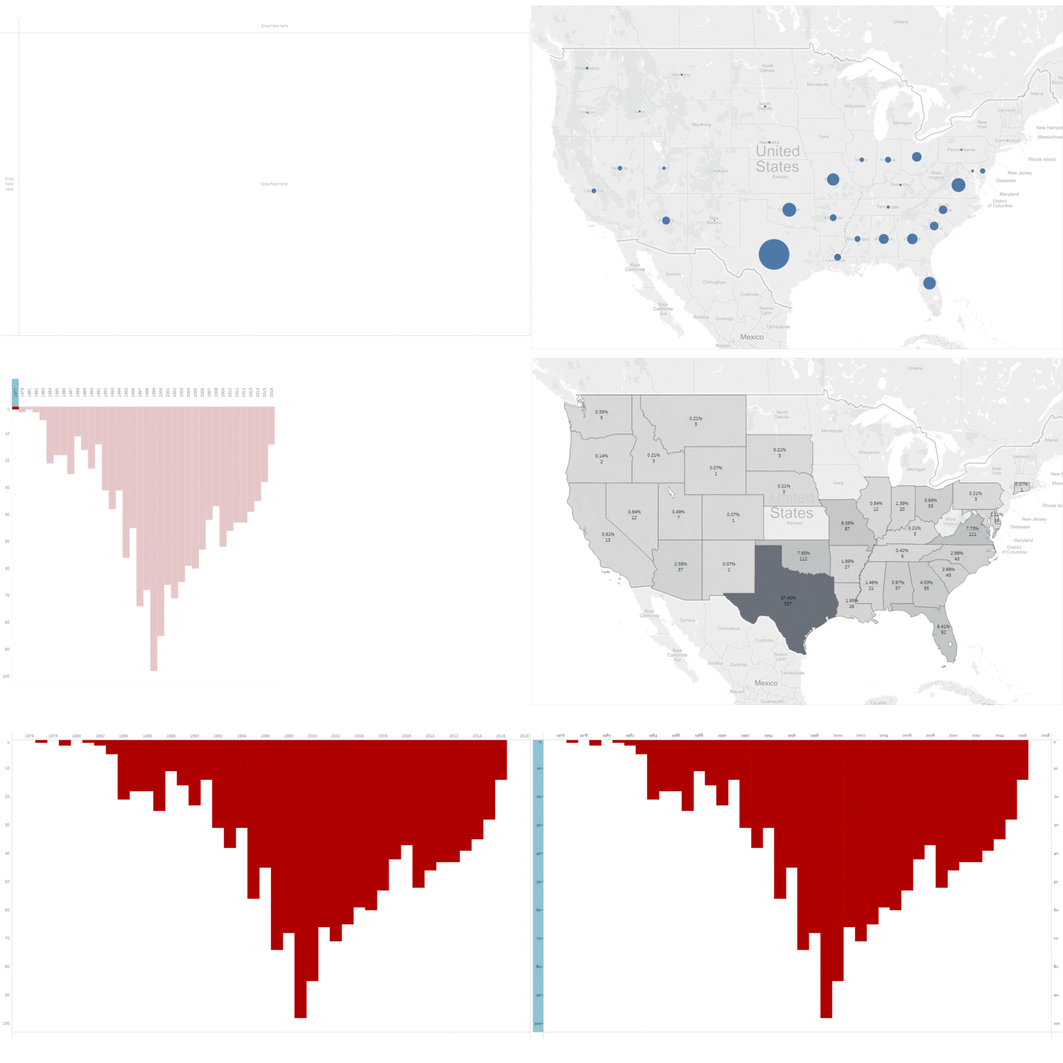
What does the squiggle look like with real data? I got a chance to find out during MakeoverMonday, week 29, when we looked at data on executions in the USA. For a project being run by Tableau’s research team, I captured a screenshot of every view I made in Tableau (this was automated!). My analysis took 90 minutes. In that time, I built 302 different views of the data. The final dashboard is shown at the top of this post.
Here’s what the exploration looked like:
You can see all phases of the squiggle in the animation.
- Rapid exploration at the start. During this phase I discovered the data had a similar shape to Simon Scarr’s Iraq’s Bloody Toll and decided that, based on that insight, I could base my final output on the design of that infographic
- In the middle phase, there are periods of formatting the time chart interspersed with exploring afresh. I’m not restricted into doing one thing or another. As I play with the data, I get new ideas to go try out. I’m honing in on something, but still exploring.
- Finally I spend a big chunk of time finessing the main chart. This is the phase when I’m trying to find the absolute best way to represent the data.
I created tables, bubbles, area charts, pie charts, sideways charts, ugly charts, and more. I threw most of them away. What the animation shows is what happens when an analyst is in the flow with their data.
I found this week’s MakeoverMonday fascinating. I have written many times before about exploration and iteration (e.g. here and here) but this GIF is the first time I’ve been able to truly see what exploration looks like. It’s the first time I’ve been able to validate that exploration can look messy from the outside but is actually hugely productive for the person doing it.
Footnotes:
- The Squiggle is based on Damien Newman’s Design Squiggle. Newman applied the squiggle to design.
- The screen captures from Tableau were captured automatically. Only changes to the views themselves are captured. Titles, annotations, and laying out dashboards aren’t captured.


2 Comments
Add Yours →I know I’m biased but this is absolute btilliance!
[…] the end do we invest time in finessing the final product. You can read Andy’s post in full here: So how, if at all, do these two approaches marry up – can you involve yourself in the full […]