This week MakeoverMonday is LIVE at Tableau Conference on Tour. Check out the hastags #makeovermonday and #data16 during Monday to follow things live.
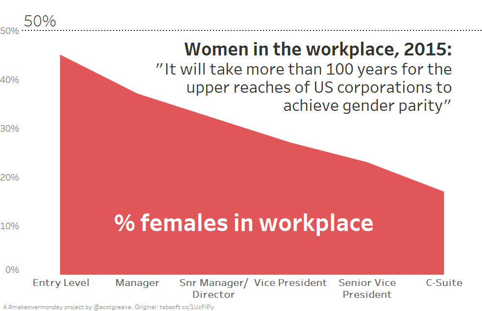
For my makeover this week, I wanted to simplift the message. The differences between 2012 and 2015 weren’t that great. There are more women at each level, but the trends themselves haven’t changed. I decided to remove 2012 from my data to focus more clearly on the Pipeline story.
I liked the quote in the first paragraph of the original so lifted that for the title.
In our makeover about women in legislature, I extended the y-axis to 100% to emphasise the distance to parity with men. In this case, I decided to end the y-axis at 50%. To make it clear that the top of the chart is 50% I made the reference line stand out, and put the title beneath it. Did that succeed? Did you see the reference line?
The original

The original chart wasn’t a great one this week.
What I liked:
- There’s a table, so I can lookup the numbers
- The colour scheme is very easy to distinguish
- They attempted to use a visual metaphor for a pipe
What could have been improved:
- The mix of line chart and pipeline renders the chart pretty meaningless: it’s not possible to see what’s actually being shown in the chart
- The designers appear to have drawn a straight line in the chart, but the data doesn’t quite drop the way it’s shown.

Recent Comments