
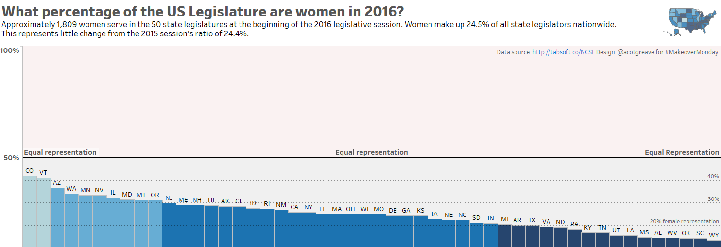
This week my aim is to emphasize where the data isn’t. I made the y-axis scale show the full range from 0% to 100% female representation. Why? In an ideal world, states should have approximately 50% female representation.
When I first explored the data, Tableau automatically tops out the y-axis just above the highest percentage state. This is reasonable but it means you don’t immediately see how low the representation is in some states. In the image below, you can see bunch of states are high on the y-axis. You have to stop yourself and wonder about truncating the UPPER end of the y-axis when showing percentages. Colorado and Vermont are the closest to 50% so well done them. But it’s still NOT 50% female representation.
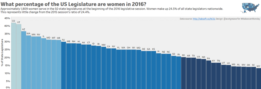
I decided to ignore the values relating to gender split in the population: all the states are close enough to 50% to make any differences mere noise.
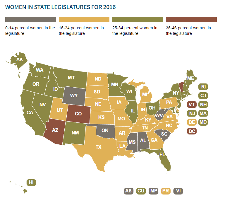
As with many other makeovers, this week’s original chart doesn’t have too much wrong with it. I liked the following:
- They binned the states into just 4 groups
- The tooltips for each state add good information
- The title and font keep things simple and clear
- A map helps for quick lookup if the viewer is looking for a specific state
Things I would have changed:
- Was this data best shown as a map? If the story is about underrepresentation, then show that, rather than just geographic information. Bar charts, or distributions could show that story more powerfully.
- The colour scheme is, to me, a little muddy. High/low doesn’t pop out. The grey is especially unclear. Without looking at the key, would you be able to tell if grey was good, bad or middling? I wouldn’t know.
4 Comments
Add Yours →Love it.
Perfect (rare) use case for showing the full 100% on the y axis.
Change is intrseable.Hiitovy teaches us this is a normal happening in the flow of things in our world.Transparency in all levels of government and proper parliamentary procedure will add up to needed integrity.All citizens of utica are in this equation.Good luck James in your run for city council.
Thank you for the nice article. Although, I disagree with you on some points:
– I think the geographical representation has value since you can see the same percentages for states that are close to one another. This could be valuable information for some people. So why not have a combination of both charts where both share the same importance and are evenly big (now the map is somewhere very small in the top right corner).
– I find the interactive Tableau bar chart a little bit confusing. It leaves me wondering about the following: Why is the width of the bar chart larger than my screen? Why are there only 2 values on the y-axis on the left and the other ones on the right? Should you scream that hard with the “equal representation” labels on the “goal line”? Doesn’t it suffice to only put the bold line? Why is so much room left on top of the chart? Isn’t it sufficient to only go to 75%?
Hi Bram
Thanks for the comment. I agree the geo story is powerful. I chose however to tell an equally powerful story.
Funny you should comment on the width. There’s no reason it’s that wide, other than that’s how I chose to make it. I probably could have kept it narrower.
Only 2 values on y-axis? Because only 50% made sense for my story: is the state above or below 50%
Screaming “Equal Representation”? Another great question. I could have just had one label but I really wanted to be sure all viewers understood what the line meant