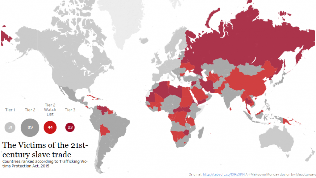
A quick post this week!
My makeover focused only on the most recent year, 2015. I did look at the trends, but didn’t find anything particularly of note to add to or support the story. I wanted to keep things simple. I played around with versions without maps, but this data set seems challenging to show in other formats. Any time I took the map out, I found myself wanting to know the detail of each mark: WHAT country is it and WHERE is it?
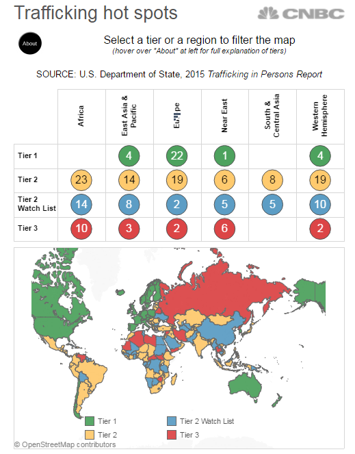
This week’s original chart came from CNBC.
Here’s what I like:
- I happen to know this one was specifically designed for mobile. CNBC had a very specific brief that required the dashboard to render correctly on mobile devices. With that in mind, the dash is quite small and simple.
- It has a nice “About” tooltip in the top left, where I’m likely to see it.
- The lookup table does allow me to see individual numbers, should I wish to find them.
What I’d improve:
- The colour palette seems arbitrary to me. I think there are nicer palettes available which could portray the categories more clearly
- The circles in the lookup table make it hard to read the numbers.
- I don’t like the vertically oriented labels in the upper table. There is space enough to have them horizontal
Here are a couple of ideas I rejected:
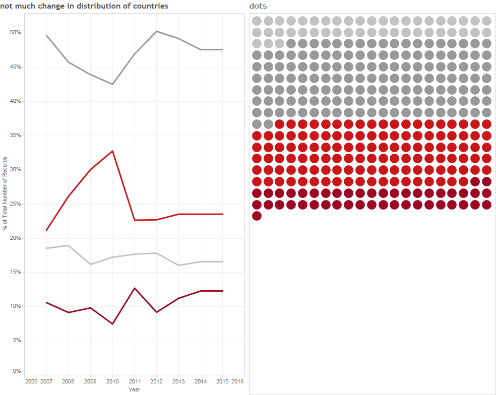
The timelines didn’t reveal too much and the dots left me feeling too curious about the actual country each dot represented. Hence I went back to a map.
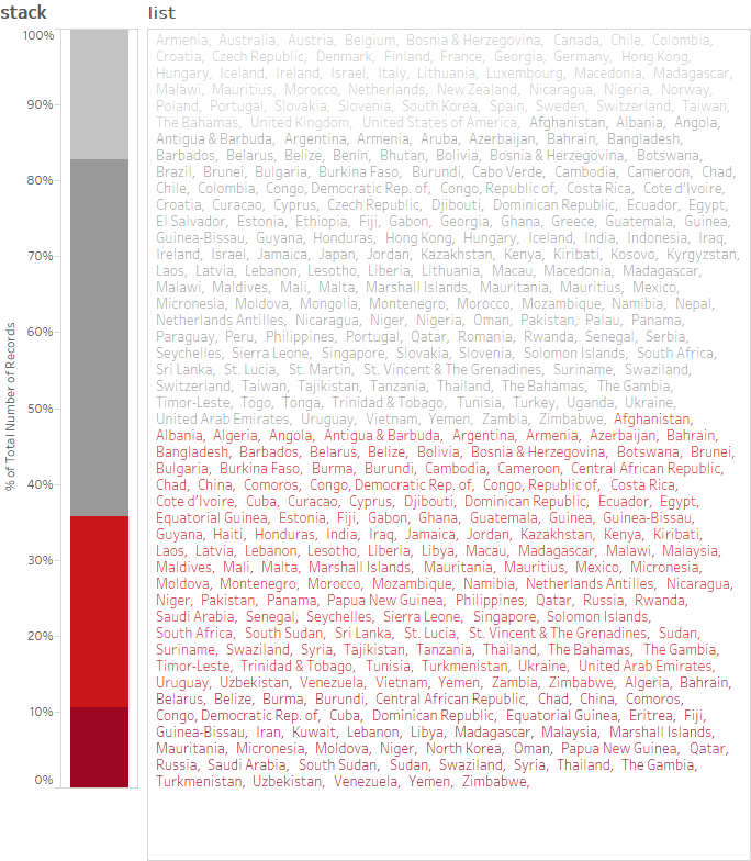
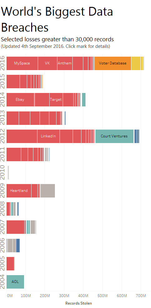
I had a crazy idea that listing out all the countries next to a stacked bar would work. It didn’t. Or did it? Could you see that idea going anywhere?

2 Comments
Add Yours →I again like your simple direct approach. I do think there are a lot of potential areas of focus on this issue, and you’ve taken one and presented it well.
I also find myself really liking the idea of the stack/list combination.
I think there are probably plenty of valid critiques of it, but there is definitely something to it.
I would say that it would be necessary to make the height of each text block exactly the match the height of the corresponding column segment.
An interactive version could include the ability to click on a name, and see that country highlighted in the context of its continent, with additional details, trends, etc.
Thanks Jamie. I was trying to align things in the Stack list. Maybe in the right circumstance that’s something I’d pursue to see if it works.