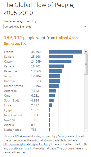

I went super simple this week: all you can do in my viz is select a country and see where people went to. You can only see one origin country and I only exposed the most recent year.
The original chord diagram lets you see a very large amount of the dataset simultaneously.
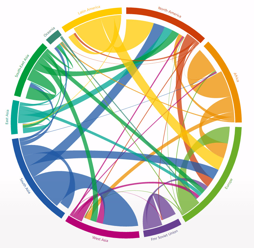
I used to dislike chord diagrams: too complex. really messy, incomprehensible. But then this chord diagram was presented at Graphical Web in 2014, and it changed my mind. Why?
- The designers took the time to explain how the chord diagram worked. Once you have worked out the mechanisms, the data pops out and becomes clear. Taking the time to read the instructions and learn how to read a chord diagram is time worth investing
- Chord diagrams require interactivity, and that’s fine. The initial state is an overhelming confusion of lines. Interacting brings it to life. Charts that require interactivity can still be valid.
- I do not believe there is another way to visualise flow that has so much detail. My own makeover this week is an admission of that: I’m using filters to show only a part of the data. Andy’s own makeover is a massive simplification of the dataset. It’s fine, as a matrix, but comes at the expense of detail, which the chord does contain. Almost all of this week’s makeovers show only a slice of the full data. Only the chord diagram allows you to access it all with ease.
- People shouldn’t shy away from complex charts. Chord diagams do not provide instant insight: you need to invest time to read it. That is not a reason to shy away from a chart. Alan Smith discussed this on the PolicyViz podcast: he explained why they used a chord diagram in the FT this summer, knowing it was a chart that needed time to digest. That’s well worth a listen.
- Chord diagrams cope with a range within your measures. Some countries have really huge numbers of people moving, while others have tiny. The outliers dwarf everything else when you encode with colour or length. I think width is a more successful encoding in this case.
I love the original chart. It’s visually striking, it’s engaging and there is a vast amount of detail available in one view, once you’ve devoted the time to learn how it works.
1 Comment
Add Yours →[…] processes behind their reworks. See below, in that order, and click here (for Andy Kriebel) and here (for Andy Cotgreave) to visit their accompanying blogs and […]