[This week you have multiple ways to see my Makeover. It’s available here as a Tableau Story. Or read below for the story rendered as a post. Notes on the original chart are at the end, too]
The Makeover
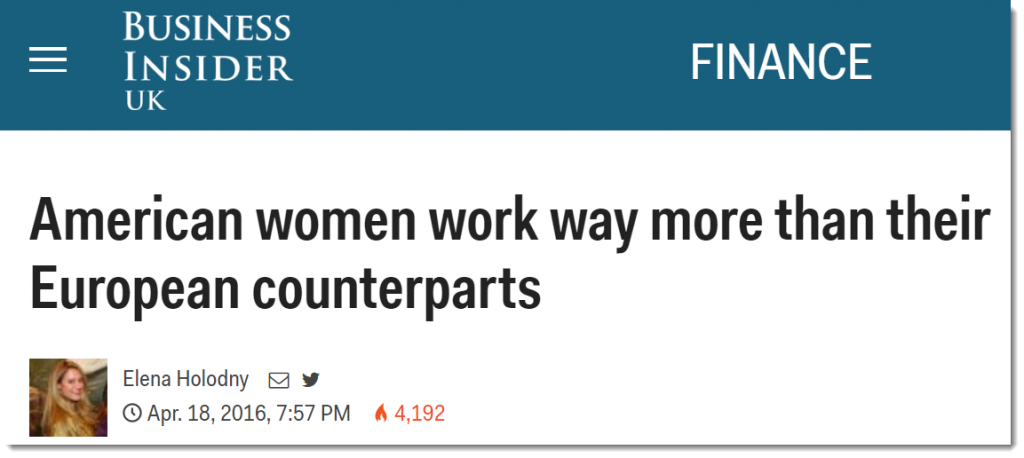
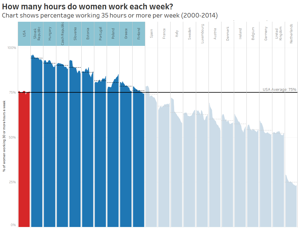
Business Insider make a bold claim in their headline
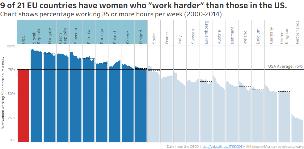
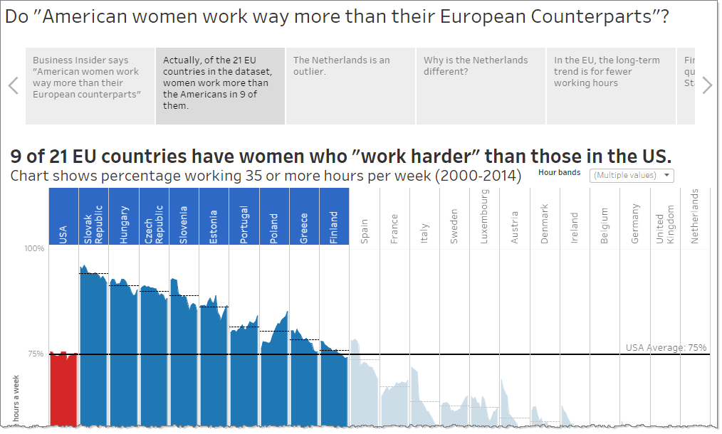
Actually, of the 21 EU countries in the dataset, women work more than the Americans in 9 of them.
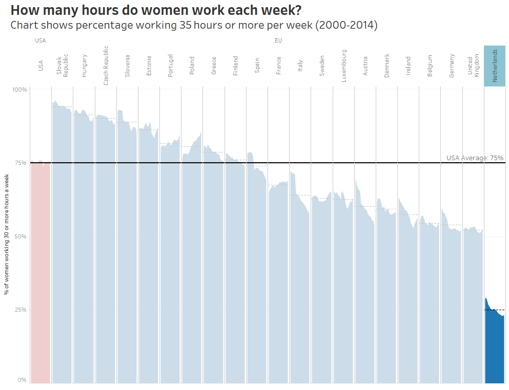
The Netherlands is an interesting outlier
What is about the Dutch?
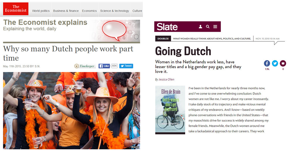 Check out these great articles from The Economist and Slate on why Dutch women don’t work so much as other nations.
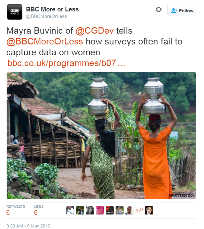
Finally, should we trust Labour Force Statistics which involve gender?
Check out this week’s fantastic episode of More or Less for more information.
The Analysis
You can download my workbook here. It’s using v10 of Tableau. (in beta at time of writing)
As you’ve gathered, this week my makeover was inspired by questioning the orignal chart. The chart itself is ok as far as stacked bar charts go. I question the boldness of the claim, though.
First of all, lots of the EU countries have higher levels of work than the US.
Secondly, as More or Less discussed this week, there are many reasons why gender data in employment statistics might be incorrect. Or, if not incorrect, the surveys are bias against female employees. For example, surveys often ask about “primary” employment. This ignores second jobs, which more women have than men. Uganda changed its surveys and female employment numbers went up by hundreds of thousands!

What did I like about the original?
- A stacked bar is pretty clear.
- I can easily find the categories on the legend and compare countries
What didn’t I like?
- Everything’s got the same intensity. I’d have softened the borders, axis lines and labels, so that the data is more clear
- It’s a good job I know my country abbreviations. GER, ITA? Some people might not know what they mean. They may think OECD is a country of its own.
- There are too many tick marks on the axis. I don’t need all that information.
- The title, “Female hours worked relatively low” doesn’t make much sense. I don’t mind using abbreviated language in titles, but this one seems to have gone too far.


Recent Comments