
I’m very excited to be in Tokyo this week. I’ll be presenting the Tableau 10.0 roadshow and at a bunch of partner and customer events, too. I’m very thankful for this opportunity!
The makeover
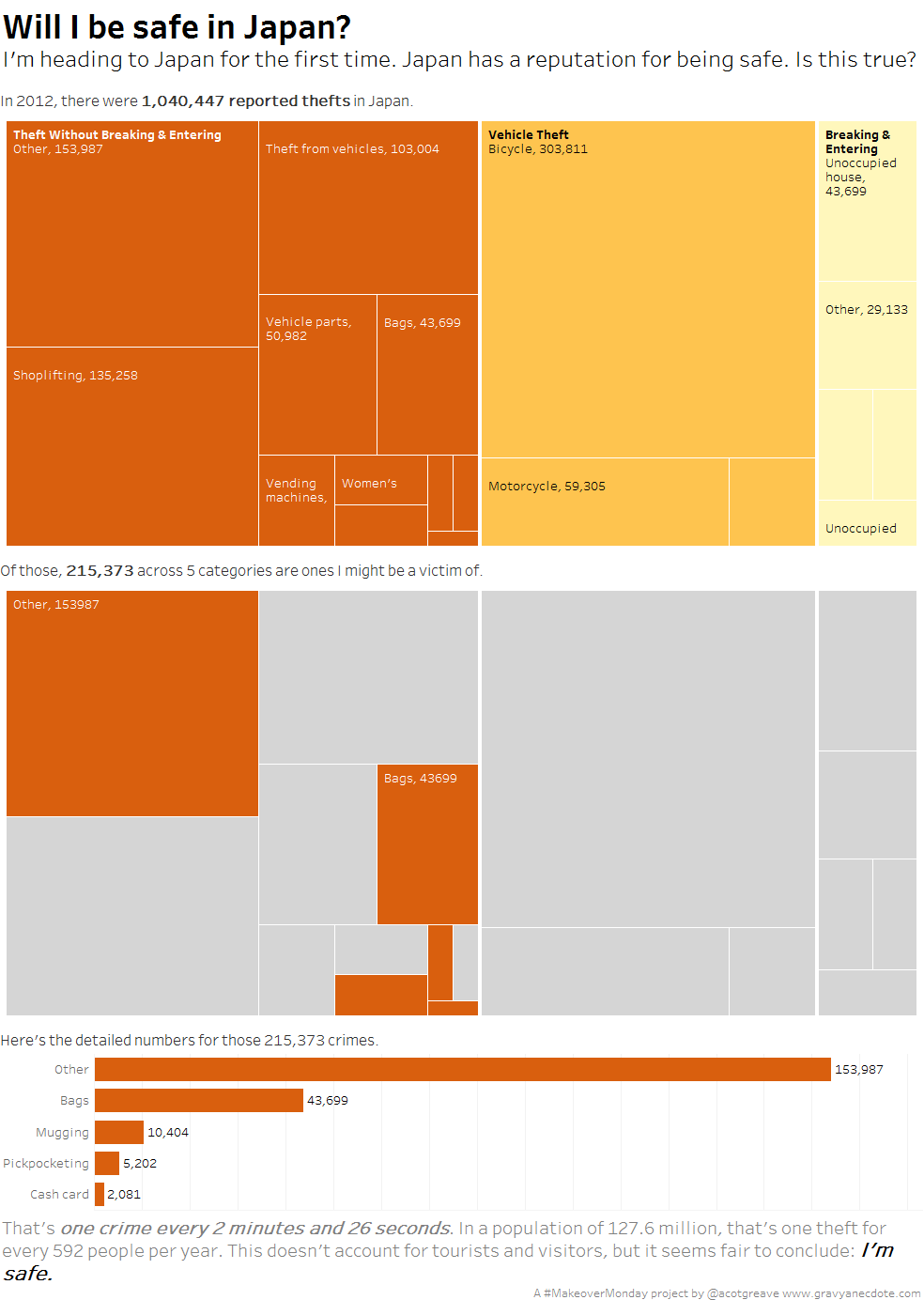
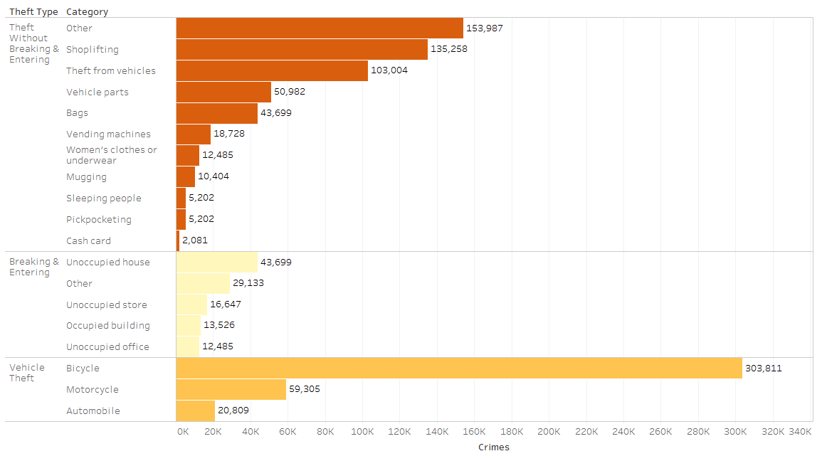
This week, Andy K found a chart showing reported thefts in Japan. The chart we’re focusing on shows the number of reported thefts in Japan in 2012. I thought I’d make it over to make it personal. Personal to me. Could I use this to prove the reputation Japan has of being a safe country to visit?
I didn’t start off wanting to ask that question. My original starting point was to draw a straightforward treemap. I haven’t seen too many of these in MakeoverMonday so I thought they deserved some attention.
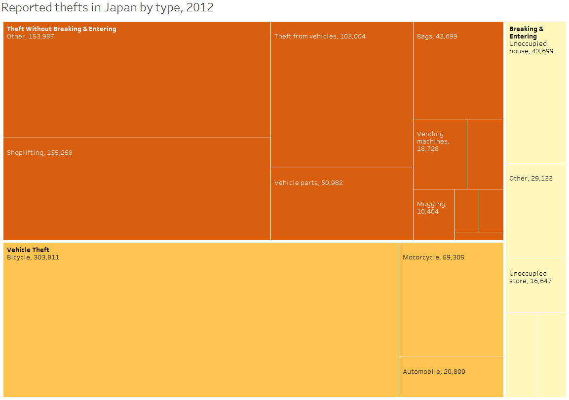
The treemap was ok, but it didn’t amaze me, and I didn’t feel that I’d really hit on anything interesting for MakeoverMonday. All I’d done was take sectors of a circle and make them sub-rectangles of a bigger one.
As I interacted with the data, though, I realized I could look for patterns relevant to me. This week is my first visit to Japan. As the original article describes, Japan has a reputation for being safe. “Well then,” I thought, “which of these crimes could I fall prey to and are they common?”
That led to my makeover and a personal story to prove the relative safety of Japan, using available data. Given there are so few crimes, it’s fair to say that this data supports the reputation Japan has of being a safe place to visit.
Iterations and alternatives
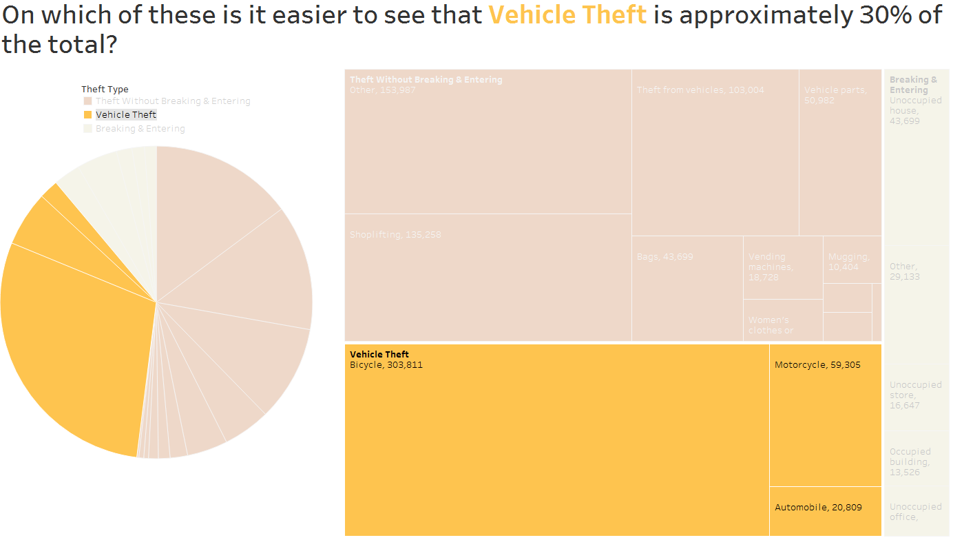
Do I love this treemap? Not especially: in fact, with this dataset, I think a pie makes it easier to see the proportional to whole relationship than a treemap. Look at the figure below. In which chart is it easier to see that Vehicle Theft accounts for about 30% of reported theft. [Note: the previous statement comes with the normal caveats about pies and their problems. I know the problems with pies, you don’t have to tell me them; I’m just describing my thought process as I explored the data and built different views.]
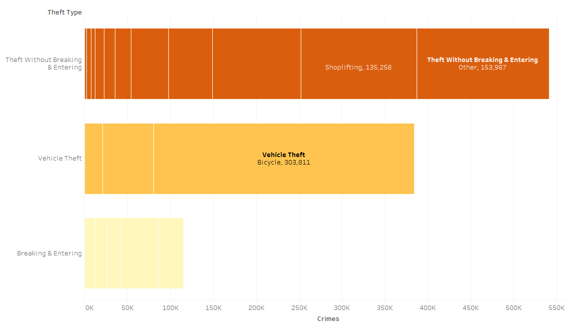
If I was going for efficiency in the makeover, I’d probably have chosen a stacked bar or even a normal bar chart. These allow for the easiest lookup of data. Here they are below.
The original chart
Here’s the original chart and my thoughts on it:

What I liked
- Everything is labelled, so I can lookup any value I want
- There’s a total in the middle so I can the proportions and relate it to the entire number of reported thefts
- The labels are aligned making them easier to lookup than otherwise
What I didn’t like
- It’s a sunburst chart. There’s a certain pleasure in looking around and following shapes from the centre outwards, but it’s so slow and inefficient. A normal bar chart gets the job done quicker
- The inner label shows the actual total number of reported thefts, but the outer numbers show percentages. That’s not made clear.
- The outer level of the sunburst appears to be randomly sorted. It could have been in descending or alphabetical order.
Recent Comments