[Note 1: Yesterday I had a classic MakeoverMonday experience. I wrote this post, and was ready to hit publish. I then realised I just needed to tweak one of my images. I went back to Tableau, had a brainwave, and ended up with a completely new idea. I NEVER would have come up with that idea had I not been able to drag drop and experiment so readily. I chose to keep this post for Tuesday]
[Note 2: The CORRECT baseline is 1961-1990. The charts in this post have incorrect titles. Download the workbook to see correct versions]
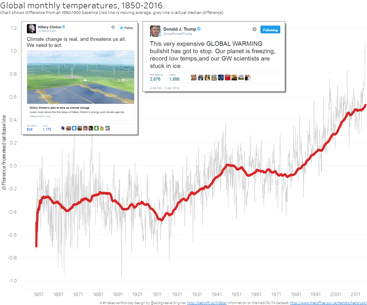
The world is getting hotter indeed. The data comes from the UK MetOffice’s HADCrut4 data: a global, gridded dataset of surface anomaly temperatures.
The science behind the dataset is complex, but the data’s straightforward: the measure is going up over time. How should you best show an upward trend?
This week, three ideas came to mind before I explored the data. I implemented each one.
1. Straight line (with politics)

You can’t beat a trend line. It’s visually the most straightforward and effective for displaying an upward trend. I chose to emphasise the moving average (red) with the actual anomalies in grey in the background.
The rising line chart conveniently leaves white space into which you can insert objects to further make your point. In this case I found two representative tweets from the likely US presidential candidates.
2. Bloomberg-inspired animation
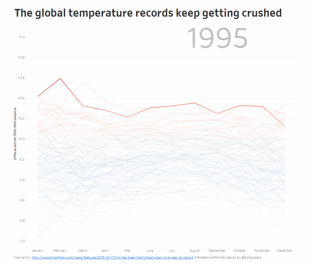
Bloomberg did an amazing visualisation with this data last year. Here was my excuse to recreate it. I think this is an especially good way to show the data because the animation brings drama to numbers. As the hottest year creeps ever upwards you have a sense of dread. “Wow, 1995 was hot. It can’t get hotter, can it? Oh. It did, 1998. Ouch. And again. And again. Yikes.”
This week’s chart was essentially exactly the same idea, spiralised. Personally, I think the radial display makes it much harder to see the extremes creeping ever higher.
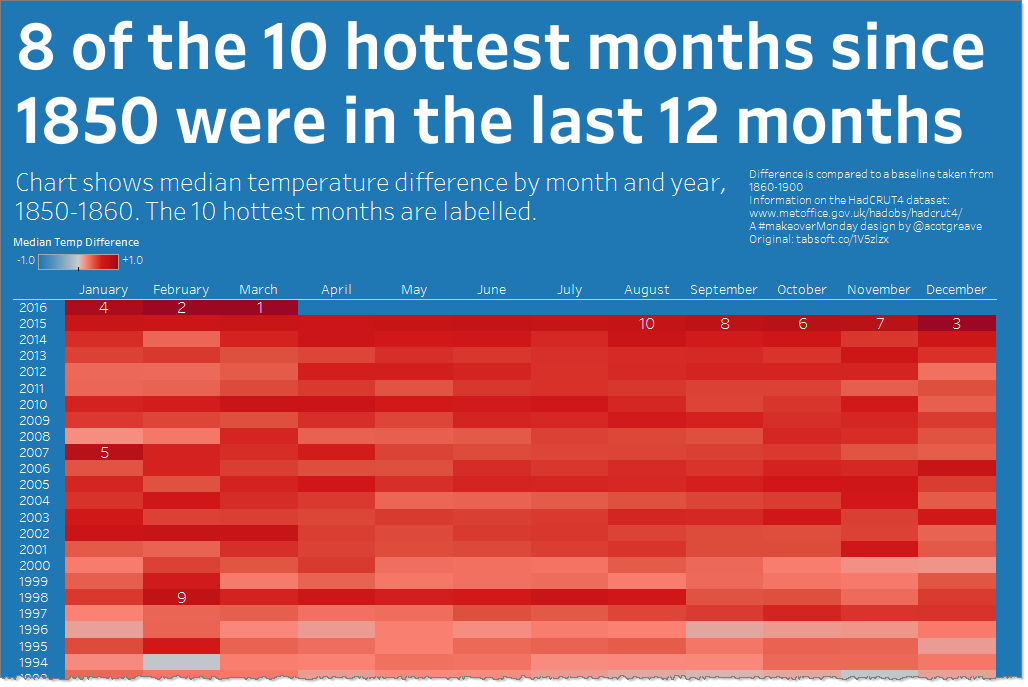
3. The highlight table

I love a highlight table. This one lets you look up each month, should you wish to, but shows, right at the top, just how common the broken records are happening. It was fact-checking the rank calculation which led me to the idea of histograms for my actual MakeoverMonday, published yesterday.
I also quite like tall and thin, but in this case, I think there’s just too much detail. We’re really making the point that the most recent months are super-hot. The highlight table takes a lot of vertical space to make that point.
Recent Comments