I’m back from vacation and in catch up mode, so here is 3 weeks of MakeoverMonday with super-fast summaries of each one. A lesson from catching up like this is that time pressure really helps keeping things simple and thinking about the simplest way to communicate a simple message. It forces you to condense your approach to the pure display of the data itself.
Week 31
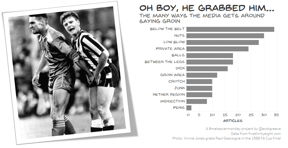
The photo of Vinnie Jones and Paul Gascoigne is utterly fantastic. I realise that the mentions in this dataset relate to 2016 basketball, but, well, I couldn’t resist using the photo.
Week 32
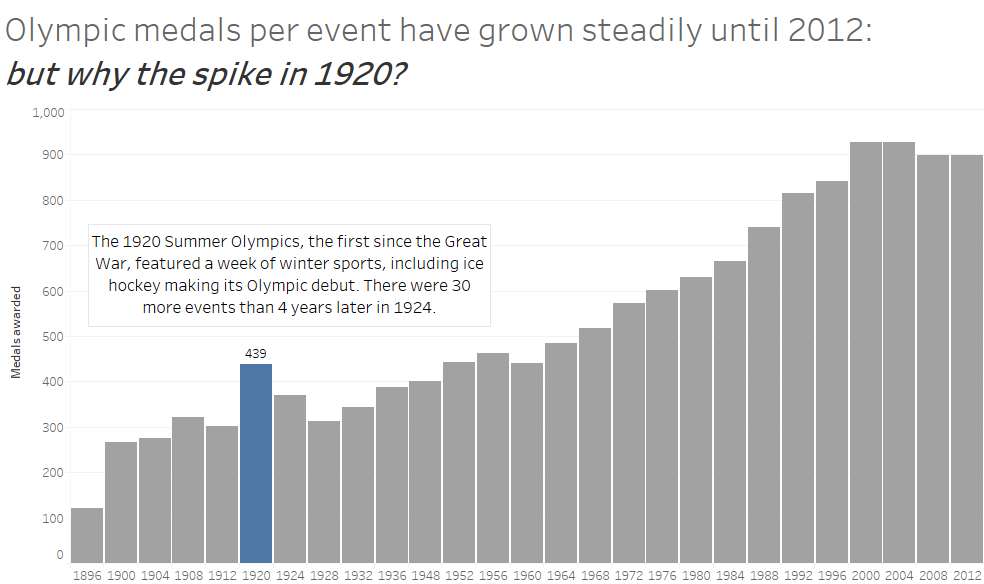
I tried for a while to show the whole dataset in an interesting way, but I couldn’t find a way to make it feel interesting. I stepped back and noticed the 1920 spike in overall medals. A quick read on Wikipedia revealed the brilliant fact that 1920 Summer Olympics included a week of Winter Sports. Bonus fact!
Week 33
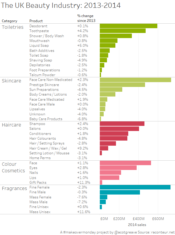
Short on time, I went for a super simple nested bar chart. Looking up the information and comparing values is easy, which cannot be said of the original. The thing is, even if I had all the time in the world, I don’t think you could create a more effective display of the information than the nested bar chart.



Recent Comments