Oh gang, I apologise but this is a super-brief Makeover this week. Work and life have multiple demands this week. Given the time squeeze, I gave myself 15 minutes to make a viz, with the rest of the time spent on this blog post.
15 minutes? What can you possibly focus on?
With only 15 minutes, I’m clearly not going to go deep into the data (even though it looks like it has some amazing detail).
0-5 minutes
Instead, I looked for one point being made in the article.
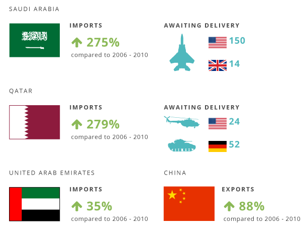
The flag section caught my eye. Firstly because it was the hardest part to interpret. So many flags and arrows and words and icons. What does it all mean? Once I deciphered the meaning, it seemed pretty interesting: 3 Middle East nations are importing way more than previously.
That was interesting: is it called out in the article? It sure is: they claim that these three countries are arming themselves in response to unrest in Syria. I find this horrible and fascinating: military hardware companies will be rubbing their hands with glee at the conflicts around the world.
Could I remake this story using the data?
5-11 minutes: building the viz
I’d spent a few minutes digesting the story, so needed to see what the dataset revealed. If you only have a matter of minutes, and want to look at how a measure changes over time, go for a line chart. There’s no time for mucking around with different views.
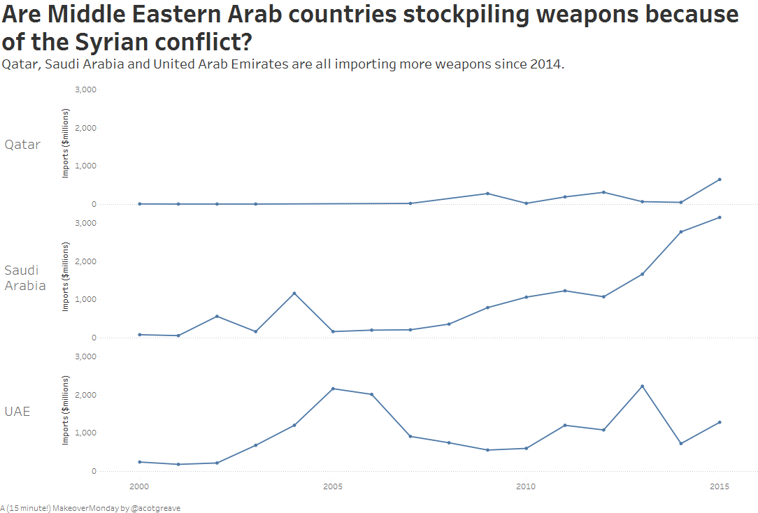
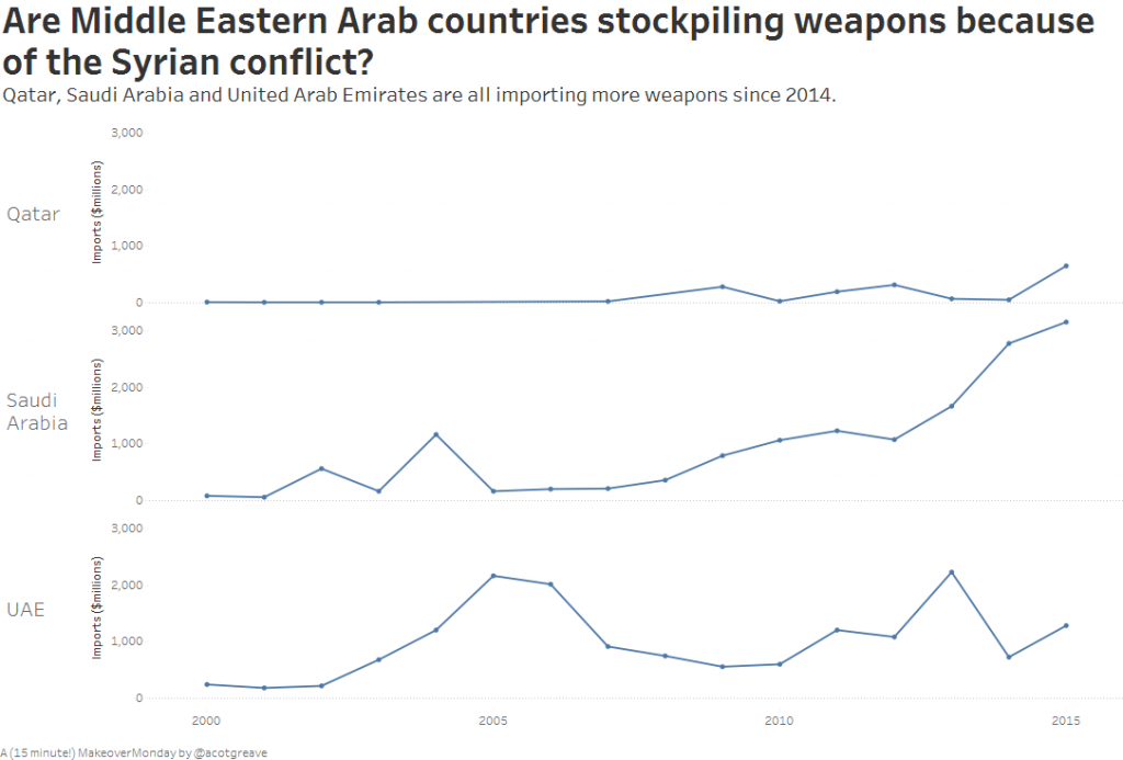
I filtered out the countries, and there you go: Qatar, Saudi Arabia and UAE all going up.
11-15 minutes: formatting
How do you make a simple makeover look really fancy? Choose an unusual font and background colour. Instant respect from us all! Well, there’s no time for that today. All I could manage was a quick switch to Smooth theme and writing a nice title. For simple charts like this, I’ll always try to ask a question, giving the viewer the information they need to query the chart itself.
15 minutes and I’m done.
How does a 15 minute makeover feel?
The main feeling is of fraud. I didn’t do much detailed checking of other countries. I don’t feel like I have really tested the hypothesis that “Middle Eastern Countries are spending more because of Syria.” I feel like I’ve just accepted the point made by the journalist and made a chart which, kind of, supports that opinion.
I feel like I’ve used the data to support the story, rather than use the data to find the story.

1 Comment
Add Yours →I’m new to Tableau and trying to expand my skills by going through past Monday Makeovers. I have a question about this data source. The Excel version has every year assigned its own column. What’s the simplest way to pull this into a single “Year” column (like the TDE file)?