Our chancellor proposed a sugar tax on soft drinks in his most recent budget. About time, too! We desperately need to improve diets and this is a start.
The BBC’s asked How bold is the tax? They used this chart:
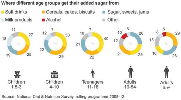
What’s good about their chart?
- ALL the info is there if you want to find it
What doesn’t work so well?
- I need to move my eye many many times to decipher and compare things. Just comparing soft drinks between two age groups means I have to do a lot of cognitive work to find an answer.
- The donut is arbitrary. A pie would have been better as there’s more of a mark to identify. If they REALLY wanted a donut, maybe they could have put the AMOUNT of added sugar as a label inside the donut.
- The story is about soft drinks, primarily, but the colour for soft drinks doesn’t really stand out
- The icons are ok, but what’s odd is how far away from the donuts they are. There’s too much white space between the donuts and the top of the icons.
- Why is alcohol red? That makes it stand out the most, but the article is about soft drinks.
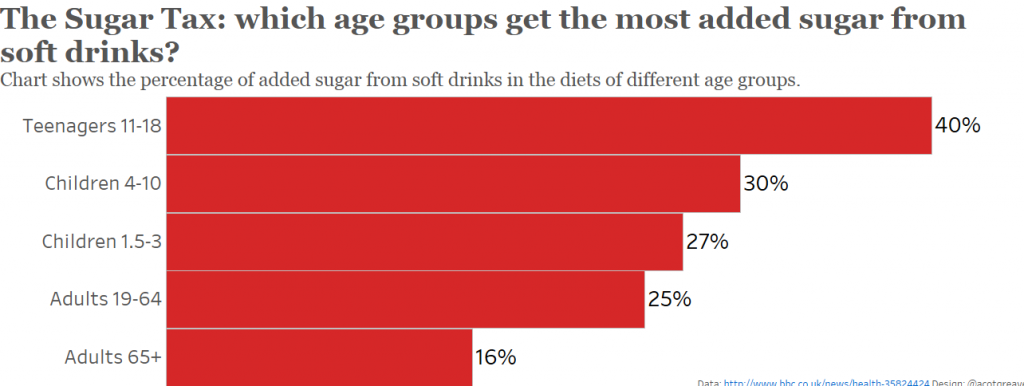
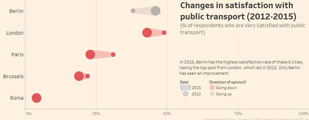
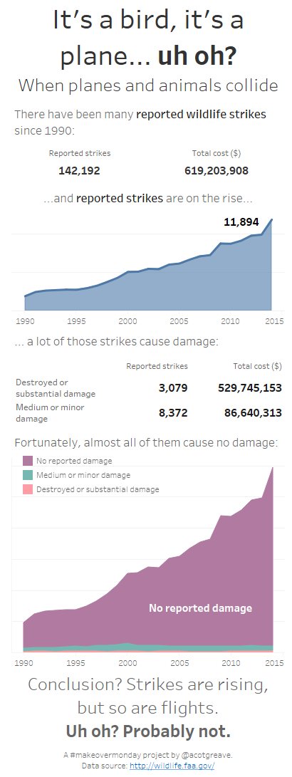
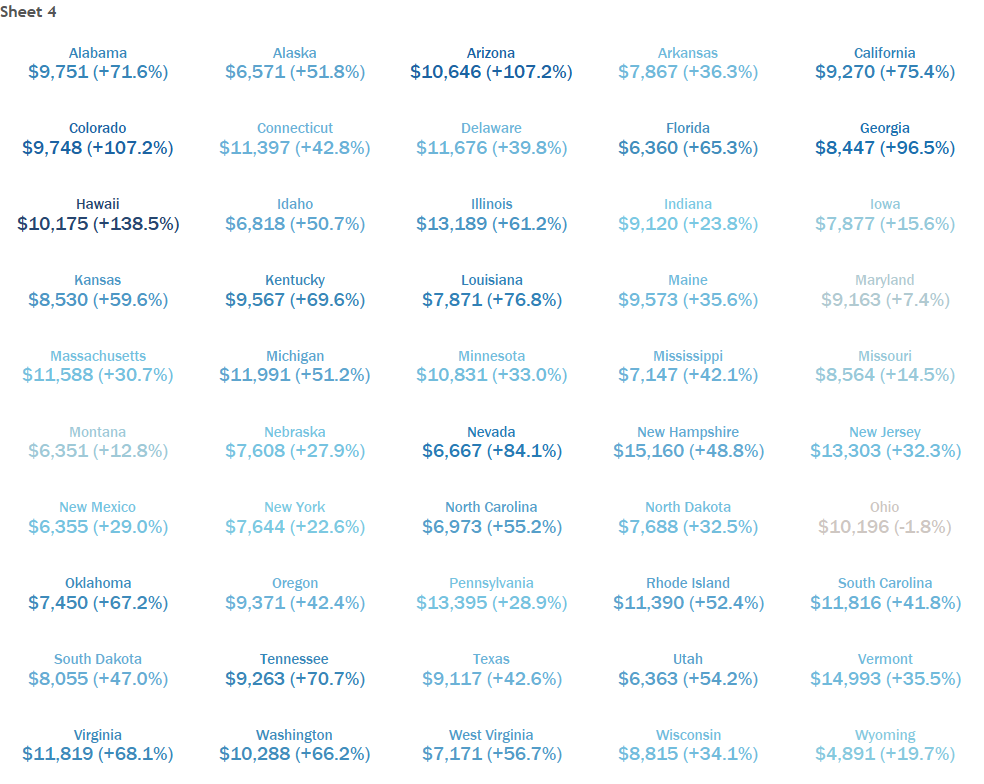
For my makeover, I decided to reduce the data to that most relevant to the story: how much of our added sugar comes from soft drinks. It shocks me to the core how much fizzy stuff our kids drink. 40% of added sugar coming from soft drinks? The BBC article also includes the actual volume of sugar, but we didn’t have that in our makeover dataset. It’s depressing.
Even if you kept all the food sources, the BBC’s approach could be improved by either a stacked bar, or even filling in the holes in the donuts. Notice that I’ve made Soft Drinks red in these examples.

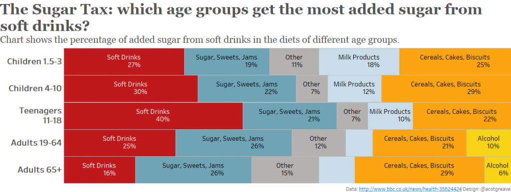
Of all the three makeovers I’ve done this week, I think the pie might be my favourite: the part to whole relationship of the sugar really jumps out.

1 Comment
Add Yours →Cool. I think I like the stacked bars! I was surprised to see that toddlers are drinking soft drinks!