
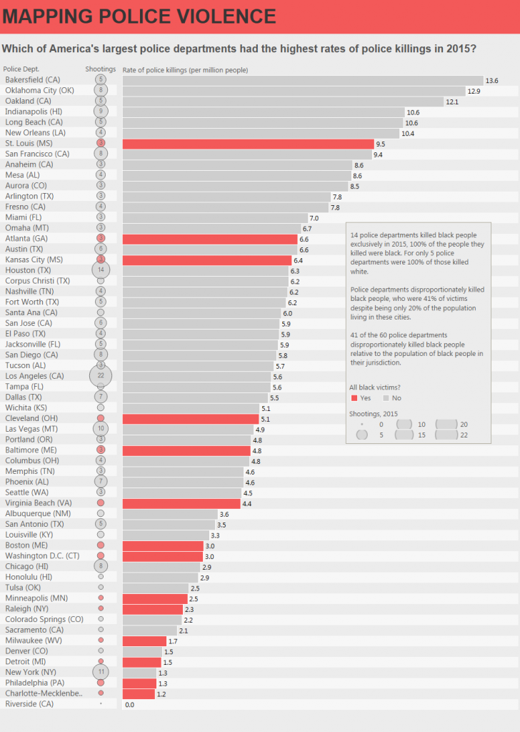
This week we chose data about police violence. It’s not a happy dataset but it is a very important one. The organisation Mapping Police Violence has data on every shooting in the US in 2015. The original article and charts can be found here.
Things I liked about the original charts:
- I found the formatting simple and striking
- I liked the simple approach to showing the data.
- They callout the key departments they are telling the story about (departments which shot only black people last year)
Things I didn’t like:
- The bar chart has vertical labels – I don’t like turning my head!
- They split the number of deaths and the rate of deaths into 2 separate charts.
- The warning symbol for departments that killed only black people didn’t appeal to me as a clean visual indicator.
For my makeover, I wanted to stay true to their intention: a clean list, showing just the numbers. There’s power in these numbers which don’t need elaboration. I turned the rate of killings into a bar, as that’s simply the best way to show magnitude of a measure.
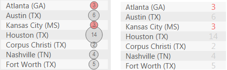
I added the number of deaths as a sized circle at the left of the bar. I toyed with just adding the number, but it was hard to identify what that number meant. I also put the labels inside the circle. I wanted to imply the magnitude of what these big numbers mean: people killed.
I took the same colour scheme as Mapping Police Violence for my own chart.
In the original, the commentary to the chart is placed on the right hand side of the chart. Since I chose to use a sorted bar chart, I have lots of white space on the middle and lower right of the chart. I added the commentary there in order to make good use of this blank space.
4 Comments
Add Yours →I like this remake.
I like that it remains simple, remains true to the intent of the original, but adds insight in a pretty straightforward manner.
The only thing I think doesn’t work great in the remake are the striped rows – all of that grey really washes out the rest of the display.
(oh, and the labels seem to indicate that Washington DC is part of Connecticut – presumably a parsing issue caused by there being a town of Washington, CT)
This may be really silly, however love to know how did you create the set as the describe option does not really tell me the way it has been done.
I have found other ways to do it i.e. 2015 victims = 2015 black victims as t/f calculated, however really was interested in how to create the set without using any calculation.
Love the remake.
Hi Andy,
Love the viz. However I noticed when I hit the sort it goes out of sync. I hope you don’t mind. I downloaded your viz, reworked it to handle the sort/sync issue and published it on Tableau Public.
https://public.tableau.com/profile/publish/PoliceViolence_3/MappingPoliceViolence#!
Love to know your thoughts on the rework.
Cheers,
Ian
New link:
https://public.tableau.com/profile/ian.james#!/vizhome/PoliceViolence_3/MappingPoliceViolence
Hopefully this one works…