
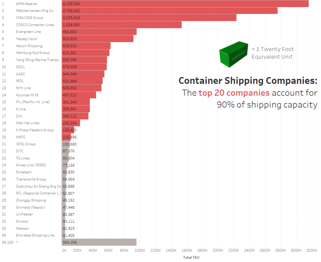
This week’s original looked so simple, I thought it would take just a few moments to whip up a bar chart. Then I figured that was too obvious. And then I got lost in a fascinating voyage of discovery finding out about the global shipping industry. I never knew capacity was measured in TEU (ie a container). And who can resist looking at images of enormous container ships? Maybe you can, but not me.
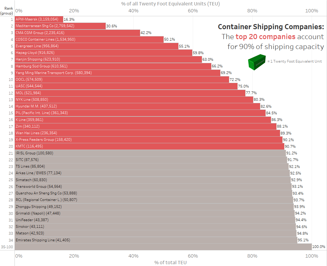
Reading about the industry soon pointed out just how dominant those top 20 companies are. Which led me to the Pareto. I’d enjoyed Andy K’s tip on Paretos last week, so they’re on my mind. I don’t actually think we really need a pareto here. In this case, the more compelling view is the basic bar chart. A simple annotation saying that the top 20 companies account for 90% is enough. It’s easier to read that information than understand it from a pareto.

3 Comments
Add Yours →I find the bar chart much easier to make sense of.
I find myself having to work fairly hard to discern how much each point added to the cumulative total of the “pareto”, at least on the top end.
I also have a bit of an issue with having a “pareto” chart that’s purely the cumulative part, though. The individual value of each point is still a very important part of a pareto, with the cumulative part being more about context, IMO (but, at the very least, it is a part that requires the context of the individual point values in order to make sense).
I am definitely on board with the fascination in global shipping. I work for a company who imports a lot of goods, and built a web-based tracking system to keep track of our import shipments. As part of it, I created a google map with a (near) real-time monitor of the vessels our containers were shipping on, and thereby spent an inordinate amount of time locating and exploring shipping ports around the world. It’s incredible the level of detail you can see.
And it’s incredible how easy it is to sucked in to watching videos of container unloading, exposes on international smuggling, documentaries on the end-of-life process on giant container ships, automated robotic dock infrastructure, real-time ship movement, hundreds of years of global shipping lanes, mapped, the different kinds of containers for different kinds of goods, etc. etc. etc. etc…..
Thanks for the comment Jamie. Good to find a fellow container nerd. Last year I did a ferry tour in Seattle. Mountains, Space Needle, city scape? Meh. But when we went along the dockside? Awesome!
Rose George’s book is a must read on this subject. An Eye opener.
https://www.amazon.co.uk/Deep-Sea-Foreign-Going-Everything/dp/1846272637