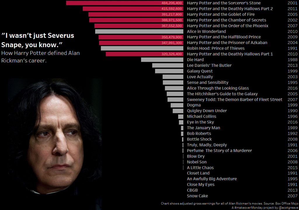
Just a quick one this week. Alan Rickman’s career was lauded, justifiably, when he died earlier this year. However, I hadn’t realised until tackling this week’s makeover just how much it had been dominated by Harry Potter.
I only have time for a very quick post this week. One thing I did do was to orient the bar chart the opposite way to normal (header on right, bars pointing to the left). Why? Because the photo of Severus was facing to the right – I wanted the makeover to look like Severus was looking at the chart itself.


1 Comment
Add Yours →How did you bring the axis over to the right? Is there a way to do that in the sheet, or did you have to create 2 separate sheets in the dashboard?